我正在为我在PayPal的产品构建一些东西(博客文章可能即将发布),并且厌倦了写这样的组件:
const styles = glamor.css({
  fontSize: 20,
  textAlign: 'center',
})
function MyStyledDiv({className = '', ...rest}) {
  return <div className={`${styles} ${className}`} {...rest} />
}
所以我决定尝试一下styled-components,因为它的宣传力度很大🚂。我真的很喜欢它:
它让我可以把同一个组件写成这样:
const MyStyledDiv = styled.div`
  font-size: 20px;
  text-align: center;
`
制作可组合的组件,并将其样式带在身上,这实在是太了不起了。
不幸的是,当我意识到目前还没有一个从右到左转换的解决方案(如CSSJanus或rtl-css-js)时,我碰了壁,而这对我正在构建的东西来说是一个硬性要求。我当时对样式化组件的尺寸也有一些问题(注意,如果你愿意放弃一些动态功能,你可以转译掉很多尺寸,我不愿意这么做)。
因此,在评估了一堆其他的解决方案,并试图增强现有的解决方案,使其成为我想要的样子之后,我决定创建我自己的解决方案。
进入glamorous 💄!
glamorous 是React组件造型的解决方案,具有优雅(灵感)的API,占地面积小( gzipped),性能好(通过<5kb glamor).它有一个与styled-components非常相似的API,并在引擎盖下使用类似的工具(glamor)。其好处是。
让我们快速了解一下迷人的组件是什么样子的:
// Create a <Title> react component that renders an <h1> which is
// centered, palevioletred and sized at 1.5em
const Title = glamorous.h1({
  fontSize: '1.5em',
  textAlign: 'center',
  color: 'palevioletred',
})

// Create a <Wrapper> react component that renders a <section> with
// some padding and a papayawhip background
const Wrapper = glamorous.section({
  padding: '4em',
  background: 'papayawhip',
})

function App() {
  return (
    <Wrapper>
      <Title>Hello World, this is my first glamorous component!</Title>
    </Wrapper>
  )
}
(感谢styled-components提供的例子灵感)。
glamorous的魅力在于,所有你能用glamor做的酷事,你都能用glamorous做。 下面是几个例子。
const MyLink = glamorous.a({
  ':hover': {
    color: 'red',
  },
})
子选择器 (你应该很少使用的逃生舱门,但有它就好了)
const MyDiv = glamorous.div({
  display: 'block',
  '& .bold': {fontWeight: 'bold'},
  '& .one': {color: 'blue'},
  ':hover .two': {color: 'red'},
})

const ui = (
  <MyDiv>
    <div className="one bold">is blue-bold!</div>
    <div className="two">hover red!</div>
  </MyDiv>
)
const MyResponsiveDiv = glamorous.div({
  width: '100%',
  padding: 20,
  '[@media](http://twitter.com/media "Twitter profile for @media")(min-width: 400px)':
    {
      width: '85%',
      padding: 0,
    },
})
import {css} from 'glamor' // or require or whatever...

const bounce = css.keyframes({
  '0%': {transform: 'scale(1)', opacity: 0.3},
  '55%': {transform: 'scale(1.2)', opacity: 1},
  '100%': {transform: 'scale(1)', opacity: 0.3},
})

const MyBouncyDiv = glamorous.div({
  animation: `${bounce} 1s infinite`,
  width: 50,
  height: 50,
  backgroundColor: 'red',
})
主题化
通过新的ThemeProvider (最近由Alessandro Arnodo添加),glamorous也支持主题化。
const Title = glamorous.h1(
  {
    fontSize: '10px',
  },
  (props, theme) => ({
    color: theme.main.color,
  }),
)

// use <ThemeProvider> to pass theme down the tree
const ui1 = (
  <ThemeProvider theme={theme}>
    <Title>Hello!</Title>
  </ThemeProvider>
)

// it is possible to nest themes
// inner themes will be merged with outers
const ui2 = (
  <ThemeProvider theme={theme}>
    <div>
      <Title>Hello!</Title>
      <ThemeProvider theme={secondaryTheme}>
        {/\* this will be blue */}
        <Title>Hello from here!</Title>
      </ThemeProvider>
    </div>
  </ThemeProvider>
)
如果你需要全局样式,你可以直接用glamor来做(你也可以用styled-components做这个)。还有很多其他很酷的事情你可以用glamor来做(包括服务器端渲染)!
glamorous 的另一个伟大功能是它会为你自动合并glamor的类名。在这里了解更多信息。
除了受风格化组件启发的API之外,glamorous 还暴露了一个受jsxstyle启发的API。有时候,你不想给某个东西起名字,因为给东西起名字很困难。特别是对于这种东西,你会发现有很多名字,比如Container 和Wrapper ,谁知道哪个是哪个!?所以,如果你发现某样东西并不真正需要一个名字,那么就不要给它起名字!(有趣的提示:这也适用于所有的人。
const {Div, A} = glamorous

function App() {
  return (
    <Div textAlign="center" color="red">
      <A
        href="[https://brave.com/](https://brave.com)"
        textDecoration="none"
        color="darkorange"
        textShadow="1px 1px 2px orange"
      >
        Browse faster and safer with Brave.
      </A>
      <div>It's fast, fun, and safe!</div>
    </Div>
  )
}
(有趣的提示:这也适用:<glamorous.Div>JSX!!</glamorous.Div>)
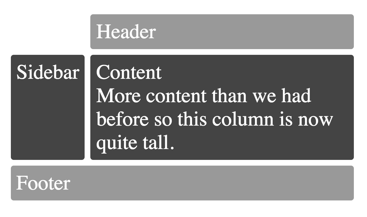
哦,只是为了好玩,所有这些围绕着CSS Grid的兴奋让你垂涎三尺? 它被glamorous微不足道地支持。
// Example inspired by
// [http://gridbyexample.com/examples/example12/](http://gridbyexample.com/examples/example12)
const MyGrid = glamorous.div({
  margin: 'auto',
  backgroundColor: '#fff',
  color: '#444',
  // You can use [@supports](http://twitter.com/supports "Twitter profile for @supports") with glamor!
  // So you can use [@supports](http://twitter.com/supports "Twitter profile for @supports") with glamorous as well!
  '[@supports](http://twitter.com/supports "Twitter profile for @supports") (display: grid)':
    {
      display: 'grid',
      gridGap: 10,
      gridTemplateAreas: `
      "....... header header"
      "sidebar content content"
      "footer  footer  footer"
    `,
    },
})

const Box = glamorous.div({
  backgroundColor: '#444',
  color: '#fff',
  borderRadius: 5,
  padding: 10,
  fontSize: '150%',
})

const HeaderFooter = glamorous(Box)({
  backgroundColor: '#999',
})

function App() {
  return (
    <MyGrid>
      <HeaderFooter css={{gridArea: 'header'}}>Header</HeaderFooter>
      <Box css={{gridArea: 'sidebar'}}>Sidebar</Box>
      <Box css={{gridArea: 'content'}}>
        Content
        <br />
        More content than we had before so this column is now quite tall.
      </Box>
      <HeaderFooter css={{gridArea: 'footer'}}>Footer</HeaderFooter>
    </MyGrid>
  )
}
你会得到。