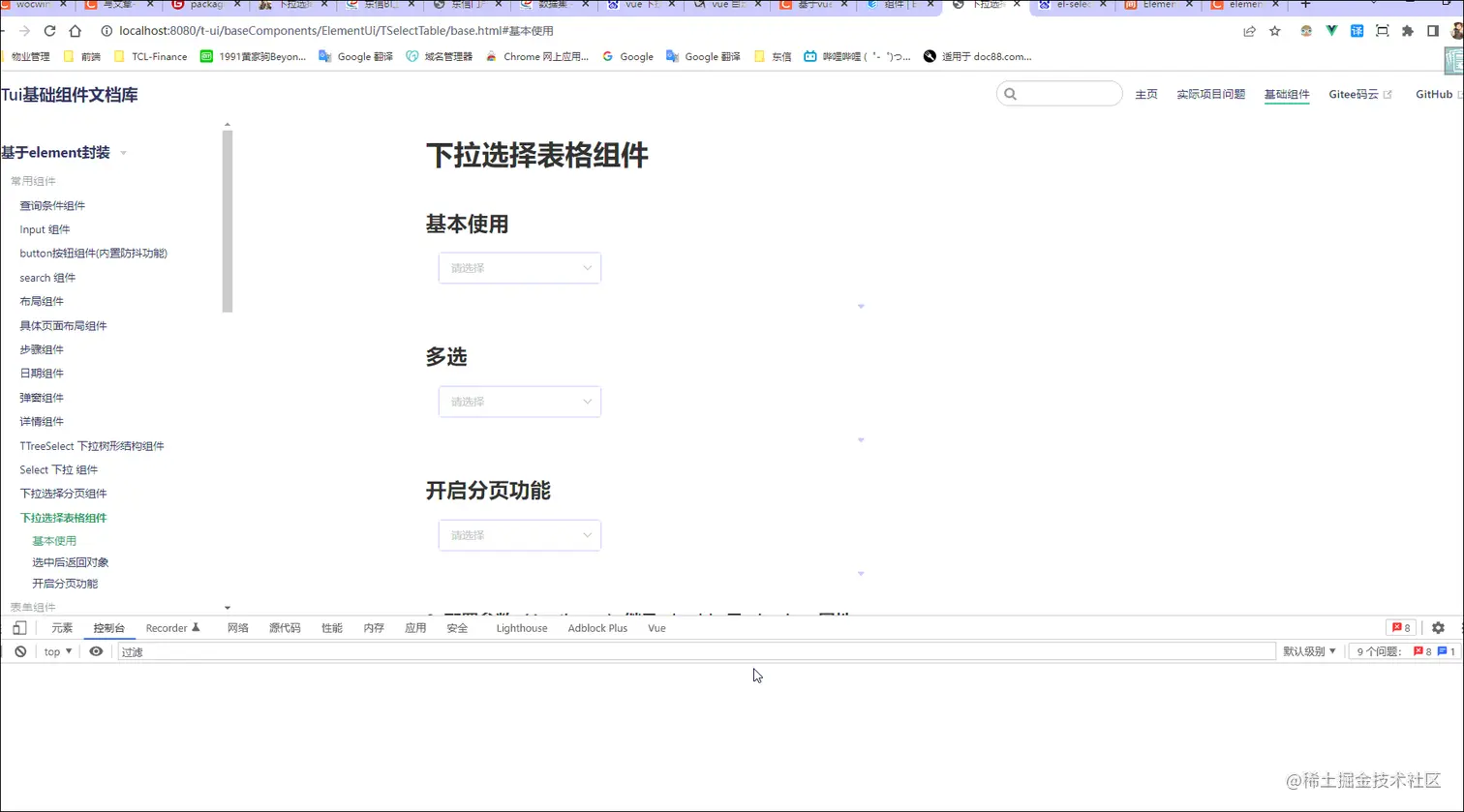
一、最终效果
二、代码示例
<t-select-table
    :table="table"
    :columns="table.columns"
    :max-height="400"
    :keywords="{label:'name',value:'id'}"
    @radioChange="radioChange"
  ></t-select-table>
三、参数配置
1. 配置参数(Attributes)
| 参数 | 说明 | 类型 | 默认值 |
|---|
| v-model | 绑定值 | boolean / string / number | 仅显示 |
| table | 表格数据对象 | Object | {} |
| ---data | 展示下拉数据源 | Array | [] |
| ---total | 数据总条数 | Number | - |
| ---pageSize | 每页显示条目个数 | Number | - |
| ---currentPage | 当前页数 | Number | - |
| columns | 表头信息 | Array | [] |
| ----bind | el-table-column Attributes | Object | - |
| ----noShowTip | 是否换行 (设置:noShowTip:true) | Boolean | false |
| ----fixed | 列是否固定( left, right) | string, boolean | - |
| ----align | 对齐方式(left/center/right) | String | center |
| ----render | 返回三个参数(text:当前值,row:当前整条数据 ,index:当前行) | function | - |
| ----slotName | 插槽显示此列数据(其值是具名作用域插槽) | String | - |
| ------scope | 具名插槽获取此行数据必须用解构接收{scope} | Object | 当前行数据 |
| keywords | 关键字配置(value-key 配置) | Object | 无 |
| ------label | 选项的标签 | String | ‘label’ |
| ------value | 选项的值 | String | ‘value’ |
| radioTxt | 单选文案 | String | 单选 |
| multiple | 是否开启多选 | Boolean | false |
| isShowPagination | 开启分页 | Boolean | false |
| tableWidth | table 宽度 | Number | 550 |
2. 事件(events)
| 事件名 | 说明 | 回调参数 |
|---|
| page-change | 页码改变事件 | 返回选中的页码 |
| selectionChange | 多选事件 | 返回选中的项数据及选中项的 keywords.value 集合 |
| radioChange | 单选 | 返回当前项所有数据 |
3.方法(Methods)
| 方法名 | 说明 | 回调参数 |
|---|
| focus | 使 input 获取焦点 | |
| blur | 使 input 失去焦点,并隐藏下拉框 | |
<template>
<el-select
ref="select"
v-model="defaultValue"
popper-class="t-select-table"
:multiple="multiple"
v-bind="selectAttr"
v-on="$listeners"
:value-key="keywords.value"
@visible-change="visibleChange"
@remove-tag="removeTag"
@clear="clear"
>
<template #empty>
<div class="t-table-select__table" :style="{ width: `${tableWidth}px` }">
<el-table
ref="el-table"
:data="tableData"
class="radioStyle"
border
@row-click="rowClick"
@cell-dblclick="cellDblclick"
@selection-change="selectionChange"
v-bind="$attrs"
v-on="$listeners"
>
<el-table-column v-if="multiple" type="selection" width="45" fixed></el-table-column>
<el-table-column type="radio" width="50" :label="radioTxt" fixed v-else>
<template slot-scope="scope">
<el-radio
v-model="radioVal"
:label="scope.$index+1"
@click.native.prevent="radioChange(scope.row,scope.$index+1)"
></el-radio>
</template>
</el-table-column>
<template v-for="(item,index) in columns">
<el-table-column
:key="index+'i'"
:type="item.type"
:label="item.label"
:prop="item.prop"
:min-width="item['min-width'] || item.minWidth || item.width"
:align="item.align || 'center'"
:fixed="item.fixed"
:show-overflow-tooltip="item.noShowTip"
v-bind="{...item.bind,...$attrs}"
v-on="$listeners"
>
<template slot-scope="scope">
<template v-if="item.render">
<render-col
:column="item"
:row="scope.row"
:render="item.render"
:index="scope.$index"
/>
</template>
<template v-if="item.slotName">
<slot :name="item.slotName" :scope="scope"></slot>
</template>
<div v-if="!item.render&&!item.slotName">
<span>{{scope.row[item.prop]}}</span>
</div>
</template>
</el-table-column>
</template>
<slot></slot>
</el-table>
<div class="t-table-select__page">
<el-pagination
v-show="(tableData && tableData.length) && isShowPagination"
:current-page="table.currentPage"
@current-change="handlesCurrentChange"
:page-sizes="[10, 20, 50, 100]"
:pager-count="5"
:page-size="table.pageSize"
layout="total, prev, pager, next, jumper"
:total="table.total"
v-bind="$attrs"
v-on="$listeners"
background
></el-pagination>
</div>
</div>
</template>
</el-select>
</template>
五、组件地址
gitHub组件地址
gitee码云组件地址
六、相关文章
基于ElementUi再次封装基础组件文档
vue+element-ui的table组件二次封装


