

这次准备分享一个下拉菜单组件,下拉菜单组件现在更多是电商类的搜索商品使用的更多一些,我记得掘金app搜索页也使用到了这个效果,主要分享一下组件编写思路以及前期踩坑。这整个组件实际是由两个组件组成的,其中一个是抽屉组件。另外一个就是今天主角下拉菜单组件,我们废话不多说,直接上效果以及和看看掘金app效果。
本人实现效果
掘金app效果
当我们要去编写一个组件的时候,我们最好去看看别的组件库官网关于这个组件库的props以及暴露的事件,以及学习props和暴露事件的命名,比如组件库有许多,我这里还是以vant组件库为例,基本将大致的功能进行实现。
踩坑全步骤
编写组件布局方面一定要考虑全面,本人一开始将所有内容放在子组件里面,结果去点击title去打开相应弹窗的打开的都是最后一个弹窗,就比如我点击全部商品显示的是好评排序内容弹窗。后面更换布局将title显示父组件里面也就是我们vuxDropDownMenu组件。在该组件使用this.$children去获取title,主要代码如下 然后给它绑定点击事件,点击的时候去获取相应索引,根据索引打开对应弹窗,以及关闭之前打开的弹窗,只保留当前一个弹窗。
点击title打开弹窗,给弹窗内容绑定相应点击事件,点击我们选择好的内容之后我们就要去更新我们的titleList也就是要更新我们的randerTitle()方法。
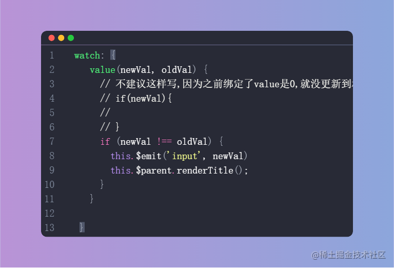
选择内容之后我们要做两件事,关闭当前弹窗,然后抛出事件,以及去监听value,只要value改变了我就去执行randerTitle()方法即可。
里面使用到部分iocn,本人这里因为当前环境没下载iconfont图标,只是用文字进行简单代替,如果其他掘友想使用本组件直接替换相应icon即可,然后该组件还有许多功能可以进行添加,比如弹窗内容一行多列,比如加入底部按钮插槽等,以及该组件代码有许多优化的点还可以进行优化。大家使用之后或者看完相应代码之后有觉得不好的地方请踊跃指出!
我们再次废话不多说,直接上源码
vuxDropDownMenu组件代码
<template>
<div ref="Rect" class="vux-down-menu">
<div v-for="(item,key) in titleList" :key="key" class="vux-drop-down-menu title"
@click="handleClickTitle(key)">
<span :class="[disableStyle(item,key)]" :style="{color:activeColorStyle(item,key)?activeColor:''}"
style="font-weight: 500">{{ item.text }}</span>
<span :class="[disableStyle(item,key),activeColorStyle(item,key)?'down':'up']"
:style="{color:activeColorStyle(item,key)?activeColor:'' }" class="icon">^</span>
</div>
<slot></slot>
</div>
</template>
<script>
import {useRect} from "../uitls";
export default {
name: "vuxDropDownMenu",
data() {
return {
titleList: [],
offset: 0
}
},
// 参数 说明 类型 默认值
// active-color 菜单标题和选项的选中态颜色 string #ee0a24
// direction 菜单展开方向,可选值为up string down
props: {
activeColor: {
type: String,
default: '#0068FF'
},
direction: {
type: String,
default: 'down',
validate(val) {
return ['up', 'down'].includes(val)
}
},
closeOnClickOverlay: {
type: Boolean, default: true
}
},
activated() {
this.updateOffset()
this.renderTitle()
},
mounted() {
const _this = this;
this.updateOffset()
this.renderTitle()
window.addEventListener("resize", this.updateOffset);
window.addEventListener("click", function (evt) {
const rect = _this.$refs.Rect;
if (!rect.contains(evt.target)) {
_this.$children.forEach(item => {
item.toggle(false)
})
}
});
},
methods: {
activeColorStyle(item, index) {
//打开之后title高亮
if (this.$children[index].isOpen) {
return item.value == this.$children[index].value;
}
},
disableStyle(item, index) {
if (this.$children[index].disabled) {
return 'disabled'
}
},
//获取每个value的值显示的title
renderTitle() {
const value = this.$children.map(item => item.value)
const data = this.$children.map(item => item.options)
this.titleList = data.map((it, i) => {
return it.find(item => item.value == value[i]);
});
},
updateOffset() {
//获取边距
const rect = useRect(this.$refs.Rect);
const {top, bottom} = rect;
if (this.direction === 'down') {
this.offset = bottom;
} else {
this.offset = window.innerHeight - top;
}
},
handleClickTitle(active) {
if (this.$children[active].disabled) {
return
}
this.$children.forEach((item, index) => {
if (active === index) {
this.updateOffset()
//调用当前实例方法
item.toggle()
//其他都关闭
} else if (item.isOpen) {
item.toggle(false)
}
})
}
}
}
</script>
<style lang="less" scoped>
.vux-down-menu {
display: flex;
align-items: center;
justify-content: space-around;
width: 100%;
flex: 1;
box-shadow: 0 2px 12px rgba(100, 101, 102, .12);
}
.disabled {
opacity: 0.6 !important;
cursor: not-allowed !important;
}
.icon {
&.up {
transition: all 0.25s linear;
transform: rotate(180deg);
}
&.down {
transition: all 0.25s linear;
}
}
.vux-drop-down-menu {
&.title {
background-color: #ffffff;
width: 100%;
display: flex;
align-items: center;
justify-content: center;
text-align: center;
height: 40px;
line-height: 40px;
font-size: 14px;
color: #333;
font-weight: 500;
min-width: 0;
z-index: 9999;
}
}
</style>
useRect.js
const isWindow = (val) => {
    return val === window;
}
const makeDOMRect = (width, height) =>

    ({
        top: 0, left: 0, right: width, bottom: height, width, height,
    });


export const useRect = (element) => {

    if (isWindow(element)) {
        const width = element.innerWidth;
        const height = element.innerHeight;
        return makeDOMRect(width, height);
    }

    if (element.getBoundingClientRect) {
        return element.getBoundingClientRect();
    }
    return makeDOMRect(0, 0);
};
vuxDropDownMenuItem组件代码
<template>
  <div v-if="showWarp" :style="[offsetStyle,heightStyle]" style="position: absolute;width: 100%;transition: height 10s">
    <vux-drawer v-model="isOpen" :close-on-click-overlay="closeOnClickOverlay" :placement="directionStyle"
                style="position: absolute;overflow-y: auto;"
                @click.native="clickCloseMark">
      <div v-for="(item,key) in options" :key="key" class="vux-down-menu-item" @click="handleClickItem(item)">
        <div style="display: flex;justify-content: space-between;">
          <div :style="{color:activeColorStyle(item)?activeColor:''}">{{ item.text }}</div>
          <div v-if="activeColorStyle(item)">
            <span :style="{color:activeColorStyle(item)?activeColor:''}">√</span></div>
        </div>
      </div>
      <slot></slot>
    </vux-drawer>

  </div>

</template>

<script>

export default {
  name: "vuxDropDownMenuItem",

  data() {
    return {
      isOpen: false,
      showWarp: false,
      offset: 0,
      activeColor: this.$parent.activeColor,
      direction: this.$parent.direction,
      height: 0,
      closeOnClickOverlay: this.$parent.closeOnClickOverlay,

    }
  },
  model: {
    prop: 'value',
  },
  props: {

//       参数  说明 类型 默认值
//       v-model 当前选中项对应的 value number | string  -
//     title 菜单项标题  string 当前选中项文字
//   options 选项数组 Option[] []
//   disabled  是否禁用菜单 boolean  false
    value: {type: [String, Number, Array, Boolean]},
    disabled: {
      type: Boolean,


    },
    title: {
      type: [Number, String]
    },
    options: {
      type: Array,
      default: () => []
    }


  },
  computed: {
    directionStyle() {
      return this.direction === 'down' ? 'top' : 'bottom';
    },
    offsetStyle() {
      if (this.direction === 'down') {
        return {
          top: this.$parent.offset + 'px',
        }
      } else {
        return {
          bottom: this.$parent.offset + 'px',
        }
      }

    },
    heightStyle() {
      if (this.direction === 'down') {
        return {
          height: this.height - this.$parent.offset + 'px',
        }
      } else {
        return {
          height: this.height + 'px',
        }
      }
    }
  },

  watch: {
    value(newVal, oldVal) {
      if (newVal !== oldVal) {
        this.$emit('input', newVal)
        this.$parent.renderTitle();
      }
    }

  },
  activated() {
    this.init()
  },
  mounted() {
    this.init()
  },
  methods: {
    init() {
      this.height = window.innerHeight;
    },
    handleClickItem(option) {
      if (this.disabled) {
        return
      }
      this.isOpen = false;
      this.showWarp = false;
      this.$emit('input', option.value);
      this.$emit('change', option);
    },
    toggle(show = !this.isOpen) {
      if (show === this.isOpen) {
        return;
      }
      this.isOpen = show;
      this.showWarp = show;

    },
    clickCloseMark() {
      // if (!this.closeOnClickOverlay) {
      //   return
      // }

      this.$children.forEach(item => {
        item.isOpen = false;
        item.showWarp = false;
      })
    },
    activeColorStyle(item) {
      return item == this.options.find(item => item.value === this.value);
    },


  }
}
</script>

<style lang="less" scoped>


.vux-down-menu-item {
  height: 40px;
  line-height: 40px;
  text-align: left;
  box-sizing: border-box;
  padding: 0 20px;
  border-bottom: 1px solid #eee;
}


</style>
vuxDrawer(抽屉、弹层)组件代码
<template>
  <div :class="caleClass" @click="closeMaskHandle">
    <div :class="[round?'round':'',curOpen?'prevent-touch-move':'']" :style="{height:heightByStyle,width:widthStyle}"
         class="drawer-content">
        <span v-if="closable" class="close-icon"
              @click="handleClose"
        ><i class="iconfont icon-close"></i></span>
      <slot>
      </slot>
    </div>
  </div>
</template>

<script>
export default {
  name: "VuxDrawer",
  data() {
    return {
      curOpen: this.open,
    };
  },
  model: {
    prop: 'open',
    event: 'input'
  },
  props: {

    round: {
      type: Boolean,
      default: false,
    },
    closable: {
      type: Boolean,
    },
    height: {
      type: [String, Number],

    },
    width: {
      type: [String, Number],
    },
    open: {
      type: Boolean,
      default: false,
    },
    placement: {
      type: String,
      default: 'bottom',
      validator(val) {
        return ['bottom', 'left', 'right', 'top'].includes(val);
      },
    },
    //是否显示
    showMark: {
      type: Boolean,
      default: true
    },
    closeOnClickOverlay: {
      type: Boolean,
      default: true
    }
  },
  computed: {

    caleClass() {
      return [
        this.showMark ? 'drawer-mask' : '',
        this.placement,
        {
          'is-open': this.curOpen,
          'is-close': !this.curOpen
        }
      ]
    },

    heightByStyle() {
      if (['top', 'bottom'].includes(this.placement)) {
        if (parseInt(this.height) <= 100) {
          return this.height + '%'
        } else {
          return 'auto'
        }
      }

    },
    widthStyle() {
      if (['left', 'right'].includes(this.placement)) {
        if (parseInt(this.width) <= 100) {
          return this.width + '%'
        } else {
          return 'auto'
        }
      }

    },
  },

  watch: {
    open(val) {
      this.curOpen = val;
    },
    curOpen(val) {
      this.$emit('input', val)
    }
  },

  methods: {
    handleClose() {

      //事件点击无效又可能是层级导致的
      this.curOpen = false;
    },

    closeMaskHandle(e) {
      if (e.target !== this.$el) {
        return;
      }
      if (!this.closeOnClickOverlay) {
        return;
      }
      this.handleClose();
    },


  },


};
</script>
<style lang="scss" scoped>
* {
  margin: 0;
  padding: 0;
  box-sizing: border-box;
}

/* 防止出现滚动 穿透*/
//.prevent-touch-move {
//  position: fixed;
//  overflow: hidden;
//  width: 100%;
//  height: 100%;
//  top: 0;
//  left: 0;
//}

.drawer-mask {
  //overflow: hidden;
  z-index: 9998 !important;
  position: fixed;
  top: 0;
  left: 0;
  right: 0;
  bottom: 0;
  background-color: rgba(0, 0, 0, 0.5);
  transition: opacity 300ms, height 2ms;


  .drawer-content {
    position: absolute;
    height: 80%;
    background-color: #fff;
    transition: transform 300ms;


    .close-icon {
      z-index: 9999;
      margin-top: 6px;
      font-size: 16px;
      position: absolute;
      right: 20px;
    }
  }

  &.is-open {
    opacity: 1;
    height: 100%;
  }

  &.is-close {
    opacity: 0;
    height: 0;
    transition-delay: 300ms;
  }

  &.bottom {
    .drawer-content {
      top: auto;
      left: 0;
      right: 0;
      bottom: 0;


      &.round {
        border-top-left-radius: 10px;
        border-top-right-radius: 10px;
      }

    }

    &.is-open {


      .drawer-content {
        transform: translateY(0);
      }
    }

    &.is-close {


      .drawer-content {
        transform: translateY(100%);
      }
    }
  }

  &.top {
    z-index: -1;

    .drawer-content {
      top: 0;
      left: 0;
      right: 0;
      bottom: auto;

      &.round {
        border-bottom-left-radius: 10px;
        border-bottom-right-radius: 10px;
      }

    }

    &.is-open {

      .drawer-content {
        transform: translateY(0);
      }
    }

    &.is-close {
      .drawer-content {
        transform: translateY(-100%);
      }
    }
  }

  &.left {
    .drawer-content {
      height: 100% !important;
      width: 80%;
      top: 0;
      left: 0;
      right: auto;
      bottom: 0;

      &.round {
        border-top-right-radius: 10px;
        border-bottom-right-radius: 10px;
      }

    }

    &.is-open {

      .drawer-content {
        transform: translateX(0);
      }
    }

    &.is-close {

      .drawer-content {
        transform: translateX(-100%);
      }
    }
  }

  &.right {
    .drawer-content {
      height: 100% !important;
      width: 80%;
      top: 0;
      left: auto;
      right: 0;
      bottom: 0;

      &.round {
        border-top-left-radius: 10px;
        border-bottom-left-radius: 10px;
      }


    }

    &.is-open {

      .drawer-content {
        transform: translateX(0);
      }
    }

    &.is-close {
      .drawer-content {
        transform: translateX(100%);
      }
    }
  }
}
</style>
