css3中有哪些新特性?
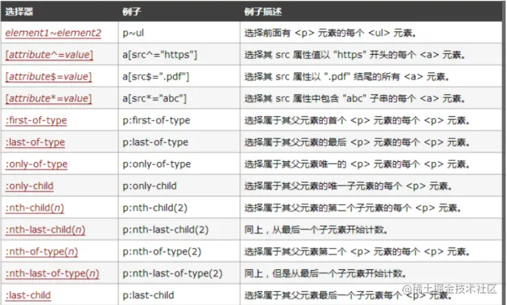
- 选择器
- 新样式
- border-radius:创建圆角边框
- box-shadow:为元素添加阴影
- border-image:使用图片来绘制边框
- 背景
- background-clip
-   background-clip: border-box; 背景从border
开始显示
-   background-clip: padding-box; 背景从
padding开始显示
-   background-clip: content-box; 背景显
content区域开始显示
-   background-clip: no-clip; 默认属性,等同于
border-box
- background-origin
-   background-origin: border-box; 从border开
始计算background-position
-   background-origin: padding-box; 从padding
开始计算background-position
-   background-origin: content-box; 从content
开始计算background-position
- background-size
-   background-size: contain; 缩小图片以适合元
素(维持像素长宽比)
-   background-size: cover; 扩展元素以填补元素
(维持像素长宽比)
-   background-size: 100px 100px; 缩小图片至指
定的大小
-   background-size: 50% 100%; 缩小图片至指定的
大小,百分比是相对包 含元素的尺寸
- background-break
-   background-break: continuous; 默认值。忽略
盒之间的距离(也就是像元素没有分成多个盒子,依然是
一个整体一样)
-   background-break: bounding-box; 把盒之间的
距离计算在内;
-   background-break: each-box; 为每个盒子单独
重绘背景
- 文字
- word-wrap
  -   normal:使用浏览器默认的换行
  -   break-all:允许在单词内换行
- text-overflow
-   clip:修剪文本
-   ellipsis:显示省略符号来代表被修剪的文本
- text-shadow
`text-shadow`可向文本应用阴影。能够规定水平阴影、
垂直阴影、模糊距离,以及阴影的颜色
- text-decoration
-   text-fill-color: 设置文字内部填充颜色
-   text-stroke-color: 设置文字边界填充颜色
-   text-stroke-width: 设置文字边界宽度
- 颜色
   -   rgba分为两部分,rgb为颜色值,a为透明度
   -   hala分为四部分,h为色相,s为饱和度,l为亮
   度,a为透明度
- transition过渡
transition: CSS属性,花费时间,效果曲线(默认
ease),延迟时间(默认0)
- transform
-   transform: translate(120px, 50%):位移
-   transform: scale(2, 0.5):缩放
-   transform: rotate(0.5turn):旋转
-   transform: skew(30deg, 20deg):倾斜
- animation动画
-   animation-name:动画名称
-   animation-duration:动画持续时间
-   animation-timing-function:动画时间函数
-   animation-delay:动画延迟时间
-   animation-iteration-count:动画执行次数,可
以设置为一个整数,也可以设置为infinite,意思是无
限循环
-   animation-direction:动画执行方向
-   animation-paly-state:动画播放状态
-   animation-fill-mode:动画填充模式
- 渐变
-  linear-gradient:线性渐变
-  radial-gradient:径向渐变


