

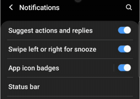
我们都很熟悉家庭开关,用于打开和关闭照明系统和其他电器设备。我们也熟悉切换按钮;如果你家里有电炊具或电磁炉,你可以在其电压和烹饪功能之间进行切换。
同样,我们的移动应用也有开关和拨动按钮来打开/关闭Wi-Fi、蓝牙等。
今天,我们要深刻地潜心了解Flutter开关和切换器的参数和属性。
什么是开关小部件?
开关按钮是一个只有两种状态的 Flutter 部件,即真/假或开/关。通常情况下,开关是一个带有拇指滑块的按钮,用户可以将其从左到右拖动,反之亦然,以在不同的状态之间切换。它不会自行维持其状态。你必须调用onChanged 属性来保持按钮的开启或关闭:
什么是Toggle widget?
同样地,一个切换部件只有两种状态:真/假或开/关。但是,一个切换部件创建了多个排成行的按钮,允许用户在它们之间进行切换:
开关和切换之间的关键区别
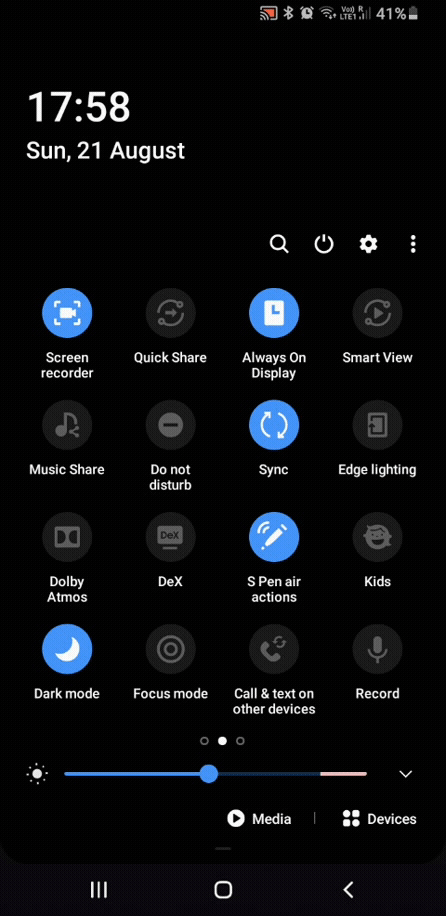
这是一个移动应用中的使用案例问题。在大多数情况下,这些小部件是在设置页面使用的。如果你拖下你的移动应用程序的通知面板,你会看到一个切换按钮的网格。但当你进入设置页面时,这些按钮就变成了开关。
你一定明白其中的区别。在你的移动应用程序中,如果你有一个只需要两种状态的控件列表,你应该使用开关。而如果你在一排或一个网格中有多个控件,你应该使用切换器。
开关小部件示例
Flutter提供了三种类型的开关小部件:
- 开关 (Android)
- CupertinoSwitch (iOS)
Switch.adaptive(它根据平台的不同进行调整)
让我们看看用于定制小部件的最常用属性。
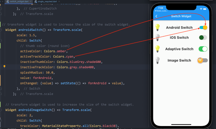
Switch (Android)
Switch(
  // thumb color (round icon)
  activeColor: Colors.amber,
  activeTrackColor: Colors.cyan,
  inactiveThumbColor: Colors.blueGrey.shade600,
  inactiveTrackColor: Colors.grey.shade400,
  splashRadius: 50.0,
  // boolean variable value
  value: forAndroid,
  // changes the state of the switch
  onChanged: (value) => setState(() => forAndroid = value),
),
CupertinoSwitch (iOS)
CupertinoSwitch(
  // overrides the default green color of the track
  activeColor: Colors.pink.shade200,
  // color of the round icon, which moves from right to left
  thumbColor: Colors.green.shade900,
  // when the switch is off
  trackColor: Colors.black12,
  // boolean variable value
  value: forIos,
  // changes the state of the switch
  onChanged: (value) => setState(() => forIos = value),
),
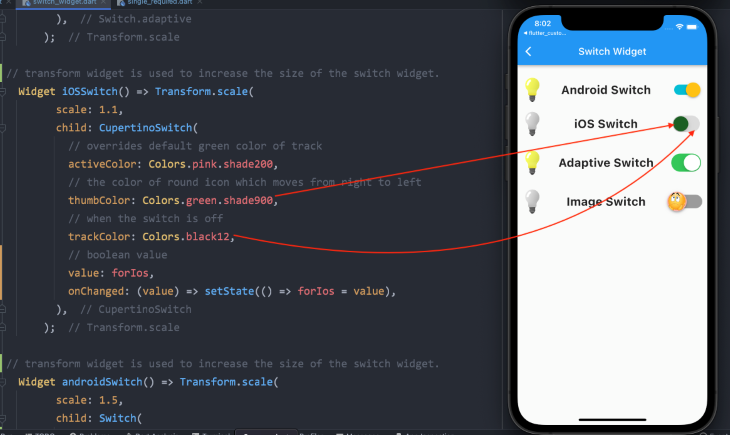
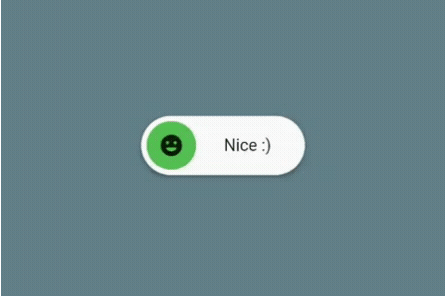
自适应开关小部件没有任何独特或不同的属性。但是,如果你想要一个图像或图标而不是通常的拇指颜色,AndroidSwitch 小组件可以进一步定制。你需要用一个资产图像来定义拇指图像属性。请看下面的代码。
安卓Switch 与图像
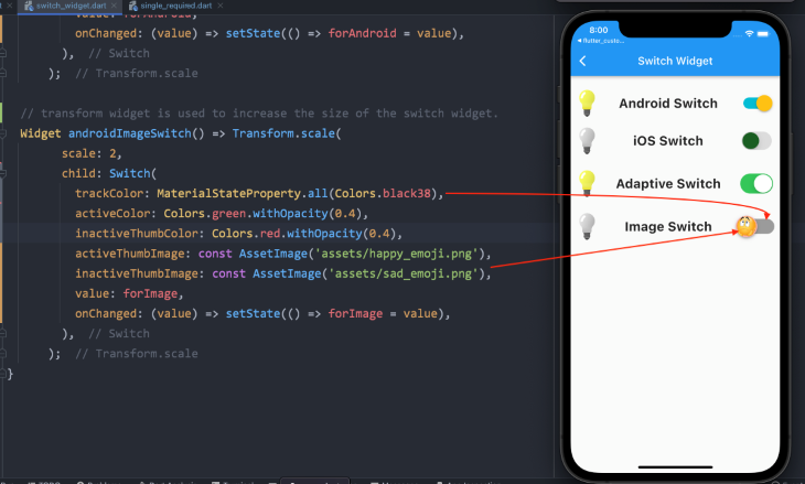
Switch(
  trackColor: MaterialStateProperty.all(Colors.black38),
  activeColor: Colors.green.withOpacity(0.4),
  inactiveThumbColor: Colors.red.withOpacity(0.4),
// when the switch is on, this image will be displayed
  activeThumbImage: const AssetImage('assets/happy_emoji.png'),
// when the switch is off, this image will be displayed
  inactiveThumbImage: const AssetImage('assets/sad_emoji.png'),
  value: forImage,
  onChanged: (value) => setState(() => forImage = value),
),
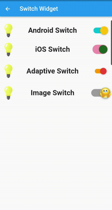
这就是代码的运行情况:
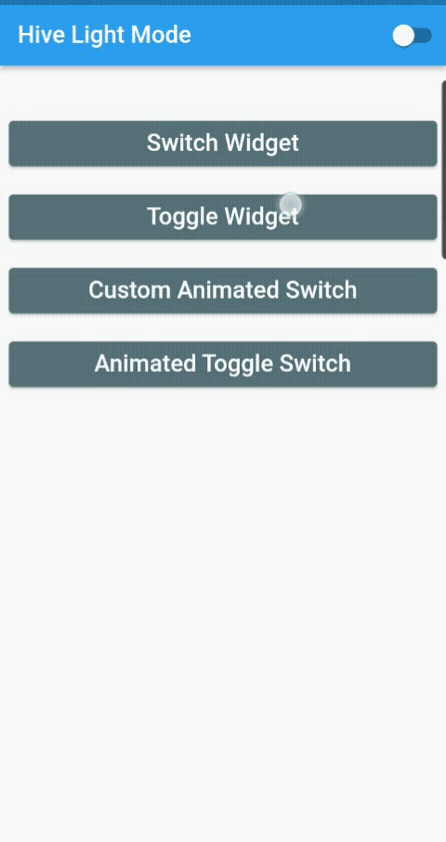
目前,我们没有保存开关小部件的状态;我们只是改变它。接下来是创建一个小的应用程序,我们将把主题从浅色变为深色,反之亦然,当你关闭该应用程序时,其状态将被保存。
这是一个简单的单页应用程序,在appBar ,它将改变主题的开关按钮。
我使用了Flutter Hive来保存应用程序的状态。你可以使用SharedPreferences ,但我选择了Hive,因为它是一个用于Flutter和Dart应用程序的快速、轻量级、NoSQL数据库。如果你需要一个没有众多关系的直接的键值数据库,Hive是有帮助的。它利用起来毫不费力,是一个离线数据库(在本地存储数据)。
让我们先看一下代码...
我们正在使用ValueListenableBuilder 来更新用户界面。每当它监听的值发生变化时,它就会建立特定的小部件。它的值与监听者保持同步;也就是说,每当值发生变化时,ValueListenable 监听它并更新UI,而不使用setState() 或任何其他状态管理技术:
const themeBox = 'hiveThemeBox';
void main() async {
 await Hive.initFlutter();
 await Hive.openBox(themeBox);
 runApp(const MyApp());
}

class MyApp extends StatelessWidget {
 const MyApp({Key? key}) : super(key: key);

 @override
 Widget build(BuildContext context) {
   //to update the UI without using setState()
   return ValueListenableBuilder(
     valueListenable: Hive.box(themeBox).listenable(),
     builder: (context, box, widget) {
       //saving the value inside the hive box,
       var darkMode = Hive.box(themeBox).get('darkMode', defaultValue: false);
       return MaterialApp(
           debugShowCheckedModeBanner: false,
           //switching between light and dark theme,
           themeMode: darkMode ? ThemeMode.dark : ThemeMode.light,
           title: 'Flutter Demo',
           darkTheme: ThemeData.dark(),
           home: HomePage(
             value: darkMode,
           ));
     },
   );
 }
}

class HomePage extends StatelessWidget {
 final bool value;
 const HomePage({Key? key, required this.value}) : super(key: key);

 @override
 Widget build(BuildContext context) {
   return Scaffold(
     appBar: AppBar(
       title: Text(value ? 'Hive Dark Mode' : 'Hive Light Mode'),
       actions: [
         Switch(
           value: value,
           onChanged: (val) {
             Hive.box(themeBox).put('darkMode', !value);
           },
         ),
       ],
     ),
     body: Padding(
       padding: const EdgeInsets.all(8.0),
       child: Column(
         crossAxisAlignment: CrossAxisAlignment.stretch,
         children: [ ],
       ),
     ),
   );
 }
}
切换小部件的例子
这里我们将看看在我们的应用程序中实现切换部件的四种不同方式:
- 单一的和必需的。用户必须在两个选项中至少选择一个。
- 单一且非必需。用户不需要选择任何选项
- 多个且必须的。用户必须在给定的选项中至少选择一个,但也可以选择多个选项
- 多重且非必需:用户可以根据需要选择或不选择。用户可以根据要求选择或取消选择,但也可以选择多个选项
首先,让我们看一下切换小部件的标准属性,以便对其进行定制,然后我们将通过每个小部件的代码,以及它的插图:
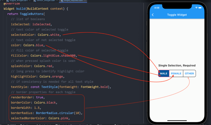
ToggleButtons(
  // list of booleans
  isSelected: isSelected,
  // text color of selected toggle
  selectedColor: Colors.white,
  // text color of not selected toggle
  color: Colors.blue,
  // fill color of selected toggle
  fillColor: Colors.lightBlue.shade900,
  // when pressed, splash color is seen
  splashColor: Colors.red,
  // long press to identify highlight color
  highlightColor: Colors.orange,
  // if consistency is needed for all text style
  textStyle: const TextStyle(fontWeight: FontWeight.bold),
  // border properties for each toggle
  renderBorder: true,
  borderColor: Colors.black,
  borderWidth: 1.5,
  borderRadius: BorderRadius.circular(10),
  selectedBorderColor: Colors.pink,
// add widgets for which the users need to toggle
   children: [ ],
// to select or deselect when pressed
  onPressed: (int newIndex) { }
);
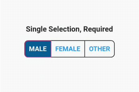
单一和必要的切换开关
首先,我们必须初始化一个布尔变量的列表:
// one must always be true, means selected.
List<bool> isSelected = [true, false, false];
由于我们强制系统至少有一个选项总是被选中,我们已经初始化了一个值为true 。
我们已经讨论了自定义切换小部件的其他属性。现在我们将子部件添加到它的children 属性中。
注意,你必须添加与布尔值列表相同数量的子部件。否则,它将抛出一个错误。
// add widgets for which the users need to toggle
children: const [
  Padding(
    padding: EdgeInsets.symmetric(horizontal: 12),
    child: Text('MALE', style: TextStyle(fontSize: 18)),
  ),
  Padding(
    padding: EdgeInsets.symmetric(horizontal: 12),
    child: Text('FEMALE', style: TextStyle(fontSize: 18)),
  ),
  Padding(
    padding: EdgeInsets.symmetric(horizontal: 12),
    child: Text('OTHER', style: TextStyle(fontSize: 18)),
  ),
],
接下来,我们必须在setState() 函数中为切换窗口部件的onPressed() 属性添加逻辑:
-
使用
for循环,我们将浏览布尔值的列表 -
使用
if语句,我们将检查index值,并始终将其设置为true。其他按钮将被设置为falseonPressed: (int newIndex) { setState(() { // looping through the list of booleans values for (int index = 0; index < isSelected.length; index++) { // checking for the index value if (index == newIndex) { // one button is always set to true isSelected[index] = true; } else { // other two will be set to false and not selected isSelected[index] = false; } } }); },
这就是我们最终产品的样子:
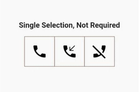
单一的和不需要的拨动开关
我们只需要做两个改动就可以了。用户可以在三个选项中只选择一个,但不需要选择它。
布尔变量列表里面的值都被初始化为false:
// all values are false
List<bool> isSelected = [false, false, false];
在onPressed() 函数中的if 语句里面,我们只在按钮之间切换,将其设置为true:
onPressed: (int newIndex) {
  setState(() {
    // looping through the list of booleans values
    for (int index = 0; index < isSelected.length; index++) {
      if (index == newIndex) {
        // toggling between the button to set it to true
        isSelected[index] = !isSelected[index];
      } else {
        // other two buttons will not be selected and are set to false
        isSelected[index] = false;
      }
    }
  });
},
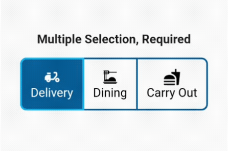
需要进行的多项选择
如前所述,用户可以选择多个选项,但系统会保持至少一个选项始终被选中。
是的,你猜对了,布尔列表中的一个值将是true 。
List<bool> isSelected = [true, false, false];
在onPressed 函数里面,事情变得有点有趣。
首先,我们添加一个变量来循环浏览布尔运算列表并确保其值为真;因此,至少有一个按钮总是被选中:
final isOneSelected = isSelected.where((element) => element).length == 1;
如果只有一个按钮被选中,用户就不能把它切换到false ,直到另一个选项被选中:
if (isOneSelected && isSelected[newIndex]) return;
接下来,在setState() 函数里面,我们再次循环浏览我们的列表,检查新的索引值,并在新旧索引之间进行切换:
setState(() {
  // looping through the list of booleans
  for (int index = 0; index < isSelected.length; index++) {
    // checking for the index value
    if (index == newIndex) {
      // toggle between the old index and new index value
      isSelected[index] = !isSelected[index];
    }
  }
});
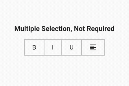
不需要的多个选择
这是很直接的。我做了一排你通常在任何文本编辑器中看到的文本编辑选项,以格式化书写的文本。有四个选项,所以我们的列表里面有四个值,而且都被设置为false:
List<bool> isSelected = [false, false, false, false];
在我们的onPressed() 函数中,我们只需在true 和false 值之间进行切换:
onPressed: (int index) {
  setState(() {
    // simply toggling buttons between true and false state
    isSelected[index] = !isSelected[index];
  });
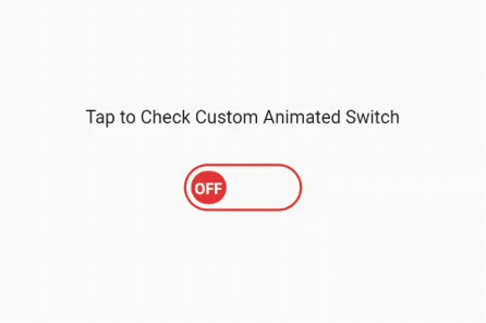
我们已经完成了对开关和切换小部件的解释,以及如何以通常的方式使用它。现在,让我们通过创建一个自定义的动画开关按钮来进行复杂的编程,在实现下一个代码集后,它将看起来像下面的图片。
创建一个自定义的动画开关按钮
我们把这个按钮分成两部分。第一部分是一个无状态的小部件,我将其命名为CustomAnimatedSwitch 。在这个无状态部件中,我们将创建自定义开关。稍后,我们将把它添加到有状态的部件中,以使用setState() 功能来打开和关闭。
第1步:添加依赖性
simple_animations: ^5.0.0+2
第2步:定义变量
首先,我们将使用一个枚举和一个布尔值来定义我们命名的常量变量:
enum _CustomSwitchParams { paddingLeft, color, text, rotation }

final bool toggle;
其次,由于我们使用的是带有级联符号(双点运算符)的简单动画包,我们在我们创建的MovieTween 对象上调用函数来访问其属性。基本上,我们正在为我们先前添加的枚举添加动画:
var customTween = MovieTween()
  ..scene(duration: const Duration(seconds: 1))
      .tween(_CustomSwitchParams.paddingLeft, 0.0.tweenTo(60.0))
  ..scene(duration: const Duration(seconds: 1))
      .tween(_CustomSwitchParams.color, Colors.red.tweenTo(Colors.green))
  ..scene(duration: const Duration(milliseconds: 500))
      .tween(_CustomSwitchParams.text, ConstantTween('OFF'))
      .thenTween(_CustomSwitchParams.text, ConstantTween('ON'),
          duration: const Duration(milliseconds: 500))
  ..scene(duration: const Duration(seconds: 1))
      .tween(_CustomSwitchParams.rotation, (-2 * pi).tweenTo(0.0));
第3步:CustomAnimationBuilder
接下来,我们将建立我们的CustomAnimationBuilder widget,并定义它所需的属性来组装开关动画:
CustomAnimationBuilder<Movie>(
   // control of the animation
   control: toggle ? Control.play : Control.playReverse,
   // the relative position where animation will start
   startPosition: toggle ? 1.0 : 0.0,
   // define unique key
   key: const Key('0'),
   duration: customTween.duration * 1.2,
   // movie tween object
   tween: customTween,
   curve: Curves.easeInOut,
   builder: (context, value, child) {
     return Container(
       decoration:
           _outerDecoration(color: value.get(_CustomSwitchParams.color)),
       width: 100.0,
       height: 40.0,
       padding: const EdgeInsets.all(4.0),
       child: Stack(
         children: [
           Positioned(
             child: Padding(
               padding: EdgeInsets.only(
                 left: value.get(_CustomSwitchParams.paddingLeft),
               ),
               child: Transform.rotate(
                 angle: value.get(_CustomSwitchParams.rotation),
                 child: Container(
                   decoration: _innerDecoration(
                     color: value.get(_CustomSwitchParams.color),
                   ),
                   width: 30.0,
                   child: Center(
                     child: Text(
                       value.get(_CustomSwitchParams.text),
                       style: const TextStyle(
                           height: 1.5,
                           fontSize: 12,
                           fontWeight: FontWeight.bold,
                           color: Colors.white),
                     ),
                   ),
                 ),
               ),
             ),
           ),
         ],
       ),
     );
   },
 );
}
第4步:CustomSwitchButton (有状态的小部件)
来到创建自定义开关按钮的第二部分,我们必须添加另一个Dart文件,其中包含一个有状态的部件,我们将其称为CustomSwitchButton 。
首先,定义一个布尔变量并将其值设置为false:
bool _switched = false;
其次,用setState() 函数创建一个方法,在true 和false 之间进行切换:
void toggleSwitch() {
  setState(() {
    _switched = !_switched;
  });
}
最后,我们将我们的CustomAnimatedSwitch 添加到这个用GestureDetector 包装的Dart文件中,将toggleSwitch 方法添加到onTap() 函数中。
这就是了!我们有了功能齐全的、定制的、动画的开关按钮。请看下面的代码和与之相关的图片:
@override
 Widget build(BuildContext context) {
   return Scaffold(
     appBar: AppBar(
       title: const Text('Custom Animated Switch'),
     ),
     body: GestureDetector(
       onTap: toggleSwitch,
       child: Center(
         child: Column(
           crossAxisAlignment: CrossAxisAlignment.center,
           mainAxisAlignment: MainAxisAlignment.center,
           children: [
             const Padding(
               padding: EdgeInsets.all(10.0),
               child: Text('Tap to Check Custom Animated Switch'),
             ),
             const SizedBox(
               height: 20.0,
             ),
             CustomAnimatedSwitch(toggle: _switched),
           ],
         ),
       ),
     ),
   );
 }
}
用于开关和切换的流行Flutter包
如果您不想创建您自己的开关按钮,您总是可以使用下面的任何一个包,它们的功能与我们做的完全一样,以制作我们自己的自定义动画开关:
[AnimatedToggleSwitch](https://pub.dev/packages/animated_toggle_switch):简单而有活力的切换开关,用于多个选择。如果你不想使用像下拉菜单那样的东西,这是一个很好的选择。
[FlutterSwitch](https://pub.dev/packages/flutter_switch):一个为Flutter创建的易于实现的自定义开关。给它一个自定义的高度和宽度,开关和切换的边框,边框半径,颜色,切换的大小,选择显示开和关的文本,并能够在切换内添加一个图标。[ToggleSwitch](https://pub.dev/packages/toggle_switch):一个简单的拨动开关小部件。它可以完全定制所需的图标、宽度、颜色、文本、角半径、动画等。它还可以保持一个选择状态
我留下了整个项目的链接,你可以在我的GitHub页面上找到。如果有任何问题或你能改进代码,请告诉我,我会给你访问我的项目的权限。
非常感谢你,并请注意安全!
