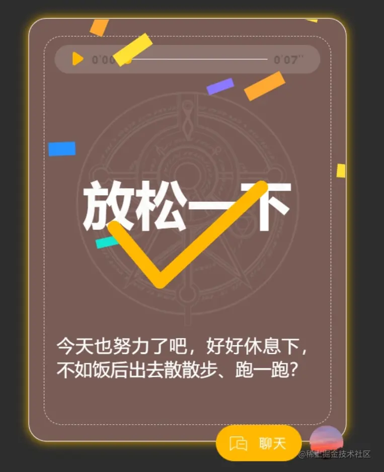
近期的项目中有一个特殊动画,完成任务后的彩带飘落动画,翻阅了一些网上的资料,可以用canvas制作,由于本人对canvas不精通,所以这里还是采用传统方法。(参考了他人博客)
主要思路:
- 两个动画:垂直落下 + 边落下边旋转
- webkitAnimationEnd:监听动画结束时,移除div
- 通过设置动态style,控制每个彩带飘落时间
使用:
    this.$bus.$on('ribbonFall',() => {
      this.show()
    }),
代码:
<template>
<div>
<ul v-if="rainVisible" class="spark-section" id="spark-section">
<template v-for="(item, index) in rainParams">
<li
class="move_1"
:style="{
left: item.left,
animationDuration: item.durTime,
webkitAnimationDuration: item.durTime,
}"
:data-index="index"
@webkitAnimationEnd="removeDom"
:key="index"
>
<div class="move-item" :class="`spark-${(index + 1) % 5}`"></div>
</li>
</template>
</ul>
</div>
</template>
<script>
export default {
data() {
return {
rainVisible: false,
rainParams: [],
timer: null,
duration: "",
};
},
created() {
this.settingData = {
continueTime: 1,
dropWealthNum: 20,
};
this.duration = this.settingData.continueTime * 1000;
this.continueTime = this.settingData.continueTime;
},
methods: {
startRedPacket() {
const win =document.documentElement.clientWidth || document.body.clientWidth;
var plusOrMinus = Math.random() < 0.5 ? -1 : 1;
const left =parseInt(Math.random() * (win - 50) + 0) + Math.random() * 10 * plusOrMinus;
const rotate = parseInt(Math.random() * (45 - -45) - 45) + "deg";
const durTime = Math.random() * (2.5 - 1.2 + 1) + 1.2 + "s";
this.rainParams.push({
left: left + "px",
transforms: "rotate(" + rotate + ")",
durTime: durTime,
isHide: false,
});
setTimeout(() => {
clearTimeout(this.timer);
this.timer = null;
return false;
}, this.duration);
this.timer = setTimeout(() => {
this.startRedPacket();
}, Math.round(this.duration / this.settingData.dropWealthNum));
},
show() {
this.rainVisible = true;
this.startRedPacket();
},
removeDom (e) {
const target = e.currentTarget
document.querySelector('#spark-section').removeChild(target)
},
},
mounted() {
this.$bus.$on('ribbonFall',() => {
this.show()
}),
this.$bus.$on('hideRibbon',() => {
this.rainVisible = false;
})
},
};
</script>
<style scoped lang="scss">
.spark-section {
display: block;
overflow: hidden;
position: absolute;
left: 0px;
top: 0px;
height: 100%;
width: 100%;
li {
position: absolute;
animation: all 3s linear;
top:-100px;
z-index: 0;
&.move_1 {
animation: aim_move 4s linear 1 forwards;
position: relative;
}
.move-item {
animation: cicle 2s infinite linear;
position: absolute;
left: 0px;
top: 0px;
}
@keyframes cicle {
0% {
transform: rotate(0deg);
left: 10px;
}
10% {
transform: rotate(30deg);
left: 0px;
}
20% {
transform: rotate(60deg);
left: -10px;
}
30% {
transform: rotate(90deg);
left: 0px;
}
40% {
transform: rotate(120deg);
left: 10px;
}
50% {
transform: rotate(150deg);
left: 0px;
}
60% {
transform: rotate(180deg);
left: -10px;
}
70% {
transform: rotate(210deg);
left: 0px;
}
80% {
transform: rotate(240deg);
left:10px;
}
90% {
transform: rotate(240deg);
left:0px;
}
100% {
transform: rotate(270deg);
left: -10px;
}
}
}
a {
display: block;
}
}
@keyframes aim_move {
0% {
transform: translateY(0);
}
100% {
transform: translateY(100vh);
}
}
.spark-1 {
width: 12px;
height: 36px;
background: #FFE034;
}
.spark-2 {
width: 12px;
height: 24px;
background: #2893FF;
}
.spark-3 {
width: 8px;
height: 24px;
background: #15E3D1;
}
.spark-4 {
width: 8px;
height: 24px;
background: #8A78FD;
}
.spark-0 {
width: 12px;
height: 36px;
background: #FFA933;
}
</style>
可优化地方:
- 彩带的飘落速度可以优化成变速,这样可以模拟重力感(未实现,请大佬指教)


