如何适配屏幕
算法:
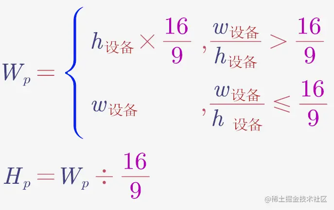
- Wp 为页面有效宽度
- Hp 为页面有效高度
- 页面左右居中,上下居中,四周留白即可
- 然后在 head 里用 JS 设置 1rem = Wp / 100
像素不能用怎么办
用 rem
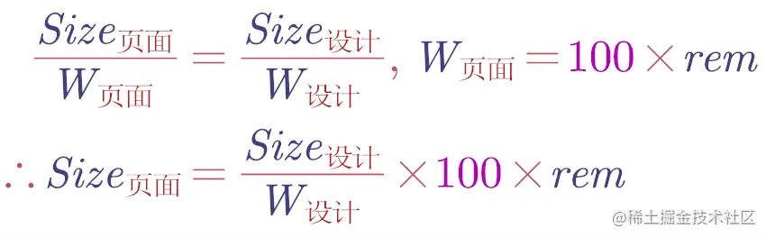
- 假设某 div 在设计稿中长 100px,设计稿宽度 1920px,那么该 div 在页面中长为 100/1920 X 100rem
- 最后可以写一个 px() 函数来计算 100px 对应的 rem
实践
<script>
const clientWidth = document.documentElement.clientWidth
const clientHeight = document.documentElement.clientHeight
window.pageWidth=clientWidth/clientHeight>16/9 ? clientHeight*(16/9) :clientWidth
const pageHeight = pageWidth/(16/9)
const string =`<style>html{
font-size:${pageWidth/100}px
}</style>`
document.write(string)
</script>
<script>
root.style.width =pageWidth+'px'
root.style.height =pageHeight+'px'
root.style.marginTop =(clientHeight-pageHeight)/2+'px'
</script>
const px = (n) => (n / 2420) * (window as any).pageWidth;
fontSize: px(12),


