<body>
<div class="question_item">
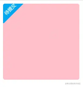
<div class="new-item-badge" v-if="isMine && !question.isFillIn">待提交</div>
</div>
</body>
<style>
.question_item {
position: relative;
width: 200px;
height: 200px;
background-color: pink;
border-radius: 5px;
overflow: hidden;
}
// 鼠标经过 转动 抖动
.question_item:hover .new-item-badge {
transform: rotate(-40deg);
-ms-transform: rotate(-40deg);
-webkit-transform: rotate(-40deg);
}
.new-item-badge {
position: absolute;
background: #02a7f0;
z-index: 999;
width: 70px;
text-align: center;
height: 40px;
line-height: 50px;
border-radius: 3px;
color: #fff;
font-size: 12px !important;
padding: 2px 4px 0;
top: -11px;
left: -26px;
-ms-transform: rotate(-45deg);
-webkit-transform: rotate(-45deg);
transform: rotate(-45deg);
-webkit-transition: 0 0.1s ease-in;
-moz-transition: 0 0.1s ease-in;
-o-transition: 0 0.1s ease-in;
transition: transform 0.1s ease-in;
}
</style>


