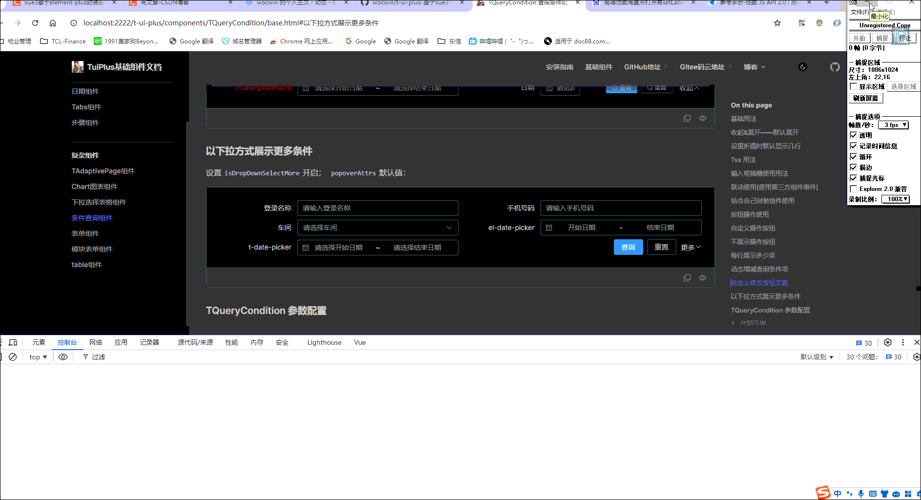
2024-07-31 TQueryCondition条件查询组件新增"以下拉方式展示更多条件"功能,效果如下:
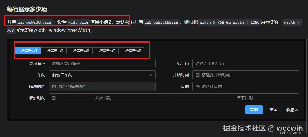
2024-06-05 条件查询组件新增每行显示多少项,效果如下:
一、需求
对于后台管理系统项目必不可少的就是 “增删改查”;而 "查",就会根据表格的列数来显示多少个查询/筛选条件;为了方便因此封装了查询条件(筛选条件)组件
二、组件功能
1、自动排列布局,每行显示4列(即4个条件)
2、内置“查询”和“重置”操作,并且按钮始终居于查询条件的最右侧
3、特定查询条件(如日期范围),可以配置占2列(span属性)
4、自动填入placeholder(日期范围除外)也可以自定义填入
5、默认输入框清空功能及下拉选择可以搜索选择功能
6、可以设置联调功能
7、可以自定义label
8、可以自定义输入框插槽
9、可以自定义 class
10、可以继承引入第三方组件的属性(属性写在bind:{}里面——bind也可以是function)
11、可以继承引入第三方组件的事件(事件写在eventHandle:{}里面)
12、条件过多有收起&展开功能
13、收起默认展示多少条
14、查询条件每行展示多少项(默认4项)
15、条件查询组件收起时设置默认展示行数
16、条件查询组件新增每行显示多少项
17、条件过多--下拉展示可动态勾选更多条件
三、最终效果
四、参数配置
1、代码示例
<t-query-condition :opts="opts" @submit="conditionEnter" @handleEvent="handleEvent" :loading="loading" />
1、配置参数(Attributes)
| 参数 | 说明 | 类型 | 默认值 |
|---|
| opts | 接收筛选器组件配置 | object | 无 |
| loading | 查询按钮 loading 状态,请求数据时需要体现 | Boolean | false |
| reset | 是否显示“重置”按钮 | Boolean | true |
| maxVisibleRows | 收起时设置默认展示行数 | Number | 1 |
| boolEnter | 是否敲回车查询 | Boolean | true |
| isShowOpen | 是否显示“收起和展开” | Boolean | true |
| packUpTxt | 收起文案 | String | '收起' |
| unfoldTxt | 展开文案 | String | '展开' |
| isExpansion | 是否默认展开 | Boolean | false |
| labelWidth | labelWidth 宽度 | String | '120px' |
| btnCheckBind | 查询按钮配置(继承el-button所有属性) | object | {type: primary, size: default,btnTxt:'查询'} |
| btnResetBind | 重置按钮配置(继承el-button所有属性) | object | { size: default,btnTxt:'重置'} |
| isFooter | 自定义按钮(设置:footer="false"不显示按钮) | Boolean | true |
| configChangedReset | 更新 opts 是否重置(默认重置) | Boolean | false |
| isShowWidthSize | 是否开启动态设置每行显示数 | Boolean | false |
| widthSize | 每行显示多少项,最小值 2 | Number | 4 |
| isDropDownSelectMore | 是否以下拉方式展示更多条件 | Boolean | false |
1-1 以下拉方式展示更多条件--配置参数(Attributes)
| 参数 | 说明 | 类型 | 默认值 |
|---|
| popoverAttrs | el-popover配置及中文文案 | object | 具体看源码 |
| moreCheckList | 数据源 | Array | - |
| -----label | 标题 | string | - |
| -----comp | 组件名称,可直接指定全局注册的组件 | string,component | - |
| -----isSelfCom | 是否使用自己封装的下拉组件(即没有el-option) | Boolean | false |
| -----prop | 接收字段(即后台接收字段) | string | - |
| -----bind | 组件配置参数(Attributes) | object | - |
| -----slotName | 自定义输入框插槽 | string | - |
| -----span | 控件占用的列宽,默认占用 1 列,最多 4 列 (独占一行) | number | 1 |
| -----changeEvent | 事件名称 | string | - |
| -----defaultVal | 默认值 | string | - |
| -----type | element 组件type(radio,checkbox,select-arr,select-obj) | string | - |
| -----arrLabel | el-select 组件options label显示 | string | label |
| -----arrKey | el-select 组件options key显示 | string | key |
| -----list | el-select 组件options 数据标识 | string | - |
| -----listTypeInfo | el-select 组件options 数据源 | object | - |
2、opts Attributes
| 参数 | 说明 | 类型 | 默认值 |
|---|
| label | 表单字段说明标题 | string | - |
| className | 自定义 class | string | - |
| placeholder | placeholder 提示语 | string | - |
| labelRender | 自定义 label(render 函数 jsx 方式编写) | function | - |
| slotName | 自定义输入框插槽(作用域插槽解构接收{param}返回当前所有表单初始值) | string | - |
| comp | 组件名称,可直接指定全局注册的组件,也可引入'elmentUI'如:Button 或者'el-button' | string,component | - |
| span | 控件占用的列宽,默认占用 1 列,最多 4 列 (独占一行) | number | 1 |
| defaultVal | 默认值 | - | - |
| bind | 渲染时组件会调用 v-bind 指定设置该配置更新元素的属性(继承第三方组件属性) | object,function | 无 |
| eventHandle | 配置组件事件,与写组件时change 等同理 | object | 本身值,当前formData数据 |
3. 事件(events)
| 事件名 | 说明 | 返回值 |
|---|
| handleEvent | 筛选器数据发生变化时触发 | event标识, val:输入值,form:整个查询条件数据 |
| submit | 点击筛选器查询按钮时触发 | form:整个查询条件数据 |
| reset | 点击筛选器重置按钮时触发 | - |
| getCheckList | 下拉动态添加条件(isDropDownSelectMore:true生效) | 返回选中的条件项 |
4、Slots
| 插槽名 | 说明 |
|---|
| querybar | 按钮操作插槽(位置基于重置后面) |
<template>
<el-form
id="t_query_condition"
v-bind="$attrs"
:label-width="labelWidth"
:form="state.form"
size="default"
class="t-query-condition"
:style="{
'grid-template-areas': gridAreas,
'grid-template-columns': `repeat(${colLength}, minmax(220px, ${
100 / colLength
}%))`,
}"
@submit.prevent
>
<el-form-item
v-for="(opt, i) in cOpts"
:key="i"
:label="opt.label"
:label-width="opt.labelWidth"
v-bind="$attrs"
:style="{ gridArea: i }"
:class="[opt.className, { render_label: opt.labelRender }]"
>
<template #label v-if="opt.labelRender">
<render-comp :form="state.form" :render="opt.labelRender" />
</template>
<template v-if="opt.slotName">
<slot :name="opt.slotName" :param="state.form"></slot>
</template>
<component
v-if="!opt.slotName && opt.comp.includes('date')"
:is="opt.comp"
v-bind="
typeof opt.bind == 'function'
? opt.bind(state.form)
: { clearable: true, filterable: true, ...$attrs, ...opt.bind }
"
:placeholder="opt.placeholder || getPlaceholder(opt)"
@change="handleEvent(opt.event, state.form[opt.dataIndex])"
v-model="state.form[opt.dataIndex]"
/>
<component
v-if="!opt.slotName && opt.comp.includes('tree-select')"
:is="opt.comp"
v-bind="
typeof opt.bind == 'function'
? opt.bind(state.form)
: { clearable: true, filterable: true, ...$attrs, ...opt.bind }
"
:placeholder="opt.placeholder || getPlaceholder(opt)"
@change="handleEvent(opt.event, state.form[opt.dataIndex])"
v-model="state.form[opt.dataIndex]"
/>
<component
v-if="
!opt.slotName &&
!opt.comp.includes('date') &&
!opt.comp.includes('tree-select')
"
:is="opt.comp"
v-bind="
typeof opt.bind == 'function'
? opt.bind(state.form)
: { clearable: true, filterable: true, ...$attrs, ...opt.bind }
"
:placeholder="opt.placeholder || getPlaceholder(opt)"
@change="handleEvent(opt.event, state.form[opt.dataIndex])"
v-on="cEvent(opt)"
v-model="state.form[opt.dataIndex]"
>
<component
:is="compChildName(opt)"
v-for="(value, key, index) in selectListType(opt)"
:key="index"
:disabled="value.disabled"
:label="compChildLabel(opt, value)"
:value="compChildValue(opt, value, key)"
>{{ compChildShowLabel(opt, value) }}</component
>
</component>
</el-form-item>
<el-form-item
v-if="Object.keys(cOpts).length > 0"
label-width="0"
style="grid-area: submit_btn"
:class="['btn', { flex_end: cellLength % colLength === 0 }]"
>
<el-button
class="btn_check"
@click="checkHandle"
v-bind="queryAttrs"
:loading="loading"
>查询</el-button
>
<el-button
v-if="reset"
class="btn_reset"
v-bind="resetAttrs"
@click="resetHandle"
>重置</el-button
>
<slot name="querybar"></slot>
<el-button
v-if="originCellLength > colLength && isShowOpen"
@click="open = !open"
link
>
{{ open ? '收起' : '展开' }}
<el-icon v-if="open">
<ArrowUp />
</el-icon>
<el-icon v-else>
<ArrowDown />
</el-icon>
</el-button>
</el-form-item>
</el-form>
</template>
六、组件地址
gitHub组件地址
gitee码云组件地址
vue3+ts基于Element-plus再次封装基础组件文档
七、相关文章
基于ElementUi再次封装基础组件文档
vue+element-ui的列表查询条件/筛选条件组件二次封装


