效果展现图
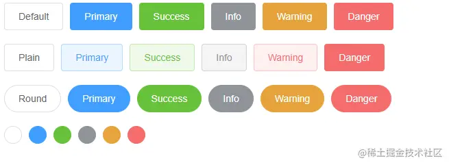
代码结构
<template>
  <div>

    <Row :gutter="[10,20]">
      <Button>Default</Button>
      <Button type="primary">Primary</Button>
      <Button type="success">Success</Button>
      <Button type="info">Info</Button>
      <Button type="warning">Warning</Button>
      <Button type="danger">Danger</Button>
    </Row>

    <Row :gutter="[10,20]">
      <Button plain>Plain</Button>
      <Button type="primary" plain>Primary</Button>
      <Button type="success" plain>Success</Button>
      <Button type="info" plain>Info</Button>
      <Button type="warning" plain>Warning</Button>
      <Button type="danger" plain>Danger</Button>
    </Row>

    <Row :gutter="[10,20]">
      <Button round>Round</Button>
      <Button type="primary" round>Primary</Button>
      <Button type="success" round>Success</Button>
      <Button type="info" round>Info</Button>
      <Button type="warning" round>Warning</Button>
      <Button type="danger" round>Danger</Button>
    </Row>

    <Row :gutter="[10,20]">
      <Button :icon="Search" circle />
      <Button type="primary" :icon="Edit" circle />
      <Button type="success" :icon="Check" circle />
      <Button type="info" :icon="Message" circle />
      <Button type="warning" :icon="Star" circle />
      <Button type="danger" :icon="Delete" circle />
    </Row>

  </div>
</template>

<script lang="ts" setup>
import { Button,Row } from "zgy-ui";
</script>
禁用状态
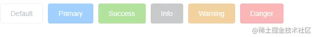
<template>
  <div>
    <Row :gutter="[10,20]">
      <Button disabled>Default</Button>
      <Button type="primary" disabled>Primary</Button>
      <Button type="success" disabled>Success</Button>
      <Button type="info" disabled>Info</Button>
      <Button type="warning" disabled>Warning</Button>
      <Button type="danger" disabled>Danger</Button>
    </Row>
  </div>
</template>

<script lang="ts" setup>
import { Button,Row } from "zgy-ui";
</script>
文字按钮
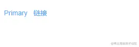
<template>
  <div>
    <Row :gutter="[10,20]">
      <Button type="text">Primary</Button>
      <Button type="text">链接</Button>
    </Row>
  </div>
</template>

<script lang="ts" setup>
import { Button,Row } from "zgy-ui";
</script>
可接收参数
  type: String,
  plain: Boolean,
  round: Boolean,
  disabled: Boolean,
  icon: String,
  iconPosition: String,
  circle:Boolean,
  size:String


