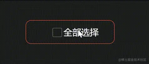
效果图
代码(sass)
html
<label class="label">
    <input type="checkbox" />
    <span>全部选择</span>
</label>
scss
.label {
    display: flex;
    align-items: center;
    border: tomato 1px solid;
    width: 140px;
    padding: 10px;
    justify-content: center;
    border-radius: 10px;
    input[type="checkbox"] {
        opacity: 0;
        &:checked {
            ~ span {
                color: tomato;
                &::after {
                    opacity: 1;
                }
                &::before {
                    border-color: tomato;
                }
            }
        }
    }
    > span {
        position: relative;
        padding-left: 20px;
        transform: all 500ms;
        &::after,
        &::before {
            content: "";
            position: absolute;
            transition: all 500ms;
            border-radius: 2px;
            width: var(--size);
            height: var(--size);
        }
        &::after {
            left: 3.5px;
            top: calc(50% - 4px);
            --size: 10px;
            background-color: tomato;
            opacity: 0;
        }
        &::before {
            left: 0;
            top: calc(50% - 7.5px);
            --size: 15px;
            border: #919191 1px solid;
        }
    }
}
核心知识点
::before、::after伪类:在原本元素的前后增加元素<label>和<input>的联合使用:点击label内的文字,input也会被选择input[type='checkbox']:checked:表示多选框选中状态下- css
~选择器:A ~ B表示选择A标签后的所有B标签,但是A和B标签必须有相同的父元素。


