预览图
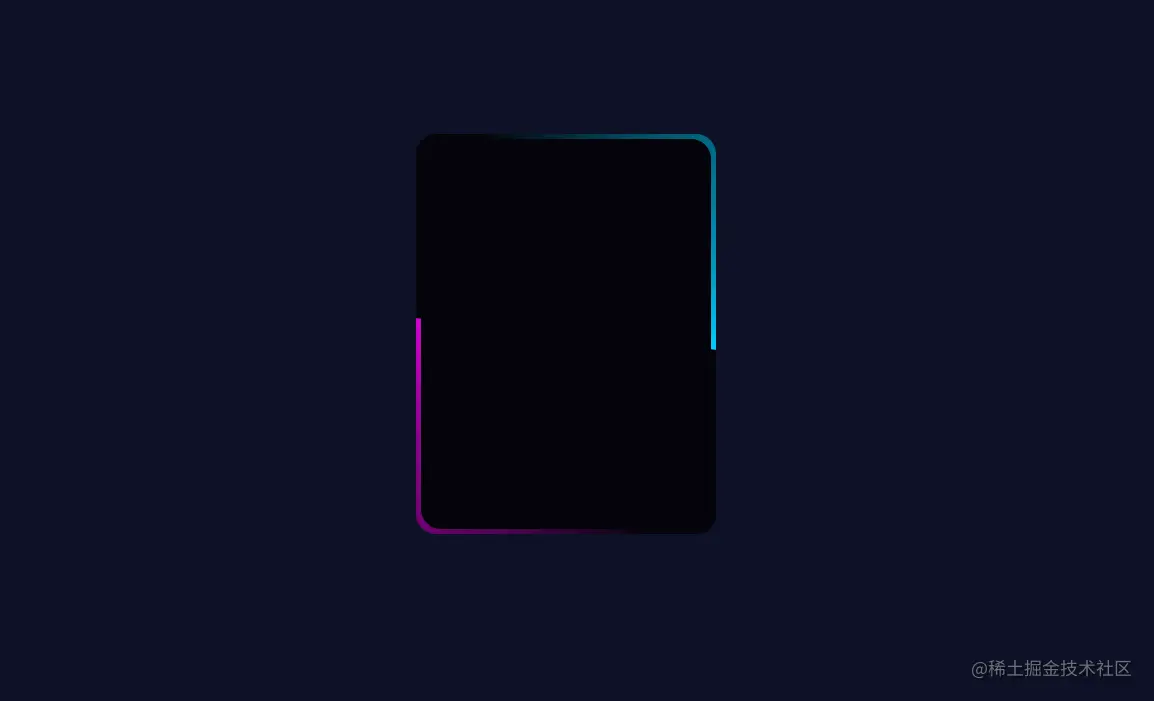
html
<div id="box"><span></span></div>
css
 body {
    background-color: #0d1126;
  }

  #box {
    width: 300px;
    height: 400px;
    margin: 200px auto  0;
    border-radius: 20px;
    background-color: #04040a;
    position: relative;
    overflow: hidden;
  }
  #box::before{
    content: '';
    width: 500px;
    height: 500px;
    background-image: conic-gradient(transparent,transparent,transparent,#d400d4);
    position: absolute;
    left: -100px;
    top: -50px;
    animation: animate 4s linear infinite;
  }
  #box::after{
    content: '';
    width: 500px;
    height: 500px;
    left: -100px;
    top: -50px;
    background-image: conic-gradient(transparent,transparent,transparent,#00ccff);
    position: absolute;
    animation: animate 4s linear infinite;
    animation-delay: -2s;
  }
  @keyframes animate {
    0% {
      transform: rotate(0deg);
    }
    100% {
      transform: rotate(360deg);
    }
  }
  #box span {
    position: absolute;
    inset: 5px;
    background-color: #04040a;
    z-index: 1;
    border-radius: 20px;
  }


