

主题控制着用户界面的视觉特征--调色板、排版、留白、边框样式、阴影、弧度等。主题越来越受欢迎,因为应用程序需要支持多种颜色模式和品牌要求。
但主题开发可能很乏味。你必须跟踪你的应用程序中的无数个状态,然后乘以你支持的主题数量。同时不断地在不同的主题之间来回切换,以检查用户界面是否正确。
有了Storybook,你可以控制哪个主题应用于你的组件,并通过工具栏点击在不同的主题之间切换。这篇文章告诉你如何做:
- 🎁 使用装饰器将主题对象传递给你的组件
- 🎛 从工具栏或使用故事参数动态地切换主题
- 🖍 自动更新故事背景以匹配主题
- 🍱 在一个故事中并排渲染多个主题
我们正在建立什么?
与作为组件输入的数据不同,主题是通过上下文提供的,或者作为CSS变量全局配置的。
我们将建立一个主题切换工具,允许你在Storybook中为你的所有组件提供主题对象。你将能够通过参数或工具栏上的按钮来控制哪个主题处于活动状态:
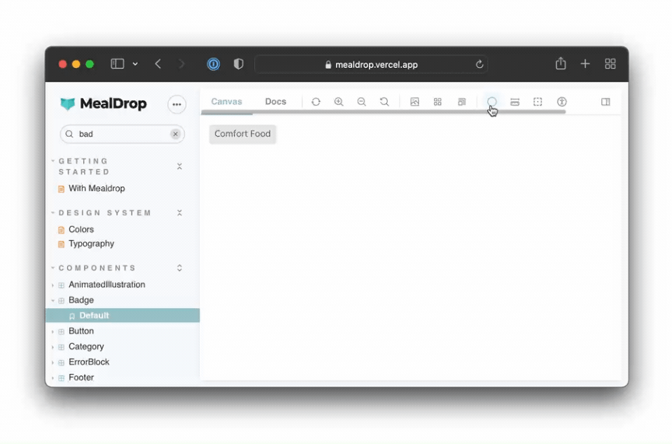
我们将使用这个徽章组件进行演示--它来自使用React和styled-components构建的Maldrop应用。
它使用主题对象的变量来设置边界半径、背景和颜色值。主题对象是通过上下文API传递给组件的:
// src/components/Badge/Badge.tsx
import styled, { css } from 'styled-components'

import { Body } from '../typography'

const Container = styled.div(
  ({ theme }) => css`
    padding: 3px 8px;
    background: ${theme.color.badgeBackground};
    border-radius: ${theme.borderRadius.xs};
    display: inline-block;
    text-transform: capitalize;
    span {
      color: ${theme.color.badgeText};
    }
  `
)

type BadgeProps = {
  text: string
  className?: string
}

export const Badge = ({ text, className }: BadgeProps) => (
  <Container className={className}>
    <Body type="span" size="S">
      {text}
    </Body>
  </Container>
)
克隆回购
让我们开始吧!Clone repo,安装依赖性,然后跟着做:
# Clone the template
npx degit yannbf/mealdrop#theme-switcher-base mealdrop

cd mealdrop

# Install dependencies
yarn
使用装饰器为你的组件提供主题
第一步是为我们的组件提供主题。我们将使用一个装饰器来做到这一点,它将用ThemeProvider 来包装每个故事,并传入lightTheme 对象。
装饰器是一种Storybook机制,允许你用额外的渲染功能来增强故事。例如,你可以提供一个组件所依赖的上下文或其他全局配置。
让我们把withTheme 装饰器添加到.storybook/preview.tsx 文件中:
// .storybook/preview.tsx
import { ThemeProvider } from 'styled-components'
import { DecoratorFn } from '@storybook/react'

import { GlobalStyle } from '../src/styles/GlobalStyle'
import { lightTheme } from '../src/styles/theme'

const withTheme: DecoratorFn = (StoryFn) => {
  return (
    <ThemeProvider theme={lightTheme}>
      <GlobalStyle />
      <StoryFn />
    </ThemeProvider>
  )
}

// export all decorators that should be globally applied in an array
export const decorators = [withTheme]
在.storybook/preview.js|tsx 文件中定义的装饰器是全局的。也就是说,它们将被应用于你所有的故事。因此,它也是加载这些组件所使用的GlobalStyle 的完美位置。
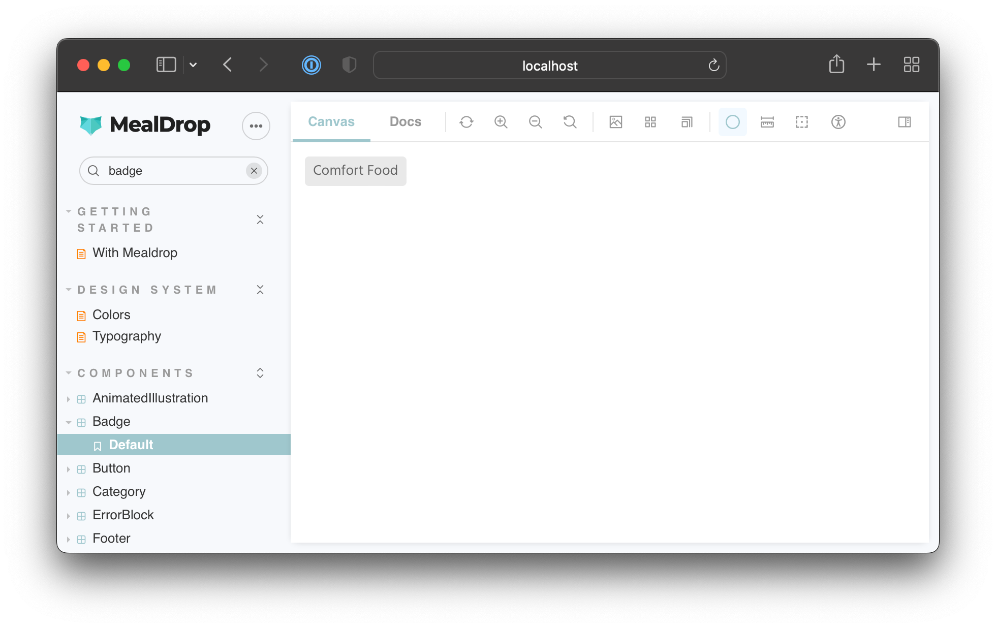
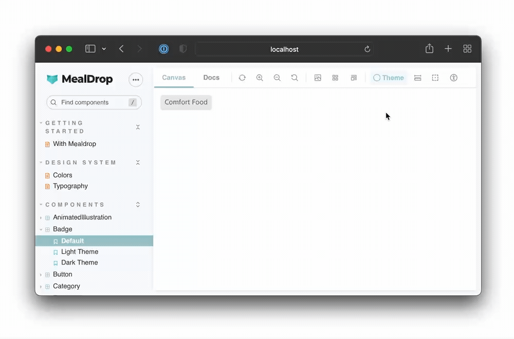
运行yarn storybook ,启动Storybook,你应该看到Badge组件在应用了浅色主题的情况下正确渲染。
通过参数设置活动主题
现在,我们的withTheme 装饰器只向组件提供了浅色主题。为了测试浅色和深色模式,我们需要在它们之间进行动态切换。我们可以使用参数来指定启用哪个主题。
参数是元数据,你可以附加到一个故事或一个组件上。然后,withTheme 装饰器可以从故事上下文对象中访问它们并应用适当的主题。
更新你的装饰器以读取主题参数:
// .storybook/preview.tsx
import { ThemeProvider } from 'styled-components'
import { DecoratorFn } from '@storybook/react'

import { GlobalStyle } from '../src/styles/GlobalStyle'
import { darkTheme, lightTheme } from '../src/styles/theme'

const withTheme: DecoratorFn = (StoryFn, context) => {
  // Get the active theme value from the story parameter
  const { theme } = context.parameters
  const storyTheme = theme === 'dark' ? darkTheme : lightTheme
  return (
    <ThemeProvider theme={storyTheme}>
      <GlobalStyle />
      <StoryFn />
    </ThemeProvider>
  )
}

export const decorators = [withTheme]
当为一个组件编写故事时,你可以选择使用参数来应用哪个主题。像这样:
// src/components/Badge/Badge.stories.tsx
import { ComponentStory, ComponentMeta } from '@storybook/react'
import { Badge } from './Badge'

export default {
  title: 'Components/Badge',
  component: Badge,
} as ComponentMeta<typeof Badge>

const Template: ComponentStory<typeof Badge> = (args) => <Badge {...args} />

export const Default = Template.bind({})
Default.args = {
  text: 'Comfort food',
}

export const LightTheme = Template.bind({})
LightTheme.args = Default.args
LightTheme.parameters = {
  theme: 'light',
}

export const DarkTheme = Template.bind({})
DarkTheme.args = Default.args
DarkTheme.parameters = {
  theme: 'dark',
}
切换回你的故事书,你会注意到,当你在这两个故事之间导航时,主题会更新:
很好!这使我们可以灵活地设置每个故事的主题。
切换背景颜色以匹配主题
这是一个好的开始。我们可以灵活地控制每个故事的主题。然而,背景仍然是一样的。让我们更新我们的装饰器,使故事的背景颜色与活动主题相匹配。
我们现在用一个ThemeBlock 组件来包装每个故事,它根据活动主题来控制背景颜色:
// .storybook/preview.tsx
import React from 'react'
import styled, { css, ThemeProvider } from 'styled-components'
import { DecoratorFn } from '@storybook/react'

import { GlobalStyle } from '../src/styles/GlobalStyle'
import { darkTheme, lightTheme } from '../src/styles/theme'
import { breakpoints } from '../src/styles/breakpoints'

const ThemeBlock = styled.div<{ left?: boolean; fill?: boolean }>(
  ({ left, fill, theme }) =>
    css`
      position: absolute;
      top: 0;
      left: ${left || fill ? 0 : '50vw'};
      border-right: ${left ? '1px solid #202020' : 'none'};
      right: ${left ? '50vw' : 0};
      width: ${fill ? '100vw' : '50vw'};
      height: 100vh;
      bottom: 0;
      overflow: auto;
      padding: 1rem;
      background: ${theme.color.screenBackground};
      ${breakpoints.S} {
        left: ${left ? 0 : '50vw'};
        right: ${left ? '50vw' : 0};
        padding: 0 !important;
      }
    `
)

export const withTheme: DecoratorFn = (StoryFn, context) => {
  // Get values from story parameter first
  const { theme } = context.parameters
  const storyTheme = theme === 'dark' ? darkTheme : lightTheme
  return (
    <ThemeProvider theme={storyTheme}>
      <GlobalStyle />
      <ThemeBlock fill>
        <StoryFn />
      </ThemeBlock>
    </ThemeProvider>
  )
}

export const decorators = [withTheme]
现在,当你在这些故事之间切换时,主题和背景颜色都会更新:

从工具条上切换主题
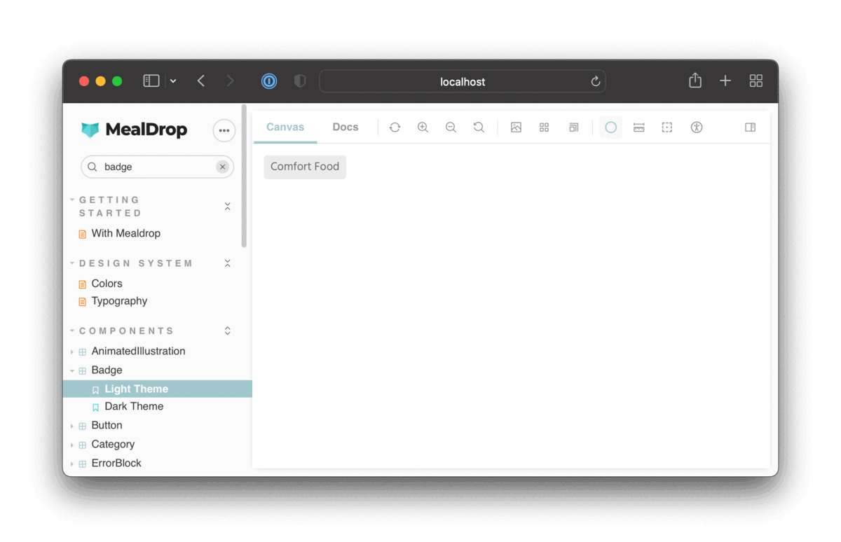
通过参数对主题进行硬编码只是一种选择。我们也可以定制Storybook的用户界面,添加一个下拉菜单,让我们可以切换哪个主题处于活动状态。
Storybook提供了工具条插件,使你能够定义一个全局值,并将其连接到工具条上的一个菜单。
为了创建一个控制活动主题的工具栏项目,我们需要在我们的.storybook/preview.tsx 文件中添加一个globalTypes 对象:
// .storybook/preview.tsx

// ...code ommited for brevity...

export const withTheme: DecoratorFn = (StoryFn, context) => {
  // Get values from story parameter first, else fallback to globals
  const theme = context.parameters.theme || context.globals.theme
  const storyTheme = theme === 'dark' ? darkTheme : lightTheme
  return (
    <ThemeProvider theme={storyTheme}>
      <GlobalStyle />
      <ThemeBlock fill>
        <StoryFn />
      </ThemeBlock>
    </ThemeProvider>
  )
}

export const globalTypes = {
  theme: {
    name: 'Theme',
    description: 'Global theme for components',
    defaultValue: 'light',
    toolbar: {
      // The icon for the toolbar item
      icon: 'circlehollow',
      // Array of options
      items: [
        { value: 'light', icon: 'circlehollow', title: 'light' },
        { value: 'dark', icon: 'circle', title: 'dark' },
      ],
      // Property that specifies if the name of the item will be displayed
      showName: true,
    },
  },
}

export const decorators = [withTheme]
我们还更新了withTheme 装饰器,以便首先从参数中获取主题值,如果它未被定义,则返回到全局值。
现在你应该看到一个切换主题的工具条项目:
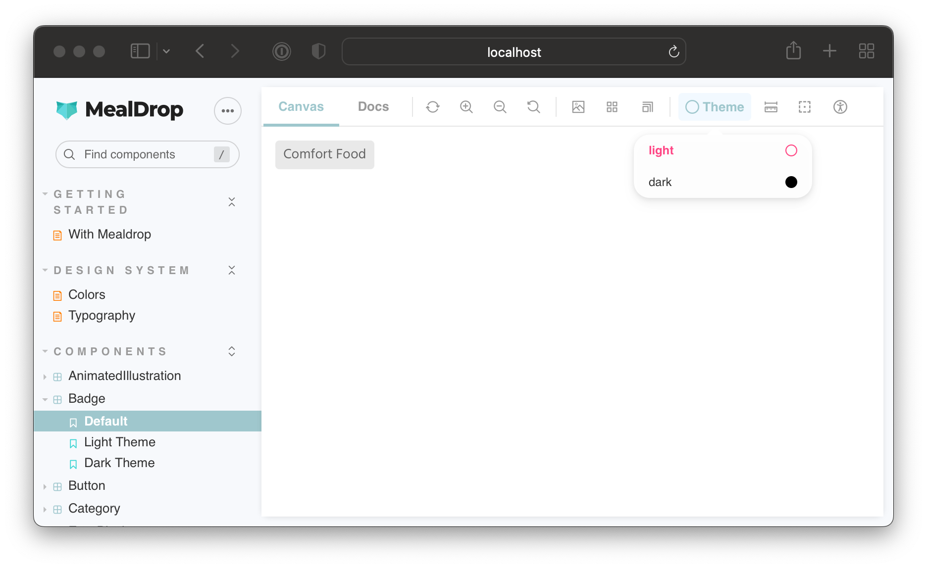
对于Default ,它没有指定一个主题参数,你可以使用工具栏切换主题。然而,LightTheme 和DarkTheme 故事将始终执行通过主题参数设置的值。
并排渲染主题
有时,如果你能同时看到一个组件的所有主题变体,就会更容易对其进行处理。你猜怎么着?你可以在一个装饰器中多次渲染一个故事,并为每个实例提供不同的主题对象。
更新withTheme 装饰器和globalTypes ,添加一个 "并排 "模式:
// .storybook/preview.tsx

// ...code ommited for brevity...

export const withTheme: DecoratorFn = (StoryFn, context) => {
  // Get values from story parameter first, else fallback to globals
  const theme = context.parameters.theme || context.globals.theme
  const storyTheme = theme === 'light' ? lightTheme : darkTheme

  switch (theme) {
    case 'side-by-side': {
      return (
        <>
          <ThemeProvider theme={lightTheme}>
            <GlobalStyle />
            <ThemeBlock left>
              <StoryFn />
            </ThemeBlock>
          </ThemeProvider>
          <ThemeProvider theme={darkTheme}>
            <GlobalStyle />
            <ThemeBlock>
              <StoryFn />
            </ThemeBlock>
          </ThemeProvider>
        </>
      )
    }
    default: {
      return (
        <ThemeProvider theme={storyTheme}>
          <GlobalStyle />
          <ThemeBlock fill>
            <StoryFn />
          </ThemeBlock>
        </ThemeProvider>
      )
    }
  }
}

export const globalTypes = {
  theme: {
    name: 'Theme',
    description: 'Theme for the components',
    defaultValue: 'light',
    toolbar: {
      // The icon for the toolbar item
      icon: 'circlehollow',
      // Array of options
      items: [
        { value: 'light', icon: 'circlehollow', title: 'light' },
        { value: 'dark', icon: 'circle', title: 'dark' },
        { value: 'side-by-side', icon: 'sidebar', title: 'side by side' },
      ],
      // Property that specifies if the name of the item will be displayed
      showName: true,
    },
  },
}

export const decorators = [withTheme]
这就是最后的结果:
并排模式对于使用Chromatic等工具进行视觉回归测试也是非常方便的。你可以通过参数启用它,一次性测试一个组件的所有基于主题的变体。
总结
在构建UI时,你必须考虑到应用状态、地域、视口尺寸、主题等的无数种变化。Storybook使测试UI变体变得容易。你可以使用数以百计的附加组件之一,或者定制Storybook以满足你的需求。

装饰器使你能够完全控制故事的渲染,并使你能够设置提供者,并使用参数或通过将它们连接到一个工具条项目来控制它们的行为。切换主题只是这项技术的一个应用。你可以用它来添加一个语言切换器或一个菜单来管理多租户的配置。
