必须要掌握的伸缩布局 flex
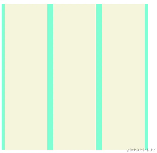
1. 垂直水平居中
    <style>
        .box {
            display: flex;
            align-items: center;
            justify-content: center;
            background-color: aquamarine;
            width: 500px;
            height: 500px;
        }
        .item {
            width: 200px;
            height: 100%;
            margin: 10px;
            background-color: beige;
        }
    </style>


    <div class="box">
        <div class="item"></div>
        <div class="item"></div>
        <div class="item"></div>
    </div>
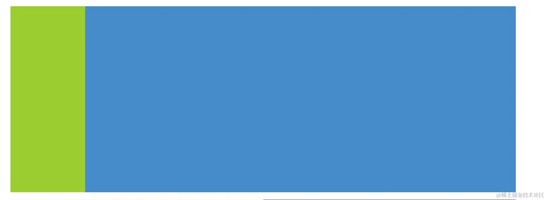
2. 左侧固定,右侧可变
<style>
.conten {
display: flex;
background-color: aquamarine;
width: 100%;
height: 500px;
}
.left {
width:200px ;
height: 100%;
background-color: yellowgreen;
}
.right {
height: 100%;
flex: 1;
background-color: rgb(69, 139, 201);
}
</style>
<div class="conten">
<div class="left"></div>
<div class="right"></div>
</div>
3. 多列布局
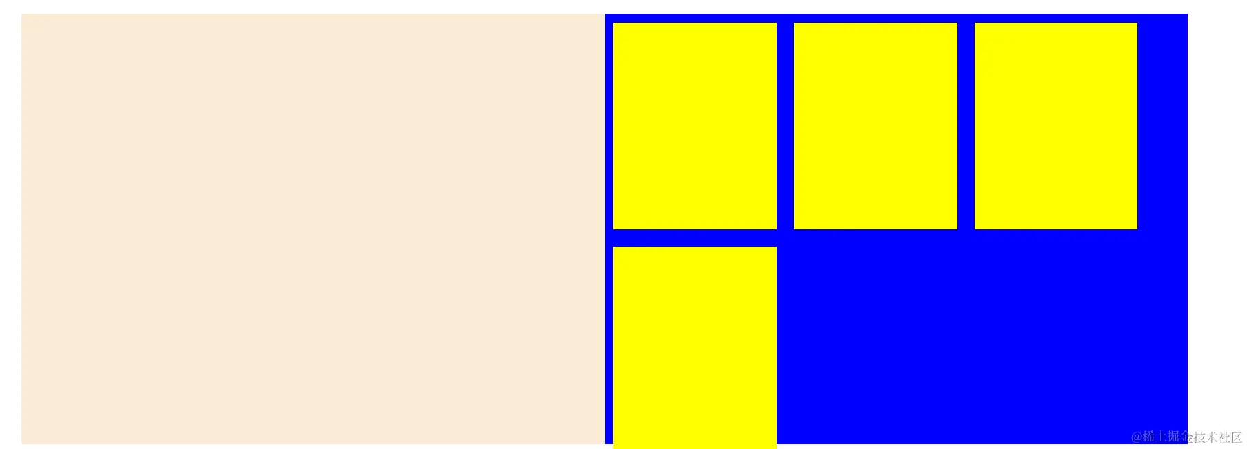
<style>
.box {
display: flex;
align-items: center;
justify-content: center;
background-color: aquamarine;
width: 500px;
height: 500px;
}
.item {
width: 200px;
height: 100%;
margin: 10px;
background-color: beige;
}
.conten {
display: flex;
background-color: aquamarine;
width: 90%;
height: 500px;
margin: 20px;
}
.left {
width:200px ;
height: 100%;
background-color: yellowgreen;
}
.right {
height: 100%;
flex: 1;
background-color: rgb(69, 139, 201);
}
.logo {
flex: 1;
background-color: antiquewhite;
}
.ping {
flex: 1;
background-color: blue;
display: flex;
flex-wrap: wrap;
}
.pItem {
height: 48%;
width: 28%;
background-color: yellow;
margin: 10px;
flex-shrink: 0;
}
</style>
<div class="conten">
<div class="logo"></div>
<div class="ping">
<div class="pItem"></div>
<div class="pItem"></div>
<div class="pItem"></div>
<div class="pItem"></div>
</div>
</div>
常用的定位布局 position
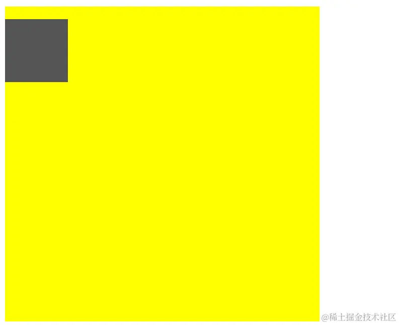
    <style>
           .pon {
            position: relative;
            width: 500px;
            height: 500px;
            background: yellow;
        }
        .son {
            position: absolute;
            width: 100px;
            height: 100px;
            background: #555;
            top: 20px;
        }
    </style>

     <div class="pon">
        <div class="son"></div>
    </div>
     <div class="grid">
        <div class="gridItem"></div>
        <div class="gridItem"></div>
        <div class="gridItem"></div>
        <div class="gridItem"></div>
        <div class="gridItem"></div>
        <div class="gridItem"></div>
        <div class="gridItem"></div>
        <div class="gridItem"></div>
        <div class="gridItem"></div>
    </div>
高级的网格布局 grid
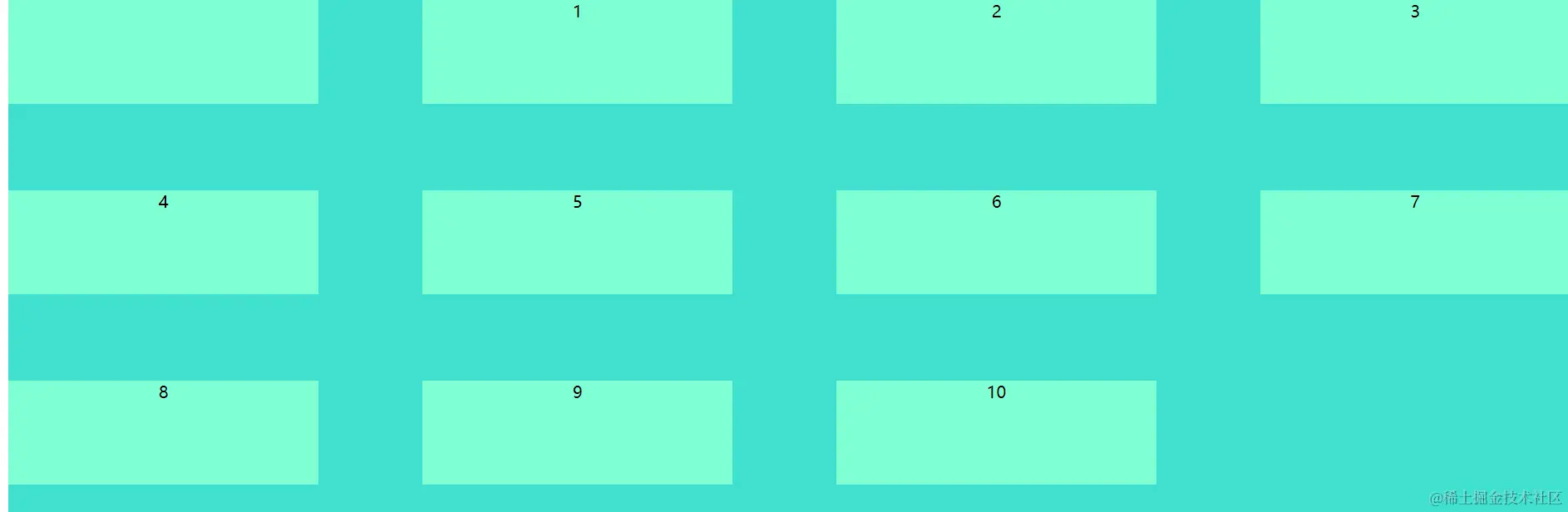
     .grid {
           display: grid;
           width: 100%;
           height: 500px;
           background: turquoise;
           grid-gap: 50px 100px;
           overflow: hidden;
           grid-template-columns: auto auto auto auto;
       }
       .gridItem {
         width: 100px;
         height: 100px;
         background-color: aquamarine;
       }
老旧的浮动布局 float
      .floa {
            width: 200px;
            height: 200px;
            background-color: blueviolet;
            overflow: hidden;
        }
        .k {
            float: left;
            width: 50px;
            height: 50px;
            background-color: violet;
        }
         <div class="floa">
        <div class="k"></div>
    </div>


