HTML部分
<header>响应式布局</header>
<div class="box">
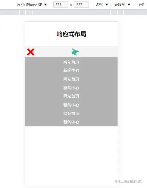
<div class="btn" id="mybtn"></div>
<div class="logo">
<img src="img/logo.png" alt="">
</div>
</div>
<nav id="dropmenu">
<ul>
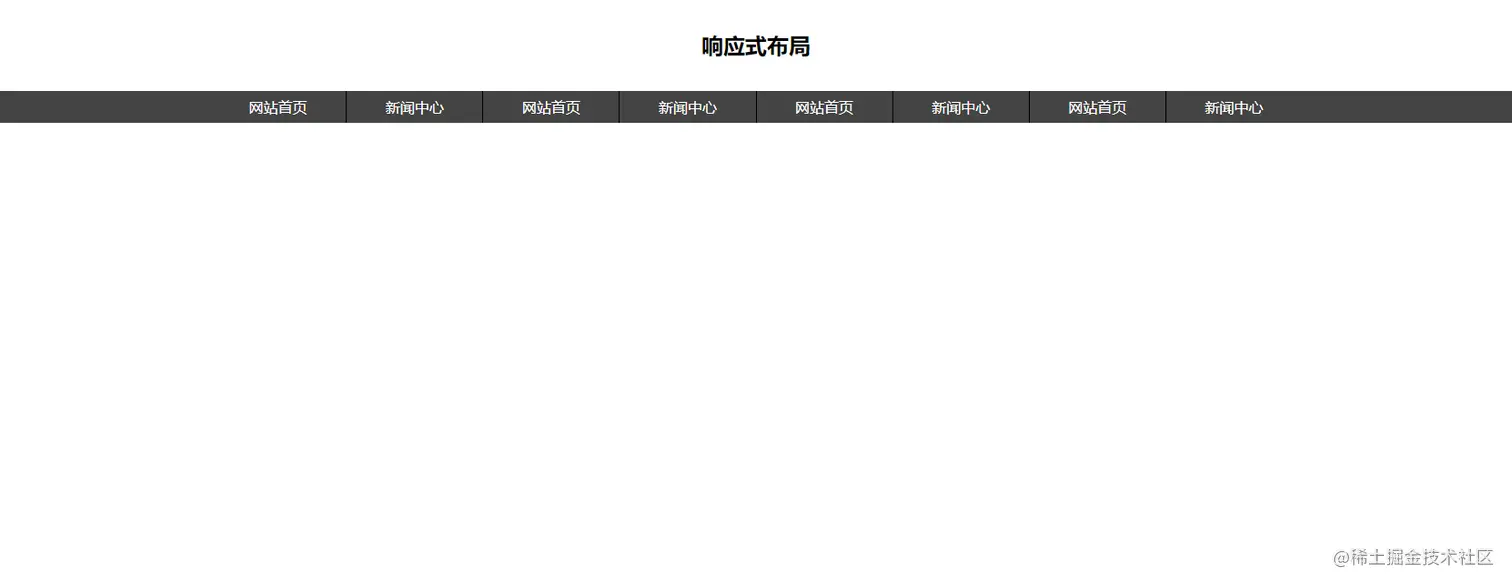
<li>
<a href="">网站首页</a>
</li>
<li>
<a href="">新闻中心</a>
</li>
<li>
<a href="">网站首页</a>
</li>
<li>
<a href="">新闻中心</a>
</li>
<li>
<a href="">网站首页</a>
</li>
<li>
<a href="">新闻中心</a>
</li>
<li>
<a href="">网站首页</a>
</li>
<li>
<a href="">新闻中心</a>
</li>
</ul>
</nav>
<script src="./js/JQuery.3.6.0.js"></script>
<script>
$(function(){
$("#mybtn").click(function(){
$("#mybtn").toggleClass("close");
$("#dropmenu").toggleClass("show");
})
})
</script>
CSS部分
* {
    margin: 0;
    padding: 0;
}
header {
    height: 100px;
    font-size: 24px;
    font-weight: bold;
    text-align: center;
    line-height: 100px;
}

@media screen and (min-width:750px) {
    nav {
        width: 100%;
        height: 35px;
        background-color: #444;
        ul {
            max-width: 1200px;
            height: 35px;
            margin: 0 auto;
            list-style: none;
            display: flex;
            li {
                height: 35px;
                border-right: 1px solid black;
                flex-grow: 1;
                transition: 0.5s;
                a {
                    display: block;
                    text-align: center;
                    color: white;
                    text-decoration: none;
                    line-height: 35px;
                }
                &:hover {
                    background-color: red;
                }
                &:last-child {
                    border: 0px;
                }
            }
        }
    }
    .box {
        display: none;
    }

}

@media screen and (max-width:750px) {
    .box {
        height: 12vw;
        background-color: #f3f3f3;
        padding: 2vw;
        box-sizing: border-box;
        display: flex;
        .btn {
            width: 8vw;
            height: 8vw;
            background-color: blue;
            background-image: url(../img/liebiao.png);
            background-size: contain;
            background-position: center center;
        }
        .close {
            background-image: url(../img/2.png);
        }
        .logo {
            height: 8vw;
            flex-grow: 1;
            text-align: center;
            img {
                height: 8vw;
            }
        }
    }
    nav {
        background-color: #b2b2b2;
        display: none;
        ul {
            li {
                a {
                    display: block;
                    height: 35px;
                    color: white;
                    text-align: center;
                    text-decoration: none;
                    line-height: 35px;
                }
            }
        }
    }
    .show {
        display: block;
    }

}
效果
PC端
移动端


