在Matplotlib中,面向对象编程的核心思想是创建一个图形对象,然后调用该图形对象的方法和属性来绘制图像。在这个过程中,PyPlot库负责生成一个图形对象,并通过该对象添加一个或多个轴对象(即绘图区域)。本文将通过一些例子告诉你如何使用Matplotlib图形对象。
1.如何使用Matplotlib 图形对象来绘制图形
-
Matplotlib提供了matplotlib.figure图形类模块,它包含了创建图形对象的方法。
-
你可以调用pythonPyPlot模块的figure()方法来创建图形对象实例。
-
下面是关于如何使用PyPlot模块的figure()方法来绘制图形的步骤。
-
from matplotlib import pyplot as plt导入Matplotlib库中的pyplot模块。
-
调用PyPlot模块的figure()方法来创建一个空白画布。
figure_object = plt.figure() -
figure()方法包含以下参数。
dgecolor : Border color. dpi : Specifies the resolution of the drawing object, that is, how many pixels per inch. The default value is 80. facecolor : Background color. figsize : Specifies the size of the canvas (width, height), in inches. frameon : Specify whether show the border or not. -
add_axes():在画布上添加轴的轴域。这个方法的参数值是一个序列。序列中的四个数字分别对应于图形的左边、下面、宽度和高度,每个数字必须在0和1之间。
ax = figure_object.add_axes([0, 0, 1, 1]) -
设置图的标题为'cos波'。
>>> ax.set_title("cos wave") Text(0.5, 1.0, 'cos wave') -
设置图的x标签为'角度'。
>>> ax.set_xlabel("angle") Text(0.5, 0, 'angle') -
将图中的y标签设为'cos'。
```
>>> ax.set_ylabel("cos")
Text(0, 0.5, 'cos')
```
11. 调用plot(x, y)方法来绘制图形。
```
>>> ax.plot(x, y)
```
2.Matplotlib图形示例
-
下面是Matplotlib图形示例的源代码。
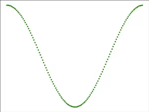
# import the matplotlib pyplot module. from matplotlib import pyplot as plt # import the numpy module. import numpy as np # import the math module. import math # generate the x axis value. x = np.arange(0, math.pi*2, 0.05) # caculate the y axis value with the numpy cos() method. y = np.cos(x) # call the PyPlot module's figure() method to create the Matplotlib figure object. figure_object = plt.figure() # create a canvas object in the figure object. ax = figure_object.add_axes([0,0,1,1]) # plot the green dot cos curve. ax_plot = ax.plot(x,y, 'g.') print(ax_plot[0]) # display the figure. plt.show() -
当你运行上述例子的源代码时,你会得到下面的图。