Matplotlib可以根据变量的取值范围自动设置x和y值。但是你也可以通过set_xlim(xmin, xmax)和set_ylim(ymin, ymax)方法自定义x轴和y轴的数值范围。当设置一个三维图像时,将增加Z轴。你可以使用set_zlim(zmin, zmzx)来设置z轴。本文将向你展示如何设置x轴和y轴的数值范围的例子。
1.Matplotlib设置X轴和Y轴的取值范围示例
-
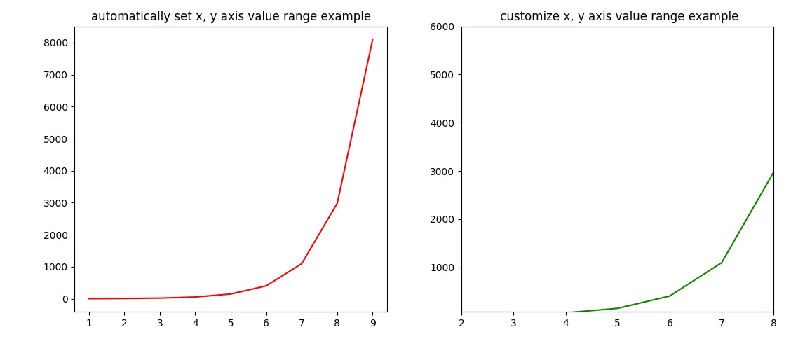
这个例子包含2个图。
-
左边的图使用了Matplotlib自动生成的x轴和y轴的数值范围。
-
在右边的图中,用**set_xlim(xmin, xmax)和set_ylim(ymin, ymax)**方法自定义x轴和y轴的数值范围。
-
下面是例子的源代码:
import matplotlib.pyplot as plt import numpy as np def set_plot_axis_value_range(): # prepare the x and y axis's values. x_axis_value_array = np.arange(1, 10) y_axis_value_array = np.exp(x_axis_value_array) # the plot canvas is divided into 1 row and 2 columns. # get the left plot object. axes1 = plt.subplot2grid((1,2),(0,0),colspan = 1, rowspan = 1) # set the left plot title. axes1.set_title('automatically set x, y axis value range example') # plot the left figure, the curve's color is red. axes1.plot(x_axis_value_array, y_axis_value_array, color='r') # get the right plot object. axes2 = plt.subplot2grid((1,2),(0,1), rowspan = 1, colspan = 1) # set the right plot title. axes2.set_title(' customize x, y axis value range example') # plot the right figure, the curve's color is green. axes2.plot(x_axis_value_array, y_axis_value_array, color='g') # set the right figure's x and y axis's display value range. axes2.set_xlim(xmin = 2, xmax = 8) axes2.set_ylim(ymin = 80, ymax = 6000) # display the plot. plt.tight_layout() plt.show() if __name__ == '__main__': set_plot_axis_value_range() -
下面是上述例子创建的图