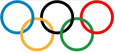
这个例子将告诉你如何使用Html和CSS在Html网页上实现奥运五环。
1.环的交错效果是如何实现的
- 以蓝环和黄环为例,蓝环是基准,黄环被切割成两部分。
- 第一部分在蓝环的上方,第二部分在蓝环的下方。
- 画完蓝环和黄环后,你可以继续画黑环。
- 这次以黄环为基准,黑环要切成两部分。
- 然后分别设定绿环和红环的样式,原理是一样的。
2.奥运会吊环示例源代码
-
Html文件的名称是implement_olympic_rings_use_html_css.html。
-
把下面的Html内容代码写进html文件。
<!DOCTYPE html> <html> <head> <meta charset="UTF-8"> <title>Implement Olympic Rings Use Html And CSS</title> <style> /* define the rings basic css style */ .ring { width: 100px; height: 100px; border-radius: 50%; position: absolute; border-style: solid; border-width: 10px; } /* define the blue ring css style */ .blue { border-color: #0180C3; top: 0; left: 0; z-index: 0; } /* define the yellow ring basic css style */ .yellow { border-color: #FEB131; left: 70px; top: 60px; } /* define the first part of the yellow ring css style */ .yellow1 { /* above the blue ring */ z-index: 1; /* clip circle */ clip-path: polygon(0 0, 100% 100%, 0 100%); } /* define the second part of the yellow ring css style */ .yellow2 { /* under the blue ring */ z-index: -1; clip-path: polygon(0 0, 100% 100%, 100% 0); } /* define the black ring basic css style */ .black { border-color: black; left: 140px; top: 0px; } /* define the first part of the black ring css style */ .black1 { z-index: -2; clip-path: polygon(0 0, 100% 0, 0 100%); } /* define the second part of the black ring css style */ .black2 { z-index: 0; clip-path: polygon(100% 0, 100% 100%, 0 100%); } /* define the green ring basic css style */ .green { border-color: #059341; left: 210px; top: 60px; } /* define the first part of the green ring css style */ .green1 { z-index: 1; clip-path: polygon(0 0, 100% 100%, 0 100%); } /* define the second part of the green ring css style */ .green2 { z-index: -1; clip-path: polygon(0 0, 100% 100%, 100% 0); } /* define the red ring basic css style */ .red { border-color: #FF0000; left: 280px; top: 0px; } /* define the first part of the red ring css style */ .red1 { z-index: -2; clip-path: polygon(0 0, 100% 0, 0 100%); } /* define the second part of the red ring css style */ .red2 { z-index: 0; clip-path: polygon(100% 100%, 100% 0, 0 100%); } </style> </head> <body> <div class="container"> <!-- the blue ring div --> <div class="ring blue"></div> <!-- the 2 yellow ring divs --> <div class="ring yellow yellow1"></div> <div class="ring yellow yellow2"></div> <!-- the 2 black ring divs --> <div class="ring black black1"></div> <div class="ring black black2"></div> <!-- the 2 green ring divs --> <div class="ring green green1"></div> <div class="ring green green2"></div> <!-- the 2 red ring divs --> <div class="ring red red1"></div> <div class="ring red red2"></div> </div> </body> </html> -
在网页浏览器中打开上述Html文件,你可以看到下面的Html页面。