

简介
在本教程中,我们将解释如何在R中用ggplot2包创建直方图,ggplot2包是R中非常流行的用于创建可视化的开源包。首先,我们将了解geom_histogram()的语法,它是用于创建直方图的ggplot2几何对象。然后,我们将看到在ggplot2中创建直方图的多个例子。
ggplot2中散点图的语法
在ggplot2中创建散点图的最小语法是
ggplot(, mapping = aes() + geom_histogram()
ggplot2可以让你在图中添加更多的层,如主题、实验室等,以创建更高级的直方图。
在R中使用ggplot2绘制直方图的例子
加载库和数据集
让我们从加载ggplot2库开始。
我们将在所有ggplot2直方图的例子中使用笔画数据集。我们将这些数据加载到一个数据框中,并使用head命令检查顶行。
In[0]:
df <- read.table("stroke.csv",header=TRUE,sep=',')
options( warn = -1 )
head(df)
Out[0]:
Out[0]:
| id | 性别 | 年龄 | 高血压 | 心脏病 | 曾婚 | 工作类型 | 居住类型 | 平均血糖水平 | BMI | 吸烟状况 | 中风 |
|---|---|---|---|---|---|---|---|---|---|---|---|
| 9046 | 男性 | 67 | 0 | 1 | 有 | 私营 | 城市 | 228.69 | 36.6 | 曾经吸烟 | 1 |
| 51676 | 女性 | 61 | 0 | 0 | 有 | 自营职业者 | 农村 | 202.21 | 不适用 | 从不吸烟 | 1 |
| 31112 | 男性 | 80 | 0 | 1 | 有 | 私营 | 农村 | 105.92 | 32.5 | 从不吸烟 | 1 |
| 60182 | 女性 | 49 | 0 | 0 | 有 | 私营 | 城市 | 171.23 | 34.4 | 吸烟 | 1 |
| 1665 | 女性 | 79 | 1 | 0 | 有 | 自营职业者 | 农村 | 174.12 | 24 | 从不吸烟 | 1 |
| 56669 | 男性 | 81 | 0 | 0 | 有 | 私营 | 城市 | 186.21 | 29 | 曾经吸烟 | 1 |
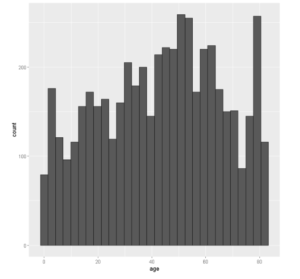
例1:在ggplot2中绘制基本直方图
让我们创建一个基本的直方图,将数据框与审美映射中的x=age一起传递给ggplot()。然后我们添加geom_histogram()的层。
In[1]:
# Basic histogram
library(ggplot2)
ggplot(df, aes(x=age)) + geom_histogram()
Out[1]:
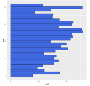
例2:ggplot2中的水平直方图
我们可以通过使用coord_flip()在ggplot2中创建一个水平直方图,它可以将一个垂直直方图翻转为水平直方图。
In[2]:
ggplot(df, aes(x=age)) +
geom_histogram(color='black',fill="royalblue")+
coord_flip()
输出[2]:
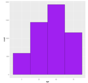
例3:在ggplot2中改变直方图的binwidth
默认情况下,在ggplot2中,直方图的bin宽度为30。我们可以通过使用geom_histogram()的binwidth参数来改变它,如下所示。
In[3]:
# Change the width of bins
ggplot(df, aes(x=age)) +
  geom_histogram(color='black',fill='purple',binwidth=25)
输出[3]:
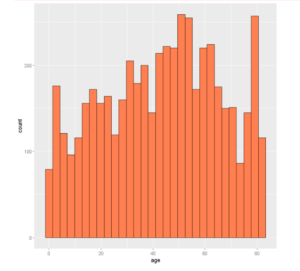
例四:改变柱状图的颜色
为了改变柱状图的颜色,我们应该在fill参数中输入所需的颜色。这些柱状图边上的颜色也可以用颜色参数来定制。
In[4]:
ggplot(df, aes(x=age)) +
  geom_histogram(color="black", fill="coral")
输出[4]:
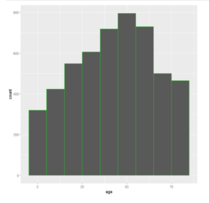
例5:改变柱状图的边框颜色
柱状图边框的颜色可以通过geom_histogram()的颜色参数来改变,如下例所示
In[6]:
ggplot(data =df, aes(x =age)) +
  geom_histogram(color = 'green',binwidth=10)
Out[6]:
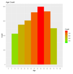
例6:颜色梯度图
让我们绘制直方图,并通过显示颜色梯度来区分不同的计数条。
在 [7]:
plot_hist <- ggplot(df, aes(x =age)) +
     geom_histogram(aes(fill = ..count..), binwidth = 10)+
     scale_x_continuous(name = "Age", breaks = seq(0, 200,5), limits=c(0, 80)) +
     scale_y_continuous(name = "Count") +
     ggtitle("Age Count") +
     scale_fill_gradient("Count", low = "green", high = "red")

plot_hist
Out[7]:
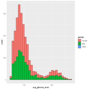
例7:按组绘制直方图颜色
我们可以给填充参数指定一个属性,我们想在直方图中对其进行分组。在下面的例子中,我们将 "性别 "作为填充参数。
In[8]:
ggplot(df, aes(x=avg_glucose_level, fill=gender)) +
  geom_histogram(color='black', alpha=1)
Out[8]:
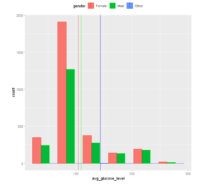
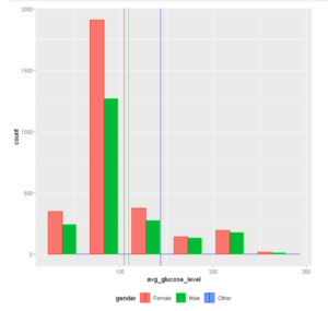
例8:在直方图上添加平均线
我们可以通过使用geom_vline()在ggplot2中为直方图添加平均线,如下所示。
在[9]中:
# Add mean lines
ggplot(df, aes(x=avg_glucose_level, color=gender,fill=gender)) +
  geom_histogram(position="dodge",binwidth=45)+
  geom_vline(data=avg_gluc, aes(xintercept=grp.mean, color=gender),
             linetype="solid")+ scale_color_manual(values=c("red", "green", "blue")) +
  theme(legend.position="top")
Out[9]:
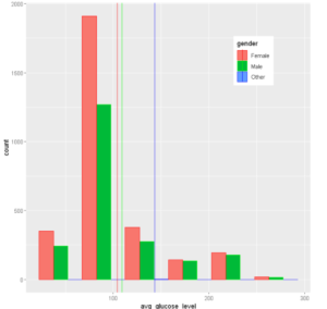
例9:改变图例的位置
我们可以使用 legend.position 方法来改变图例的位置,进一步说,我们可以通过x和y坐标来为图例定制一个理想的位置。(我们使用的是上面创建的同一个图。)
In[10]:
p + theme(legend.position="bottom")
Out[10]:
自定义图例的位置。
在[11]中:
p + theme(legend.position = c(0.8, 0.8))
Out[11]:
完全删除图例。
In [12]:
p + theme(legend.position="none")
输出[12]:
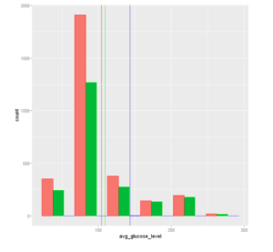
例10:设置直方图的轴限值
为了指定X轴和Y轴允许的数值范围,我们可以使用xlim和ylim参数。
In[13]:
ggplot(df, aes(x=avg_glucose_level,color=gender,fill=gender)) +                        # Modify x- & y-axis limits
  geom_histogram() +scale_fill_manual(values=c("royalblue", "yellow2", "green"))+xlim(40, 255) +ylim(0, 620)
Out[13]:
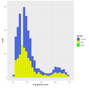
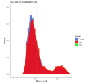
例11:在ggplot2中绘制直方图密度图
我们还可以通过使用geom_density()和geom_histogram()在ggplot2中创建直方图密度图,如下面的例子所示。
In[14]:
# Change line colors by groups
ggplot(df, aes(x=avg_glucose_level,color=gender,fill=gender)) +
geom_histogram(aes(y=..density..), position="identity", alpha=0.7)+
geom_density(alpha=0.8)+
geom_vline(data=avg_gluc, aes(xintercept=grp.mean, color=gender),
           linetype="dashed")+
scale_color_manual(values=c("#999999", "#E69F00", "#56B4E9"))+
scale_fill_manual(values=c("royalblue", "red", "green"))+
labs(title="Glucose level histogram plot",x="Glucose level", y = "Density")+
theme_classic()+xlim(0, 255) +ylim(0,0.02)
Out[14]:
-
还可以阅读 - 使用ggplot2在R中学习散点图并举例说明
-
还可以阅读 - 使用ggplot2在R中绘制直线图的教程及实例
-
参考资料 -ggplot2文档
