

简介
R有一个非常流行的库ggplot2,可以很容易地创建漂亮的可视化。在这篇文章中,我们将向你展示一个在ggplot2中创建条形图的教程。首先,我们将介绍geom_bar()的语法,并介绍用它来创建不同类型的条形图的各种例子。
ggplot2中条形图的语法
在ggplot2中,以下是生成条形图的最基本的语法 --
ggplot(, mapping = aes() + geom_bar()
你可以通过添加更多的层次来定制条形图,如主题、实验室等。
在R中使用ggplot2绘制条形图的例子
加载数据集
我们将使用学生成绩数据集来绘制ggplot2条形图的所有例子。它包含各种特征,如性别、种族、父母的教育水平、午餐状况、考试准备课程,也有他们在数学、阅读和写作方面的考试成绩。
在[0]:
df <- read.table("student.csv",header=TRUE,sep=',')
head(df)
| 性别 | 种族。 | 父母的教育水平 | 午餐 | 考试准备课程 | 数学成绩 | 阅读成绩 | 写作分数 |
|---|---|---|---|---|---|---|---|
| 女性 | B组 | 学士学位 | 标准 | 无 | 72 | 72 | 74 |
| 女性 | C组 | 一些大学 | 标准 | 已完成 | 69 | 90 | 88 |
| 女性 | B组 | 硕士学位 | 标准 | 无 | 90 | 95 | 93 |
| 男性 | A组 | 副学士学位 | 免费/减免 | 没有 | 47 | 57 | 44 |
| 男性 | C组 | 一些大学 | 标准 | 没有 | 76 | 78 | 75 |
| 女性 | B组 | 副学士学位 | 标准 | 无 | 71 | 83 | 78 |
加载ggplot2
ggplot2库可以通过下面的行来加载。
在[1]中:
library(ggplot2)
例子1:在ggplot2中绘制基本条形图
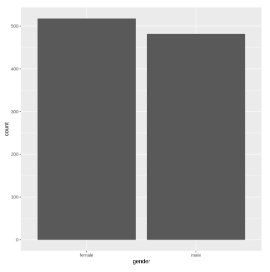
在下面的例子中,我们通过传递数据集以及x和y的属性映射,在ggplot2中绘制了非常基本的条形图。
In[2]:
ggplot(data=df, aes(x=gender, y=reading.score)) +
geom_bar(stat="identity")
输出[2]:
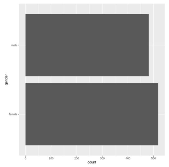
例2:水平条形图
我们可以在ggplot2中借助coord_flip()层来创建水平条形图。在下面的例子中,我们要把上面创建的条形图翻转为水平的。
In[3]:
ggplot(data=df, aes(x=gender, y=reading.score)) +
geom_bar() + coord_flip()
输出[3]:
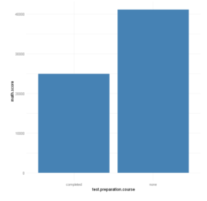
例四:改变柱状图的颜色
条形图的颜色可以通过使用geom_bar()中的填充参数来改变,如下面的例子所示。
在[4]中:
ggplot(data=df, aes(x=test.preparation.course, y=math.score)) +
geom_bar(stat="identity", fill="steelblue")
Out[4]:
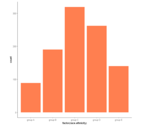
例子5:使用条形图的主题
我们可以在柱状图上添加一个主题层,如下面的例子所示,以获得更好的外观。ggplot2库中有很多主题,你可以从这里找到列表。
In[5]:
ggplot(df, aes(x = factor(race.ethnicity))) +
    geom_bar(fill = "coral") +
    theme_classic()
Out[5]:
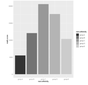
例6:灰度条形图
灰色的阴影在打印和复印时都能很好地显示出来。要想只用灰度来显示条形图,可以使用scale_fill_grey()。
In[6]:
ggplot(df, aes(x =race.ethnicity,y=math.score, fill=race.ethnicity)) +
    geom_bar(stat="identity") +
  scale_fill_grey()
输出[6]:
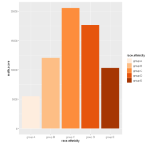
例7:在条形图中使用彩色调色板
在ggplot2中,我们可以通过使用scale_fill_brewer()在条形图中添加许多颜色的调色板。
In[7]:
ggplot(df, aes(x =race.ethnicity,y=math.score, fill=race.ethnicity)) +
geom_bar(stat="identity") +  scale_fill_brewer(palette="Oranges")
Out[7]:
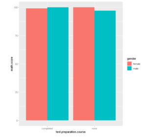
例8:躲避条形图
你可以创建并排的条形图,这也被称为 "回避 "图。要绘制一个躲避条形图,你需要在geom_bar( )中提供position = "躲避 "参数。
In[8]:
ggplot(df, aes(x =test.preparation.course , y =math.score, fill =gender)) +
geom_bar(stat = "identity", position = "dodge")
输出[8]:
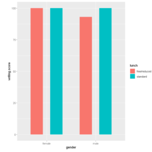
例九:控制条形图的间距
为了增加条形图的间距,你需要设置 position_dodge 大于条形图的宽度值。
In [9]:
ggplot(data =df, mapping = aes(x =gender, y =writing.score, fill =lunch)) +
geom_bar(stat = "identity", width = 0.5, position = position_dodge(0.8))
Out[9]:
- 还可以阅读 - R语言中使用ggplot2绘制直方图的教程及实例
- 还可以阅读 - 使用ggplot2学习R语言中的散点图及实例
- 还可以阅读 -在R中使用ggplot2绘制线图的教程及实例
