css手写箭头流动画,直线、垂直箭头流动画

先给大家看一下效果图
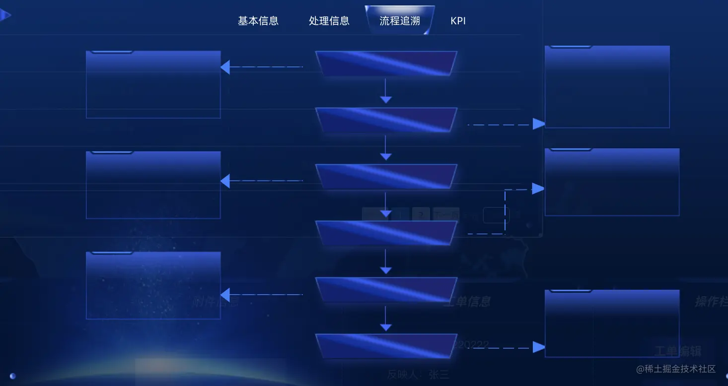
<template>
<div class="boxcenter">
<ul class="infoleft verticalflex">
<li v-for="item in datatime" :key="item">
<div>操作人:{{ item.operate }}</div>
<div>部门:{{ item.department }}</div>
<div>流程:{{ item.process }}</div>
<div v-show='item.remark'>备注:{{item.remark}}</div>
</li>
</ul>
<ul class="iconnav verticalflex">
<li v-for="data in (datatime.length/2)" :key="data">
<div></div>
</li>
</ul>
<div class="centeritem">
<ul class="timecenter">
<li v-for="item in datatime" :key="item">{{ item.year }} {{ item.time }}</li>
</ul>
<ul class="arrow verticalflex">
<li v-for="data in (datatime.length-1)" :key="data"></li>
</ul>
</div>
<ul class="iconfonav verticalflex">
<li>
<div></div>
</li>
<li>
<div class="border">
<center>
<div class="borderbox">
</div>
</center>
</div>
</li>
<li>
<div></div>
</li>
<li>
<div></div>
</li>
</ul>
</div>
</template>
<script>
export default {
data() {
return {
datatime: [
{
operate: '张三',
remark: '',
department: '北片区',
process: '系统接单',
year: '2022-06-07',
time: '10:00:00'
},
{
department: '北片区',
remark: '',
process: '系统接单',
operate: '张三',
year: '2022-06-07',
time: '10:00:00'
},
{
operate: '张三',
department: '北片区',
remark: '',
process: '系统接单',
year: '2022-06-07',
time: '10:00:00'
},
{
operate: '张三',
remark: '预计复水时间',
process: '系统接单',
department: '北片区',
year: '2022-06-07',
time: '10:00:00'
},
{
remark: '',
department: '北片区',
process: '系统接单',
operate: '张三',
year: '2022-06-07',
time: '10:00:00'
},
{
department: '北片区',
remark: '',
process: '系统接单',
operate: '张三',
year: '2022-06-07',
time: '10:00:00'
}
]
}
}
}
</script>
<style lang='scss' scoped>
@keyframes flow {
from {
transform: translateX(0);
}
to {
transform: translateX(-50%);
}
}
@keyframes flowY {
from {
transform: translateY(0);
}
to {
transform: translateY(-50%);
}
}
@keyframes flowright {
from {
transform: translateX(-50%);
}
to {
transform: translateX(0);
}
}
* {
margin: 0;
padding: 0;
box-sizing: border-box;
}
.boxcenter {
height: 459px;
width: 942px;
display: flex;
}
.infoleft {
margin-top: 7px;
margin-left: 106px;
display: flex;
position: relative;
flex-wrap: wrap;
li {
width: 181px;
height: 91px;
background-image: url("./img/liuchen1.png");
background-repeat: no-repeat;
background-size: 100%;
margin-bottom: 44px;
}
li:nth-child(2) {
position: absolute;
left: 616px;
top: 20px;
}
li:nth-child(4) {
position: absolute;
left: 620px;
top: 155px;
}
li:nth-child(6) {
position: absolute;
left: 620px;
top: 327px;
}
// li:nth-child(3) {
// margin-bottom: 0;
// }
}
.verticalflex {
display: flex;
height: 459px;
flex-direction: column;
}
.iconnav {
width: 120px;
margin-top: 19px;
& > li {
position: relative;
margin: 0;
padding: 0;
height: 100%;
width: calc(100% - 10px);
overflow: hidden;
}
& > div {
width: 114px;
height: 22px;
background-repeat: no-repeat;
background-size: 100%;
margin-bottom: 139px;
margin: 0;
padding: 0;
overflow: hidden;
}
li::before {
content: "";
position: absolute;
right: 98px;
top: 0;
width: 0;
height: 0;
border: 10px solid transparent;
border-right-width: 13px;
border-right-color: #3782ff;
}
div::before {
content: "";
position: absolute;
width: 300%;
height: 1px;
top: 9px;
background: repeating-linear-gradient(90deg, #3782ff 0, #3782ff 15px, #3782ff 15px, rgba(0, 0, 0, 0) 20px);
transform: translateX(-100%);
animation: flow linear 8s infinite;
}
li:nth-child(3) {
margin-bottom: 0;
}
}
.timecenter {
// margin-top: 19px;
li {
width: 212px;
height: 57px;
background-image: url("./img/timeicon.png");
background-repeat: no-repeat;
background-size: 100%;
margin-bottom: 19px;
}
}
.centeritem {
position: relative;
}
.arrow {
position: absolute;
top: 44px;
li {
background-image: url("./img/bottomjian.png");
background-repeat: no-repeat;
background-size: 100%;
width: 17px;
height: 35.56px;
margin-left: 93px;
margin-bottom: 41px;
// left: 100px;
// bottom: 20px;
}
}
.iconfonav {
margin-top: 97px;
position: relative;
& > li {
position: relative;
margin: 0;
padding: 0;
width: 103px;
height: 24px;
overflow: hidden;
& > div {
position: relative;
margin: 0;
padding: 0;
height: 100%;
width: calc(100% - 10px);
overflow: hidden;
}
& > div::before {
content: "";
position: absolute;
width: 200%;
height: 1px;
top: calc(50% - 3px);
background: repeating-linear-gradient(90deg, #3782ff 0, #3782ff 15px, rgba(0, 0, 0, 0) 15px, rgba(0, 0, 0, 0) 20px);
transform: translateX(-100%);
animation: flowright linear 8s infinite;
}
}
& > li::after {
content: "";
position: absolute;
right: -12px;
top: 0;
width: 0;
height: 0;
border: 8px solid transparent;
border-left-width: 20px;
border-left-color: #3782ff;
}
& > li:nth-child(2)::after {
border: none;
}
& > li:nth-child(2) {
margin-bottom: 130px;
margin-top: 118px;
width: 60px;
// left: 0px;
}
& > li:nth-child(2) {
margin-bottom: 177px;
margin-top: 75px;
overflow: visible;
.border {
height: 119px;
// transform: scaleY(10px);
padding-top: 20px;
center {
position: relative;
margin: 0;
padding: 0;
transform: translateY(18px) !important;
left: 49px;
top: -40px;
height: 70px;
width: 2px;
overflow: visible;
.borderbox {
position: relative;
margin: 0;
padding: 0;
width: 100%;
height: calc(100% - 10px);
overflow: hidden;
// .searitem {
// position: relative;
// margin: 0;
// padding: 0;
//
// width: 500px;
//
// height: 24px;
// overflow: hidden;
//
// .tranform {
// position: relative;
// margin: 0;
// padding: 0;
// height: 100%;
// width: calc(100% - 10px);
// overflow: hidden;
// }
//
// .tranform::before {
// content: "";
// position: absolute;
// width: 200%;
//
// height: 6px;
// top: calc(50% - 3px);
//
// background: repeating-linear-gradient(90deg, skyblue 0, skyblue 15px, rgba(0, 0, 0, 0) 15px, rgba(0, 0, 0, 0) 20px);
// transform: translateX(-100%);
// animation: flow linear 8s infinite;
// }
// }
//
// .searitem::after {
// content: "";
// position: absolute;
//
// right: -12px;
// top: 0;
// width: 0;
// height: 0;
//
// border: 12px solid transparent;
//
// border-left-width: 20px;
// border-left-color: skyblue;
// }
}
.borderbox::before {
content: "";
position: absolute;
height: 200%;
width: 6px;
left: calc(50% - 3px);
background: repeating-linear-gradient(0deg, #3782ff 0, #3782ff 15px, rgba(0, 0, 0, 0) 15px, rgba(0, 0, 0, 0) 20px);
transform: translateY(100%);
animation: flowY linear 8s infinite;
}
}
}
}
& > li:nth-child(4) {
position: absolute;
top: 87px;
left: 49px;
width: 53px;
}
}
.inforight {
& > li:nth-child(1) {
width: 168px;
height: 111px;
background-image: url("./img/liuchen2.png");
background-repeat: no-repeat;
background-size: 100%;
}
& > li:nth-child(2), & > li:nth-child(3) {
width: 181px;
height: 91px;
background-image: url("./img/liuchen1.png");
background-repeat: no-repeat;
background-size: 100%;
}
& > li:nth-child(2) {
margin-top: 27px;
margin-bottom: 99px;
}
}
</style>


