

Bootstrap是一个很棒的CSS框架,可以帮助你创建时尚、圆润的网站。
一些开发者和团队发现,用Bootstrap编写的代码比普通的CSS更容易维护,所以他们更喜欢Bootstrap而不是vanilla CSS。
但是,如果每个人都使用Bootstrap的默认样式,那么每个网站看起来都一样--很快,互联网就会变得非常平淡。幸运的是,Bootstrap也是高度可定制的。
如何定制Bootstrap
如果你是初学者,你可以通过自定义CSS样式表来定制Bootstrap。CSS的特殊性在这里很重要。你可以用相同或更高的特异性编写自定义CSS,并在index.html的head部分中,在链接到Bootstrap原始CSS的那一行之后链接到它:
<!-- index.html -->
<head>

    <link rel="stylesheet" href="./node_modules/bootstrap/dist/css/bootstrap.min.css">
    <!-- custom CSS should come after Bootstrap CSS -->
    <link rel="stylesheet" href="./custom.css"

</head>
对于小的调整,这样做是可以的。但对于大型项目来说,这可能会很耗时,而且可能会有很多多余的样式声明。所以必须有另一种更干净的方法。
如何在Bootstrap中使用Sass
这个解决方案就是使用Sass--一个CSS预处理器。Sass在被用于网页之前会被编译成CSS。
在Bootstrap 3.x版本之前,你可以在CSS预处理器中进行选择。Less或Sass。但从第4版开始,Bootstrap只使用Sass。Bootstrap 4和5框架的源代码完全是用Sass编写的,这证明了Sass已经变得非常成熟。
你可能听说过这样的标语:"Sass是具有超能力的CSS"。如果你想学习Sass,官方网站是一个很好的资源。你也可以参考freeCodeCamp上的其他教程,比如这个关于如何使用Sass与CSS的教程,或者这个关于如何使用Sass与Bootstrap 5的视频课程。
Sass有两种语法。较早的一种使用缩进,较新的SCSS语法(SCSS为Sassy CSS)使用类似CSS的大括号。
SCSS是CSS的一个超集。因此,以.scss为扩展名保存的CSS代码(或穿插在CSS中的SCSS)也是有效的Sass代码。
在本教程中,我们将使用SCSS版本。不管是什么样式,缩进的Sass或类似CSS的SCSS,Sass编译器都会将其转译为香草式CSS,在浏览器上使用。
我们在本教程中要做的是
- 我们将改变Bootstrap的主要和次要主题颜色。
- 我们还将改变Bootstrap使用的默认媒体中断点。
一旦我们能做到这些,做其他的定制工作就会变得很容易。
先决条件
- 使用npm或yarn的Node.js
- 一个代码编辑器,最好是VS Code。
- 对Sass有基本了解
从官方网站下载Bootstrap:https://getbootstrap.com
由于我们已经安装了Node.js,我打算使用npm版本。
npm i bootstrap
我们还需要安装Sass编译器。我们可以从他们的网站上获得官方的dart-sass版本。无论你是在Windows、Mac还是Linux上,你只需要下载dart-sass包,解压缩,并将其添加到路径(环境变量)中。
有一个npm sass包。此外,还有一个Live Sass CompilerVS Code扩展,安装量超过200万。你可以自由地使用你喜欢的任何Sass编译器。
这里,我们将使用npm包:sass。
下载Bootstrap和Sass编译器后,在node-modules 目录中,有一个名为bootstrap 的文件夹。
里面也有三个文件夹。dist,js, 和scss 。
所有编译的CSS都在dist ,Bootstrap的JavaScript代码在js ,所有的Sass文件都在scss 。
如何改变主题的主色调和次色调
对于自定义,我们的想法是覆盖.scss文件并重新编译。
Bootstrap官方文档建议尽可能不要改变核心的bootstrap文件。所以我们要创建一个自定义.scss样式表。
而我们要在custom.scss文件中导入所有的Bootstrap:
//custom.scss

@import "../node_modules/bootstrap/scss/bootstrap";
在Bootstrap中,变量的后缀是!default (一个Sass标志)。!default 标志告诉编译器,只有在该值未被定义的情况下才设置该值。
因此,我们在@import指令之前设置变量,这样,以后编译器就会设置我们的值,而不是默认值:
//custom.scss

$primary: teal;
$secondary: green;

@import "../node_modules/bootstrap/scss/bootstrap";
我们还需要一个HTML文件来预览结果:
<!-- index.html -->
<!DOCTYPE html>
<html lang="en">
<head>
    <meta charset="UTF-8">
    <meta http-equiv="X-UA-Compatible" content="IE=edge">
    <meta name="viewport" content="width=device-width, initial-scale=1.0">
    <title>Welcome! Customize Bootstrap with Sass</title>
    <link rel="stylesheet" href="./node_modules/bootstrap/dist/css/bootstrap.min.css"
</head>
<body>
 <div class="container" >
 <div class="row">
    <nav class="navbar navbar-expand-lg navbar-light bg-primary">
        <div class="container-fluid">
          <a class="navbar-brand" href="#">Customize Bootstrap</a>
          <button class="navbar-toggler" type="button" data-bs-toggle="collapse" data-bs-target="#navbarSupportedContent" aria-controls="navbarSupportedContent" aria-expanded="false" aria-label="Toggle navigation">
            <span class="navbar-toggler-icon"></span>
          </button>
          <div class="collapse navbar-collapse" id="navbarSupportedContent">
            <ul class="navbar-nav me-auto mb-2 mb-lg-0">
              <li class="nav-item">
                <a class="nav-link active" aria-current="page" href="#">Home</a>
              </li>
              <li class="nav-item">
                <a class="nav-link" href="#">Link</a>
              </li>
              <li class="nav-item dropdown">
                <a class="nav-link dropdown-toggle" href="#" id="navbarDropdown" role="button" data-bs-toggle="dropdown" aria-expanded="false">
                  Dropdown
                </a>
                <ul class="dropdown-menu" aria-labelledby="navbarDropdown">
                  <li><a class="dropdown-item" href="#">Action</a></li>
                  <li><a class="dropdown-item" href="#">Another action</a></li>
                  <li><hr class="dropdown-divider"></li>
                  <li><a class="dropdown-item" href="#">Something else here</a></li>
                </ul>
              </li>
              <li class="nav-item">
                <a class="nav-link disabled" href="#" tabindex="-1" aria-disabled="true">Disabled</a>
              </li>
            </ul>
            <form class="d-flex">
              <input class="form-control me-2" type="search" placeholder="Search" aria-label="Search">
              <button class="btn btn-outline-success" type="submit">Search</button>
            </form>
          </div>
        </div>
      </nav>
<div class="container">
<div class="row">

  <div class="col-xl pt-3">
    Lorem ipsum dolor sit amet consectetur adipisicing elit. Vero, laborum hic, quia maiores animi nobis eligendi est eos saepe architecto reiciendis! Aliquam inventore distinctio reprehenderit corporis amet assumenda officiis dolorem, animi delectus sunt dolor commodi. Adipisci nam nemo labore eligendi quas, rem ipsum iusto eveniet itaque vero necessitatibus! Quas, cupiditate tempora unde nam exercitationem libero aut labore deserunt nesciunt voluptate dignissimos quis porro reprehenderit maiores excepturi, esse, nisi dolores sit tenetur voluptatum corrupti alias provident pariatur? Quam illo unde autem, fugit numquam dolores, odio sed rem saepe exercitationem fuga, nisi soluta sunt officiis! Similique, vero repudiandae quae dignissimos fuga natus!
    </div>

  <div class="col-xl pt-3 ">
    Lorem ipsum dolor sit, amet consectetur adipisicing elit. Numquam, aliquid, cumque nisi tenetur similique labore repudiandae voluptas qui hic blanditiis beatae sapiente autem dolore! Quam, cupiditate nostrum laboriosam blanditiis vel ratione, repellat, incidunt modi tempore soluta ab nesciunt? Ab similique illum suscipit exercitationem et, aut quisquam neque atque recusandae rem delectus facilis. Magnam rerum fugit minus explicabo vel! Hic quibusdam laudantium dolorum, pariatur ipsam veritatis voluptate animi, nesciunt dolorem autem dicta. Debitis quae nam dicta autem ipsum mollitia! Ipsum ipsa, molestias fugiat officiis aut illum ullam architecto maxime labore vitae. Ipsum quos neque rerum, esse iste quo explicabo eos ipsa?
    </div>

</div>
</div>

<div class="mt-5 pt-5 mb-5 text-center">
  <button type="button" class="btn btn-primary">Primary</button>
  <button type="button" class="btn btn-secondary">Secondary</button>
  <button type="button" class="btn btn-success">Success</button>
  <button type="button" class="btn btn-danger">Danger</button>
  <button type="button" class="btn btn-warning">Warning</button>
  <button type="button" class="btn btn-info">Info</button>
  <button type="button" class="btn btn-light">Light</button>
  <button type="button" class="btn btn-dark">Dark</button>
  <button type="button" class="btn btn-link">Link</button>
</div>

 </div>

 </div>

</body>
</html>
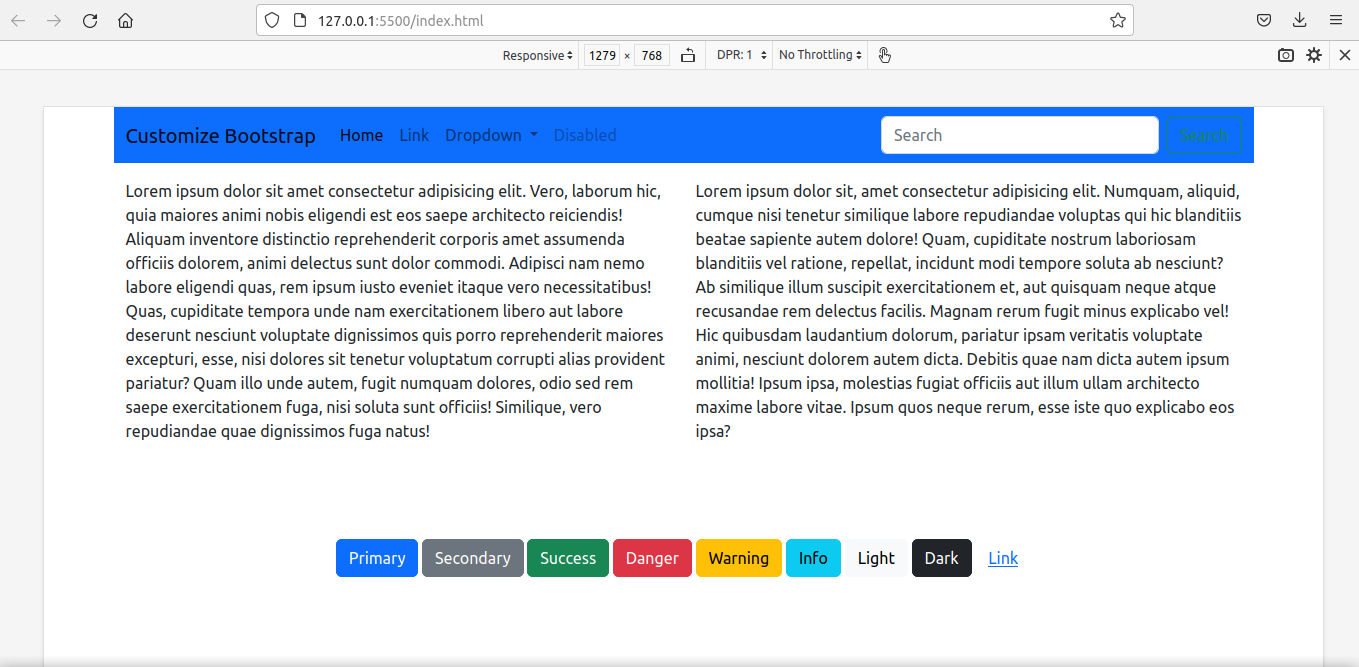
我们还没有编译Sass。要查看默认样式,请运行Live Server。
如果没有安装Live Server,你可以从VS Code扩展市场下载免费扩展。
这就是我们看到的情况:
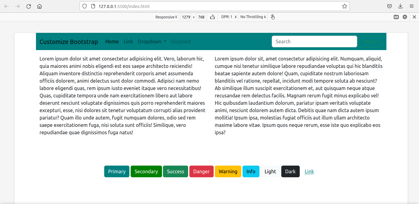
是时候编译我们的自定义Sass文件了。
编译的语法很简单。指定用冒号分隔的源文件夹和目标文件夹。
我把我的custom.scss文件放在一个叫custom_scss 的文件夹里:
sass custom_scss/custom.scss:assets/css/custom_bootstrap.css
重新编译后,我们在assets/css/custom_bootstrap.css 文件中就有了定制的bootstrap。
我们将使用这个定制的bootstrap样式表,而不是默认的bootstrap文件:
<!-- index.html -->
<head>

<link rel="stylesheet" href="./assets/css/custom_bootstrap.css"> `

</head>
然后再次运行Live Server。
我们得到了用我们的新样式定制的网页。
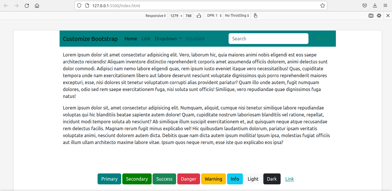
如何改变网格断点
我们现在要定制媒体断点。同时,我们也要重新定义容器的最大宽度。
最简单的方法是简单地覆盖这些变量:
$primary: teal;
$secondary:green;

$grid-breakpoints: (
  xs: 0,
  sm: 576px,
  md: 768px,
  lg: 992px,
  xl: 1280px,
  xxl: 1600px
);

$container-max-widths: (
  sm: 540px,
  md: 720px,
  lg: 960px,
  xl: 1220px,
  xxl: 1520px
);

@import '../node_modules/bootstrap/scss/bootstrap'
由于这违反了DRY原则(Don't Repeat Yourself),使用map-merge() 函数是一个更好的选择。
我们必须先在custom.scss文件中导入函数,以使map.merge() 。
我们还必须导入变量,因为$grid-breakpoints(将在函数中使用)是在那里定义的:
//custom.scss

$primary: teal;
$secondary: green;

@import '../node_modules/bootstrap/scss/functions';
@import '../node_modules/bootstrap/scss/variables';
这就是代码:
//custom.scss

$primary: teal;
$secondary: green;

//We have to import the functions first to use map.merge()

@import '../node_modules/bootstrap/scss/functions';

// We have to import the variables beforehand to
//use the variable $grid-breakpoints.
// Otherwise, compiler will show error - '$grid-breakpoints
//undefined.'

@import '../node_modules/bootstrap/scss/variables';

$new-breakpoints: (
    xl: 1280px,
    xxl:1600px
);

$grid-breakpoints: map-merge($grid-breakpoints, $new-breakpoints);

$new-container-max-widths: (
  xl: 1220px,
  xxl:1520px
);

$container-max-widths: map-merge($container-max-widths, $new-container-max-widths);

@import "../node_modules/bootstrap/scss/bootstrap";
我们再次编译并使用最新的文件来代替旧的文件。
<link rel="stylesheet" href="./assets/css/custom_bootstrap.css">
这就是最后的结果:
这不仅仅是主题颜色和媒体断点。边框、间距、盒状阴影、字体、图标......你可以定制任何东西。
我已经把上述所有代码放在了这个GitHubrepo中。
如果想进一步探索,Bootstrap官方文档是这方面的一个很好的资源。
总结
在本教程中,我已经向你展示了我们如何使用Sass来定制Bootstrap。
即使我们是在一个使用React与Bootstrap的项目中,想法也是一样的。创建一个自定义的.scss文件,进行自定义,导入bootstrap,重新编译,然后链接到自定义的文件,以取代原来的bootstrap文件。
学习愉快!
