

在这篇文章中,我们将编写一个Python脚本,从API中获取货币汇率,并绘制汇率与时间的关系图。
内容表:
-
问题陈述
-
实施
a.API的情况
b.使用的API和设置
c.
使用的库
使用的库
d.脚本
e.绘制图表 -
结论
问题陈述
有时我们需要对数据集上的股票和汇率进行分析,以便为交易或其他需要获得正确的数据见解。所以今天我们要写一个Python脚本来绘制时间与汇率的图表。
要求
- 汇率API
- 提出网络请求的请求库
- JSON提取器库
- 用于形成数据框架的Pandas
- 用于绘制图表的Matplotlib
实施
API
为了完成这个任务,我们需要一个api来获取汇率数据集。有很多api服务器可以做同样的事情,其中一些是免费的,另一些是付费的。
API的列表
api.exchangerate.host(免费)api.exchangeratesapi.io(免费/付费)currencyapi.com(免费/付费)polygon.io(免费/付费)
对于这项任务,我们将使用api.exchangerate.host ,因为它是免费的,而且时间序列(一种涉及任意两个目标日期之间的数据集的版本。)也是免费的。
其他API的时间序列数据集是付费的。
请求库
Request是一个Python库,可以分别发送和接收服务器的请求和响应。在这里,我们使用它来发送所需数据的请求到api。
# here https://api.exchangerate.host/ is the host
# timeseries is one of the stamps for data type
# timeseries fetch all data set in between the mentioned dates

url = 'https://api.exchangerate.host/timeseries?base={0}&start_date={1}&end_date={2}&symbols={3}'.format(base,start_date,end_date,out_curr)
response = requests.get(url)

#we are using http get method by request to fetch url
在上面的代码中,url是api请求url的格式化字符串。
脚本
首先,我们将使用请求库来获取数据,然后我们需要JSON库来解析响应数据:
#import libraries to handle request to api
import requests
import json
import pprint
# base currency or reference currency
base="USD"

# required currency for plot
out_curr="INR"

# exchange data from a date
start_date="2021-01-01"

# exchange data till a date
end_date="2021-03-04"

# api url for request
url = 'https://api.exchangerate.host/timeseries?base={0}&start_date={1}&end_date={2}&symbols={3}'.format(base,start_date,end_date,out_curr)
response = requests.get(url)

# retrive response in json format
data = response.json()

pprint.pprint(data["rates"])
输出:
> {'2021-01-01': {'INR': 73.092243},
> '2021-01-02': {'INR': 73.092239},
> '2021-01-03': {'INR': 73.086997},
>  ................................
> '2021-03-02': {'INR': 73.278633},
> '2021-03-03': {'INR': 73.025504},
> '2021-03-04': {'INR': 73.06728}}
在URL中我们有4个参数:
- base-> 它需要兑换的基础货币,例如:印度卢比、欧元、美元
- start_date-> 从这个日期开始的数据
- end_date-> 到所述日期的数据
- symbols-> 在这里,我们把所需的货币字符串放到一个或多个
在向api请求日期后,我们将使用JSON解析器将响应数据存储为json格式。
正如我们在上面的打印语句中看到的,响应中有很多我们不需要的辅助数据,因此我们要从响应中提取数据和它们的对应数据:
# create an empty array to store date and exchange rates
rates=[]
# extract dates and rates from each item of dictionary or json in the above created list
for i,j in data["rates"].items():
      rates.append([i,j[out_curr]])
print(rates)
输出:
>[['2021-01-01', 73.092243], ['2021-01-02', 73.092239], ['2021-01-03', 73.086997],
>...............................................................
>['2021-03-02', 73.278633], ['2021-03-03', 73.025504], ['2021-03-04', 73.06728]]
在上面的脚本中,我们已经在2d数组中提取了所需的数据。
现在我们要将上述数据做成一个数据框架:
# create an data frame
import pandas as pd
df=pd.DataFrame(rates)
# define column names explicitely
df.columns=["date","rate"]
df
输出:
>   date	      rate
> 0	2021-01-01	73.092243
> 1	2021-01-02	73.092239
> 2	2021-01-03	73.086997
> 3	2021-01-04	73.085430
> 4	2021-01-05	73.141760
> ...	...	...
> 58	2021-02-28	73.693804
> 59	2021-03-01	73.313893
> 60	2021-03-02	73.278633
> 61	2021-03-03	73.025504
> 62	2021-03-04	73.067280
>    63 rows × 2 columns
输出是完美的,符合我们的要求。
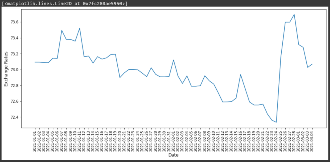
现在让我们进入最后的部分,我们将根据上述提取的数据绘制图表:
import matplotlib.pyplot as plt

# Put dates on the x-axis
x = df['date']
# Put exchange rates on the y-axis
y = df['rate']
# Specify the width and height of a figure in unit inches
fig = plt.figure(figsize=(15,6))
# Rotate the date ticks on the x-axis by degrees
plt.xticks(rotation=90)
# Set title on the axis
plt.xlabel('Date', fontsize=12)
plt.ylabel('Exchange Rates', fontsize=12)
# Plot the data
plt.plot(x,y)
总结
上述任务是我们实现的非常基本的功能。我们可以利用这些工具(在这篇OpenGenus文章中提到)对交易有一个很好的洞察力。
