

Bootstrap屏幕尺寸介绍
网络应用程序是以两种方式制作的。一种是静态的,另一种是响应式的。静态网络应用程序在一个屏幕尺寸上工作,但响应式网络应用程序根据屏幕尺寸进行修改。数字设备有不同的屏幕宽度。网络应用程序根据屏幕宽度来设置它们的尺寸。在这个话题中,我们将学习Bootstrap的屏幕尺寸。
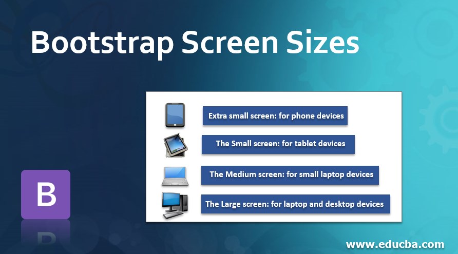
Bootstrap有四种屏幕尺寸:
- 超小屏幕:用于手机设备。
- 小屏幕:适用于平板设备。
- 中号屏幕:适用于小型笔记本设备。
- 大屏幕:适用于笔记本电脑和桌面设备。
语法
有四个类用于四个屏幕尺寸。以下是屏幕尺寸的语法:
- xs - 用于手机尺寸设备的超小屏幕。
- sm-- 小屏幕,用于平板电脑大小的设备。
- md--中等屏幕,用于小型笔记本尺寸的设备。
- lg--大屏幕,用于笔记本电脑和桌面大小的设备。
Bootstrap屏幕尺寸的类型
根据设备的不同,有四种类型的屏幕尺寸。
1.超小屏幕尺寸。
- xs的屏幕宽度小于768px。因此,xs总是出现一列(.col - xs)。
- 对于这种屏幕尺寸,容器的大小总是水平的。
2.小屏幕尺寸。
- 屏幕宽度等于或大于768px的sm。sm总是出现一列(.col - sm)。
- 容器尺寸折叠超过768px的水平显示。
3.中等的屏幕尺寸。
- 屏幕宽度等于或大于992px的md。md总是出现一列(.col - mg)。
- 容器大小折叠超过992px的水平显示。
4.大屏幕的尺寸。
- 屏幕宽度等于或大于1200px的为lg。 lg总是出现一列(.col - lg)。
- 容器尺寸塌陷超过1200px的水平显示。
Bootstrap屏幕尺寸的例子
下面提到了不同的例子。
例子#1 - 下面的例子是超小的屏幕尺寸。
代码:
<!DOCTYPE html>
<html>
<head>
<title> Bootstrap Screen size Example </title>
<meta charset="utf-8">
<meta name= "viewport" content= "width=device-width, initial-scale=1">
<link rel= "stylesheet" href= "https://maxcdn.bootstrapcdn.com/bootstrap/3.4.1/css/bootstrap.min.css">
</head>
<body>
<div class= "container-fluid">
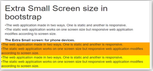
<h1> Extra Small Screen size in bootstrap </h1>
<p>The web application made in two ways. One is static and another is responsive. <br>
The static web application works on one screen size but responsive web application modifies according to screen size.
</p>
<b> The Extra Small screen: for phone devices. </b>
<div class="row">
<div class="col-xs" style="background-color:orange;">
The web application made in two ways. One is static and another is responsive. <br>
The static web application works on one screen size but responsive web application modifies according to screen size.
</div>
<div class="col-xs" style="background-color:yellow;">
The web application made in two ways. One is static and another is responsive. <br>
The static web application works on one screen size but responsive web application modifies according to screen size.
</div>
</div>
</div>
<script src= "https://ajax.googleapis.com/ajax/libs/jquery/3.4.1/jquery.min.js">
</script>
<script src= "https://maxcdn.bootstrapcdn.com/bootstrap/3.4.1/js/bootstrap.min.js">
</script>
</body>
</html>
输出:
例子#2 - 下面的例子是小尺寸的屏幕。
代码:
<!DOCTYPE html>
<html>
<head>
<title> Bootstrap Screen size Example </title>
<meta charset="utf-8">
<meta name= "viewport" content= "width=device-width, initial-scale=1">
<link rel= "stylesheet" href= "https://maxcdn.bootstrapcdn.com/bootstrap/3.4.1/css/bootstrap.min.css">
</head>
<body>
<div class="container-fluid">
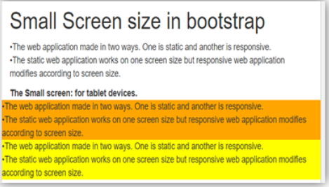
<h1> Small Screen size in bootstrap </h1>
<p>The web application made in two ways. One is static and another is responsive. <br>
The static web application works on one screen size but responsive web application modifies according to screen size.
</p>
<b> The Small screen: for tablet devices. </b>
<div class="row">
<div class="col-sm" style="background-color:orange;">
The web application made in two ways. One is static and another is responsive. <br>
The static web application works on one screen size but responsive web application modifies according to screen size.
</div>
<div class="col-sm" style="background-color:yellow;">
The web application made in two ways. One is static and another is responsive. <br>
The static web application works on one screen size but responsive web application modifies according to screen size.
</div>
</div>
</div>
<script src= "https://ajax.googleapis.com/ajax/libs/jquery/3.4.1/jquery.min.js">
</script>
<script src= "https://maxcdn.bootstrapcdn.com/bootstrap/3.4.1/js/bootstrap.min.js">
</script>
</body>
</html>
输出:
例子#3 - 下面的例子是中等尺寸的屏幕。
代码:
<!DOCTYPE html>
<html>
<head>
<title> Bootstrap Screen size Example </title>
<meta charset="utf-8">
<meta name= "viewport" content= "width=device-width, initial-scale=1">
<link rel= "stylesheet" href= "https://maxcdn.bootstrapcdn.com/bootstrap/3.4.1/css/bootstrap.min.css">
</head>
<body>
<div class="container-fluid">
<h1> The Medium Screen size in bootstrap </h1>
<p>The web application made in two ways. One is static and another is responsive. <br>
The static web application works on one screen size but responsive web application modifies according to screen size.
</p>
<b> The Extra Small screen: for small laptop devices. </b>
<div class="row">
<div class="col-md" style="background-color:orange;">
The web application made in two ways. One is static and another is responsive. <br>
The static web application works on one screen size but responsive web application modifies according to screen size.
</div>
<div class="col-md" style="background-color:yellow;">
The web application made in two ways. One is static and another is responsive. <br>
The static web application works on one screen size but responsive web application modifies according to screen size.
</div>
</div>
</div>
<script src= "https://ajax.googleapis.com/ajax/libs/jquery/3.4.1/jquery.min.js">
</script>
<script src= "https://maxcdn.bootstrapcdn.com/bootstrap/3.4.1/js/bootstrap.min.js">
</script>
</body>
</html>
输出:

例子 #4 - 下面的例子是大屏幕尺寸。
代码:
<!DOCTYPE html>
<html>
<head>
<title> Bootstrap Screen size Example </title>
<meta charset="utf-8">
<meta name= "viewport" content= "width=device-width, initial-scale=1">
<link rel= "stylesheet" href= "https://maxcdn.bootstrapcdn.com/bootstrap/3.4.1/css/bootstrap.min.css">
</head>
<body>
<div class="container-fluid">
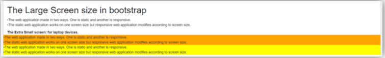
<h1> The Large Screen size in bootstrap </h1>
<p>The web application made in two ways. One is static and another is responsive. <br>
The static web application works on one screen size but responsive web application modifies according to screen size.
</p>
<b> The Extra Small screen: for laptop devices. </b>
<div class="row">
<div class="col-lg" style="background-color:orange;">
The web application made in two ways. One is static and another is responsive. <br>
The static web application works on one screen size but responsive web application modifies according to screen size.
</div>
<div class="col-lg" style="background-color:yellow;">
The web application made in two ways. One is static and another is responsive. <br>
The static web application works on one screen size but responsive web application modifies according to screen size.
</div>
</div>
</div>
<script src= "https://ajax.googleapis.com/ajax/libs/jquery/3.4.1/jquery.min.js">
</script>
<script src= "https://maxcdn.bootstrapcdn.com/bootstrap/3.4.1/js/bootstrap.min.js">
</script>
</body>
</html>
输出
结论
Bootstrap的屏幕尺寸用于响应式的网络应用。屏幕尺寸有助于按照设备屏幕的标准格式来制作应用程序。此外,它还有助于使应用程序对用户来说易于使用。
