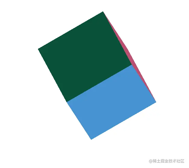
纯CSS和HTML写正方体顶点立起旋转
源代码:
<!DOCTYPE html>
<html lang="en">
<head>
<meta charset="UTF-8" />
<meta http-equiv="X-UA-Compatible" content="IE=edge" />
<meta name="viewport" content="width=device-width, initial-scale=1.0" />
<title>Document</title>
<style>
* {
margin: 0;
padding: 0;
box-sizing: border-box;
}
.mbox {
width: 200px;
height: 200px;
margin: 50px auto;
top: 100px;
position: relative;
transform-style: preserve-3d;
perspective: 200;
perspective-origin:center;
-webkit-perspective:center;
animation: move 5s linear infinite alternate forwards;
}
div.square {
width: 200px;
height: 200px;
position: absolute;
}
.top {
background-color: rgb(18, 196, 136);
transform: translateZ(100px);
}
.bottom {
background-color: rgb(70, 147, 209);
transform: translateZ(-100px);
}
.left {
background-color: rgb(189, 79, 112);
transform: translateX(-100px) rotateY(-90deg);
}
.right {
background-color: rgb(59, 212, 59);
transform: translateX(100px) rotateY(90deg);
}
.before {
background-color: rgb(158, 136, 64);
transform: translateY(100px) rotateX(90deg);
}
.after {
background-color: rgb(9, 82, 57);
transform: translateY(-100px) rotateX(-90deg);
}
@keyframes move{
from{
transform: rotateY(45deg) rotateX(45deg) rotateZ(45deg);
}
to{
transform: rotateY(720deg) rotateX(45deg) rotateZ(45deg);
}
}
</style>
</head>
<body>
<div class="mbox">
<div class="square top"></div>
<div class="square bottom"></div>
<div class="square left"></div>
<div class="square right"></div>
<div class="square before"></div>
<div class="square after"></div>
</div>
</body>
</html>


