<!DOCTYPE html>
<html lang="en">
<head>
<meta charset="UTF-8" />
<meta http-equiv="X-UA-Compatible" content="IE=edge" />
<meta name="viewport" content="width=device-width, initial-scale=1.0" />
<title>Document</title>
<style>
* {
margin: 0;
padding: 0;
}
body {
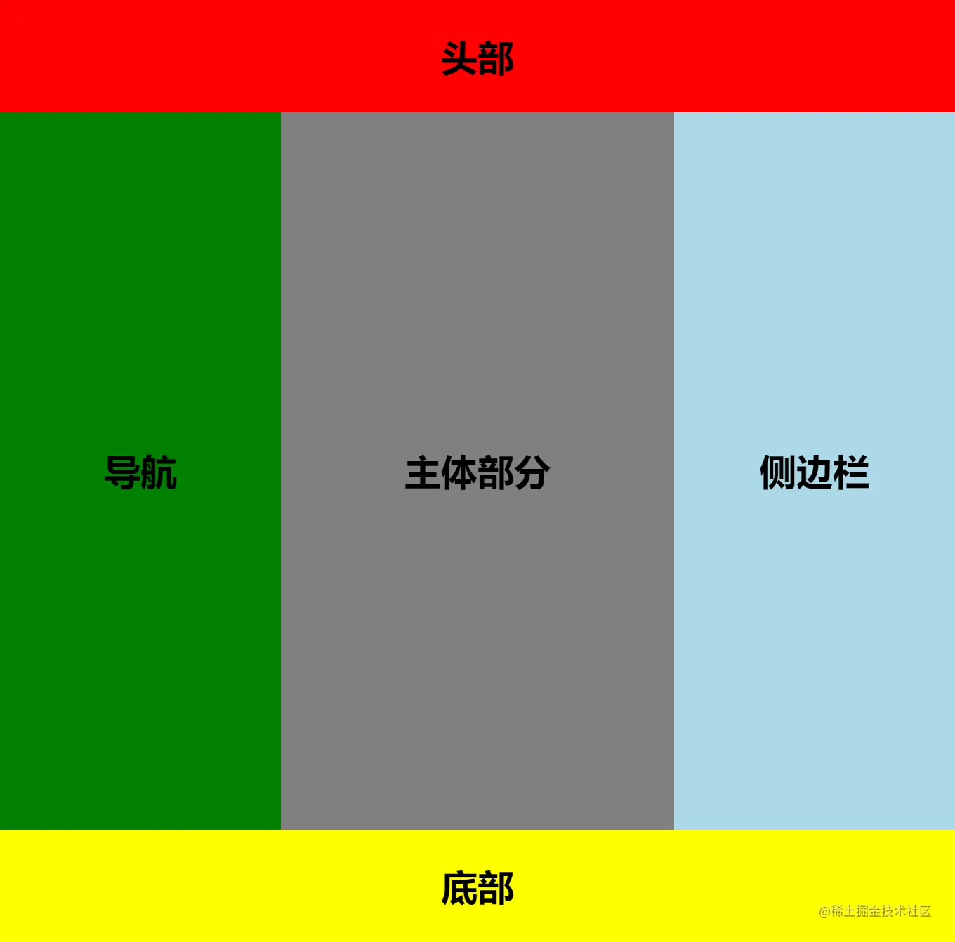
display: grid;
height: 100vh;
grid-template-rows: 80px 1fr 80px;
grid-template-columns: 200px 1fr 200px;
grid-template-areas:
"header header header"
"nav main aside"
"footer footer footer";
}
header {
background-color: red;
grid-area: header;
}
nav {
background-color: green;
grid-area: nav;
}
main {
background-color: gray;
grid-area: main;
}
aside {
background-color: lightblue;
grid-area: aside;
}
footer {
background-color: yellow;
grid-area: footer;
}
.grid-center {
font-size: 26px;
font-weight: bold;
display: grid;
place-content: center;
}
</style>
</head>
<body>
<header class="grid-center">头部</header>
<main class="grid-center">主体部分</main>
<nav class="grid-center">导航</nav>
<aside class="grid-center">侧边栏</aside>
<footer class="grid-center">底部</footer>
</body>
</html>


