

Button/Link 的常规使用
1.设置button的常用属性
.background()设置背景 可以为颜色或者其他控件.frame()设置宽或高.clipShape()裁剪到指定形状.border()设置边框 不会跟随圆角而变化.overlay()自定义添加的图层 可以是文字 图片等.foregroundColor()设置自定义颜色.clipped()超出区域进行裁剪.cornerRadius()设置圆角.blur()设置模糊样式 半径越大越模糊,opaque设置是否透明.shadow()设置阴影
在很多属性和方法中 都和Image 有很多共同之处,具体效果如下
import SwiftUI
/*
当我们使用offset()修饰符时,我们改变了一个视图应该呈现的位置,
而不实际改变它的基本几何体。这意味着当我们随后应用background()时,
它使用文本的原始位置,而不是偏移量。如果移动修饰符的顺序,
使background()在offset()之前,那么事情会更像您预期的那样,
再次表明修饰符顺序很重要。
*/
struct TestButtonView: View {
var body: some View {
VStack(alignment: .leading){
HStack(alignment: .center, spacing: 5){
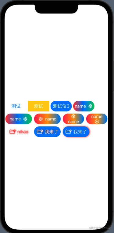
Button("测试") {
print("我来了")
}
.frame(width: 80, height: 40, alignment: .center)
.cornerRadius(20).onTapGesture {
print("测试数据展示")
}
Button("测试") {
print("我来了")
}
.frame(width: 80, height: 40, alignment: .center)
.cornerRadius(20)
.foregroundColor(.white)
.background(Color.yellow)
//注意修饰符设置的顺序,先设置圆角 在设置背景色 是没有效果的
Button("测试仪3") {
}
.frame(width: 80, height: 40, alignment: .center)
.background(Color.blue)
.foregroundColor(.white)
.cornerRadius(20)
Button(action: {
}){
Text("name")
Image(systemName: "snow")
}
.frame(width: 80, height: 40, alignment: .center)
.background(LinearGradient(gradient: Gradient(colors: [.red,.blue,.green]), startPoint: .leading, endPoint: .trailing))
.cornerRadius(20)
.foregroundColor(.white)
}
HStack{
Button(action: {
}){
Text("name")
Image(systemName: "snow")
}
.frame(width: 100, height: 40, alignment: .center)
.background(LinearGradient(gradient: Gradient(colors: [.red,.blue,.green]), startPoint: .leading, endPoint: .trailing))
.cornerRadius(20)
.foregroundColor(.white)
Button(action: {
}){
Image(systemName: "snow")
Text("name")
}
.frame(width: 100, height: 40, alignment: .center)
.background(LinearGradient(gradient: Gradient(colors: [.pink,.orange,.blue]), startPoint: .leading, endPoint: .trailing))
.cornerRadius(20)
.foregroundColor(.white)
Button(action: {
}){
VStack{
Image(systemName: "snow")
Text("name")
}
}
.frame(width: 80, height: 40, alignment: .center)
.background(LinearGradient(gradient: Gradient(colors: [.pink,.orange,.blue]), startPoint: .leading, endPoint: .trailing))
.cornerRadius(20)
.foregroundColor(.white)
Button(action: {
}){
VStack{
Text("name")
Image(systemName: "snow")
}
}
.frame(width: 80, height: 40, alignment: .center)
.background(LinearGradient(gradient: Gradient(colors: [.pink,.orange,.blue]), startPoint: .leading, endPoint: .trailing))
.cornerRadius(20)
.foregroundColor(.white)
}
// .background(Color.blue)
//设置决定定位
// .position(x: 100, y: 100)
//设置偏移量
// .offset(x: 100, y: 100)
//注意设置shadow的顺序,在bgground之前设置是给当前字添加shadow,在bgground之后设置是给整个背景设置shadow
HStack{
Button {
print("开始点击")
} label: {
Label("nihao",systemImage: "folder.badge.plus")
}
.frame(width: 100, height: 40, alignment: .center)
.shadow(color: .red, radius: 3, x: 2, y: 0)
.cornerRadius(20)
.foregroundColor(.red)
//同样的看到 shadow 和 cornerRadius的顺序 对UI展示也有对应的影响
Button {
print("开始点击")
} label: {
Label("我来了",systemImage: "folder.badge.plus")
}
.frame(width: 100, height: 40, alignment: .center)
.background(Color.blue)
.foregroundColor(.white)
.shadow(color: .red, radius: 3, x: 2, y: 0)
.cornerRadius(20)
Button {
print("开始点击")
} label: {
Label("我来了",systemImage: "folder.badge.plus")
}
.frame(width: 100, height: 40, alignment: .center)
.background(Color.blue)
.foregroundColor(.white)
.cornerRadius(20)
.shadow(color: .red, radius: 3, x: 2, y: 0)
}
}
}
}
2.Link的常规使用
相比较Button,Link就是一个跳转到网页的快速实现,可以在App中直接打开手机中的默认浏览器到指定页面。在上面执行直接跳转到safari页面中
var body: some View {
    VStack{
        HStack{
            Link(destination: URL(string: "https://www.baidu.com/")!) {
                Text("测试数据")
            }
        }
    }
}
