

Bootstrap Inline Form的定义
Bootstrap内嵌式表单对于网络应用程序用户和创建者之间的交流非常有用。Bootstrap内联表格与标签和元素一起显示在一行中。它在水平方向上显示元素、属性和标签,并在左边对齐。这是一个以最小的空间和尺寸在用户和开发者之间进行互动的组件。它对于使用按钮从用户那里获得信息非常有用。
语法。
- 内嵌式表单在HTML页面的body部分使用表单标签。
- "form-inline "类对内联表单来说是必不可少的。
- form-inline "类被放在元素的内部。
- 下面是基本的内联表单语法,包括表单标签和内联表单类。
<form class = "form-inline"> form tags and attributes </form>
- 内联表单使用标签和它们的属性进行用户输入。
<form class = "form-inline">
- form-control "类对于控制输入信息非常有用。它在标签的内部。
<input type = "search" class = "form-control" placeholder = "search here">
</form>
- 内嵌式表单需要标签和它们所需的类来收集信息。
<form class = "form-inline">
<input type = "search" class = "form-control" placeholder = "search here">
<button type = "submit" class = "btn btn-info"> Search </button>
</form>
- Bootstrap3使用class="form-group "进行验证,并调整了属性和标签。
<form class = "form-inline">
<div class="form-group">
<input type = "search" class = "form-control" placeholder = "search here">
</div>
<button type = "submit" class = "btn btn-info"> Search </button>
</form>
内联表单如何在Bootstrap中工作?
有两种方法来处理内联表单。
方法#1
- bootstrap3的支持性文件添加在HTML页面的head部分。
<meta name = "viewport" content = "width=device-width, initial-scale=1">
<link rel = "stylesheet" href = "https://maxcdn.bootstrapcdn.com/bootstrap/3.4.1/css/bootstrap.min.css">
<script src = "https://ajax.googleapis.com/ajax/libs/jquery/3.5.1/jquery.min.js">
</script>
<script src = "https://maxcdn.bootstrapcdn.com/bootstrap/3.4.1/js/bootstrap.min.js">
</script>
- bootstrap3的内联表单语法被放置在HTML页面的body部分。
<form class = "form-inline">
<div class = "form-group">
<input type = "search" class = "form-control" placeholder = "search here">
</div>
<button type = "submit" class = "btn btn-info"> Search </button>
</form>
方法#2
bootstrap4支持性文件添加在HTML页面的头部部分。
<link rel = "stylesheet" href = "https://maxcdn.bootstrapcdn.com/bootstrap/4.5.2/css/bootstrap.min.css">
<script src = "https://ajax.googleapis.com/ajax/libs/jquery/3.5.1/jquery.min.js">
</script>
<script src = "https://cdnjs.cloudflare.com/ajax/libs/popper.js/1.16.0/umd/popper.min.js">
</script>
<script src = "https://maxcdn.bootstrapcdn.com/bootstrap/4.5.2/js/bootstrap.min.js">
</script>
- bootstrap4的内嵌表单语法被放置在html页面的body部分。
<form class = "form-inline">
<input type = "search" class = "form-control" placeholder = "search here">
<button type = "submit" class = "btn btn-info"> Search </button>
</form>
- 下面是bootstrap4内嵌式表单工作方法的组合。
<!DOCTYPE html>
<html>
<head>
<title>Bootstrap inline form Example</title>
<meta charset="utf-8">
<meta name = "viewport" content = "width=device-width, initial-scale=1">
<link rel = "stylesheet" href = "https://maxcdn.bootstrapcdn.com/bootstrap/4.5.2/css/bootstrap.min.css">
<script src = "https://ajax.googleapis.com/ajax/libs/jquery/3.5.1/jquery.min.js">
</script>
<script src = "https://cdnjs.cloudflare.com/ajax/libs/popper.js/1.16.0/umd/popper.min.js">
</script>
<script src = "https://maxcdn.bootstrapcdn.com/bootstrap/4.5.2/js/bootstrap.min.js">
</script>
</head>
<body>
<div class="container">
<h2> Bootstrap Inline form for login </h2>
<form class = "form-inline">
<input type = "search" class = "form-control" placeholder = "search here">
<button type = "submit" class = "btn btn-info"> Search </button>
</form>
</div>
</body>
</html>
例子
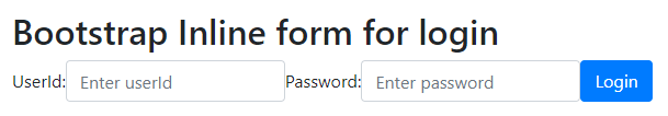
bootstrap4 inline form for Login 示例和输出。
例子 #1
代码。
<!DOCTYPE html>
<html>
<head>
<title>Bootstrap inline form Example</title>
<meta charset="utf-8">
<meta name = "viewport" content = "width=device-width, initial-scale=1">
<link rel = "stylesheet" href = "https://maxcdn.bootstrapcdn.com/bootstrap/4.5.2/css/bootstrap.min.css">
<script src = "https://ajax.googleapis.com/ajax/libs/jquery/3.5.1/jquery.min.js">
</script>
<script src = "https://cdnjs.cloudflare.com/ajax/libs/popper.js/1.16.0/umd/popper.min.js">
</script>
<script src = "https://maxcdn.bootstrapcdn.com/bootstrap/4.5.2/js/bootstrap.min.js">
</script>
</head>
<body>
<div class="container">
<h2> Bootstrap Inline form for login </h2>
<form class="form-inline">
<label for="userid"> UserId: </label>
<input type="text" class="form-control" placeholder="Enter userId" id="userid">
<label for="password"> Password: </label>
<input type="password" class="form-control" placeholder="Enter password" id="password">
<button type="submit" class="btn btn-primary"> Login </button>
</form>
</div>
</body>
</html>
输出。
例子#2
margin的内联表格的例子和输出。
代码。
<!DOCTYPE html>
<html>
<head>
<title> Bootstrap inline form Example
</title>
<meta charset="utf-8">
<meta name = "viewport" content = "width=device-width, initial-scale=1">
<link rel = "stylesheet" href = "https://maxcdn.bootstrapcdn.com/bootstrap/4.5.2/css/bootstrap.min.css">
<script src = "https://ajax.googleapis.com/ajax/libs/jquery/3.5.1/jquery.min.js">
</script>
<script src = "https://cdnjs.cloudflare.com/ajax/libs/popper.js/1.16.0/umd/popper.min.js">
</script>
<script src = "https://maxcdn.bootstrapcdn.com/bootstrap/4.5.2/js/bootstrap.min.js">
</script>
</head>
<body>
<div class = "container">
<h2> Bootstrap Inline form for Register </h2>
<form class = "form-inline">
<label for = "user" class = "mr-md-3"> FullName: </label>
<input type = "text" class = "form-control mt-2 mr-md-3" placeholder = "Enter Name" id = "user">
<label for = "email" class = "mr-md-3"> Email :</label>
<input type = "email" class = "form-control mt-2 mr-md-3" placeholder = "Enter email" id = "email">
<label for = "pass" class = "mr-md-3"> Password: </label>
<input type = "password" class = "form-control mt-2 mr-md-3" placeholder = "Enter password" id = "pass">
<button type = "submit" class = "btn btn-info mt-2"> Register </button>
</form>
</div>
</body>
</html>
输出。
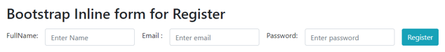
说明。
mt-2 "类对输入标签中的尺寸为2的顶部马汀是有用的。mr-md-3 "类适用于输入标签为3号的中等尺寸屏幕设备的右侧马汀。
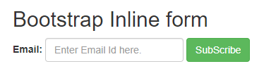
例子#3
bootstrap3的内嵌式表单例子和输出。
代码。
<!DOCTYPE html>
<html >
<head>
<title> Bootstrap inline form Example </title>
<meta charset="utf-8">
<meta name = "viewport" content = "width=device-width, initial-scale=1">
<link rel = "stylesheet" href = "https://maxcdn.bootstrapcdn.com/bootstrap/3.4.1/css/bootstrap.min.css">
<script src = "https://ajax.googleapis.com/ajax/libs/jquery/3.5.1/jquery.min.js">
</script>
<script src = "https://maxcdn.bootstrapcdn.com/bootstrap/3.4.1/js/bootstrap.min.js">
</script>
</head>
<body>
<div class = "container">
<h2> Bootstrap Inline form</h2>
<form class = "form-inline">
<div class = "form-group">
<label> Email: </label>
<input type = "email" class = "form-control" id = "email" placeholder = "Enter Email Id here.">
</div>
<button type = "button" class = "btn btn-success"> SubScribe </button>
</form>
</div>
</body>
</html>
输出。
例子 #4
bootstrap inline form with sr-only class 示例和输出。
代码。
<!DOCTYPE html>
<html>
<head>
<title> Bootstrap Inline Form Example </title>
<meta name = "viewport" content = "width=device-width, initial-scale=1">
<link rel = "stylesheet" href = "https://maxcdn.bootstrapcdn.com/bootstrap/3.4.1/css/bootstrap.min.css">
<script src = "https://ajax.googleapis.com/ajax/libs/jquery/3.5.1/jquery.min.js">
</script>
<script src = "https://maxcdn.bootstrapcdn.com/bootstrap/3.4.1/js/bootstrap.min.js">
</script>
</head>
<body>
<div class = "container">
<h2> Bootstrap Inline form </h2>
<form class = "form-inline">
<div class = "form-group">
<label class = "sr-only" for = "user"> UserName: </label>
<input type = "text" class = "form-control" id = "user" placeholder = "Enter User Name" >
</div>
<div class="form-group">
<label class = "sr-only" for = "password"> Password: </label>
<input type = "password" class = "form-control" id = "password" placeholder="Enter password">
</div>
<button type = "submit" class = "btn btn-primary"> Sine In </button>
</form>
</div>
</body>
</html>
输出。
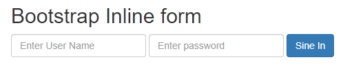
描述。
类="sr-only "是用来为用户提供无形的名称,并且只为一个网络应用程序提供重组。
总结
- 它是沟通和收集用户信息的最简单的方法。
- 它有助于在Web应用程序中以最小的空间和内存与用户互动。
