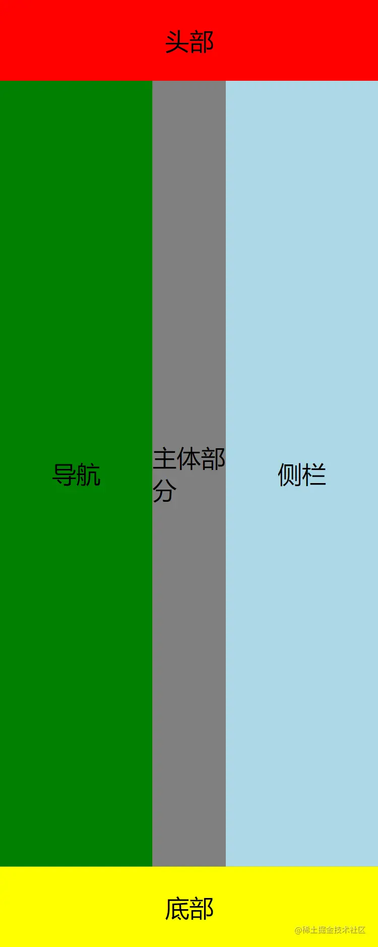
Flex实现圣杯布局
<!DOCTYPE html>
<html lang="en">

<head>
    <meta charset="UTF-8" />
    <meta http-equiv="X-UA-Compatible" content="IE=edge" />
    <meta name="viewport" content="width=device-width, initial-scale=1.0" />
    <title>Document</title>
    <style>
        * {
            margin: 0;
            padding: 0;
        }

        body {
            display: flex;
            flex-direction: column;
            height: 100ch;
            background-color: olivedrab;
            justify-content: space-between;
        }

        div.header {
            height: 80px;
            background-color: red;
        }

        div.footer {
            height: 80px;
            background-color: yellow;
        }

        div.nav {
            width: 200px;
            background-color: green;
        }

        div.main {
            flex-grow: 1;
            background-color: gray;
        }

        div.side {
            width: 200px;
            background-color: lightblue;
        }

        div.body {
            flex-grow: 1;
            display: flex;
        }

        div.nav {
            order: -1;
        }

        .flex-center {
            display: flex;
            justify-content: center;
            align-items: center;
            font-size: 24px;
        }
    </style>
</head>

<body>
    <div class="header flex-center ">头部</div>
    <div class="body">
        <div class="main flex-center ">主体部分</div>
        <div class="nav flex-center ">导航</div>
        <div class="side flex-center ">侧栏</div>
    </div>
    <div class="footer flex-center ">底部</div>
</body>

</html>


