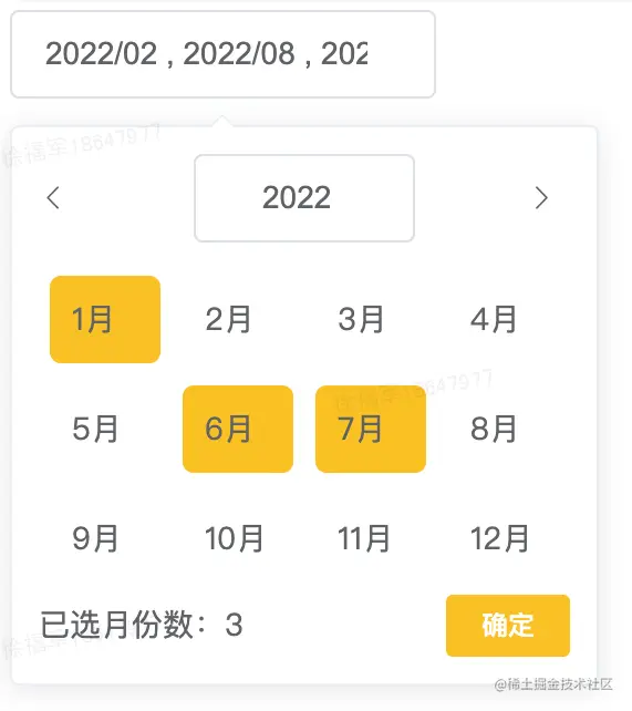
element-ui的时间选择器只有选择日的时候支持多选。但是多选月份的需求也很常见。下面分享一个月份多选的组件。(注意,代码中有用到了moment来处理时间,以及scss来处理样式。拷贝代码的时候注意替换一下自己项目中有的)
使用方法
<monthMultiSelect v-model="month"></monthMultiSelect>
组件源码
<template>
  <span class="mothSelectBox"
  ><el-popover
    placement="bottom-start"
    v-bind="$attrs"
    :close-delay="100"
    trigger="manual"
    v-model="visible"
  >
    <div>
      <div class="month-head" v-if="visible">
        <i @click="preYear" class="month-head-arrow el-icon-arrow-left"></i>

        <el-date-picker
          v-model="year"
          type="year"
          style="width: 100px"
          prefix-icon
          value-format="timestamp"
          :clearable="false"
        >
        </el-date-picker>
        <i @click="nextYear" class="month-head-arrow el-icon-arrow-right"></i>
      </div>

      <div class="month-body">
        <div v-for="row in 3" :key="row" class="month-body-row">
          <div
            @click="selectMonth((row - 1) * 4 + col)"
            :class="isSelect((row - 1) * 4 + col)"
            v-for="col in 4"
            :key="col"
          >
            {{ (row - 1) * 4 + col }}月
          </div>
        </div>
      </div>
      <div class="month-buttom">
        <div>已选月份数:{{ allMonths.length }}</div>
        <el-button size="mini" type="primary" @click="visible = false">
          确定
        </el-button>
      </div>
    </div>
    <el-input
      slot="reference"
      ref="input"
      clearable
      :disabled='disabled'
      v-model="inputValue"
      @clear="clearInput"
      @focus="focus"
    ></el-input> </el-popover
  ></span>
</template>

<script>
import moment from 'moment';
export default {
  props: {
    value: {
      required: true,
    },
    format: {
      type: String,
      default: 'YYYY/MM',
    },
    disabled: {
      type: Boolean,
      default: false
    }
  },
  watch: {
    value: {
      handler(val) {
        if (Array.isArray(val) && val.join(',') !== this.allMonths?.join(',')) {
          this.$set(this, 'allMonths', [...val]);
        }
      },
      immediate: true,
    },
  },
  computed: {
    inputValue: {
      get() {
        return this.allMonths
          .map((item) => moment(item).format(this.format))
          .join(' , ');
      },
      set() {
        return '';
      },
    },
  },
  data() {
    return {
      visible: false,
      moment,
      month: null,
      allMonths: [],
      year: +moment().startOf('year'),
    };
  },
  created() {
    window.moment = moment;
  },
  methods: {
    selectMonth(val) {
      const key = +moment(+this.year).add(val, 'months');
      if (!this.allMonths.includes(key)) {
        this.allMonths.push(key);
      } else {
        this.allMonths.splice(this.allMonths.indexOf(key), 1);
      }
      this.emitChange();
    },
    isSelect(month) {
      const key = +moment(+this.year).add(month, 'months');
      return `month-body-col${
        this.allMonths.includes(key) ? ' month-body-selected' : ''
      }`;
    },
    preYear() {
      let base = this.year || Date.now();
      this.year = +moment(+base).subtract(1, 'years');
    },
    nextYear() {
      let base = this.year || Date.now();
      this.year = +moment(+base).add(1, 'years');
    },
    focus() {
      this.visible = true;
    },
    clearInput() {
      this.allMonths = [];
      this.emitChange();
    },
    emitChange() {
      this.$emit('input', this.allMonths);
      this.$emit('change', this.allMonths);
    },
  },
};
</script>

<style lang="scss" scoped>
.mothSelectBox {
  display: inline-block;
}
.month-head {
  display: flex;
  justify-content: space-between;
  align-items: center;
  ::v-deep .el-input__prefix {
    display: none;
  }
  ::v-deep .el-input__inner {
    outline: none;
  }
  .month-head-arrow {
    cursor: pointer;
    width: 20px;
  }
}
.month-body {
  margin-top: 10px;
  .month-body-row {
    display: flex;
    justify-content: space-between;
  }
  .month-body-col {
    margin: 5px;
    width: 30px;
    cursor: pointer;
    padding: 10px;
  }
  .month-body-selected {
    background-color: #ffc107;
    border-radius: 5px;
  }
}
.month-buttom {
  display: flex;
  justify-content: space-between;
  align-items: center;
}
</style>


