类型1
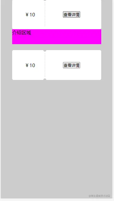
- 点击查看详情能够看到介绍,并且隐藏底部得凹槽
- 通过设置元素上下两个伪类,并且设置两个伪类的背景与容器背景效果相同,然后移动两个伪类的位置,从而达到预期的效果
<!DOCTYPE html>
<html lang="en">

<head>
    <meta charset="UTF-8">
    <meta http-equiv="X-UA-Compatible" content="IE=edge">
    <meta name="viewport" content="width=device-width, initial-scale=1.0">
    <title>Document</title>
    <style>
        * {
            margin: 0;
            padding: 0;
        }

        body {
            width: 100vw;
            height: 100vh;
            background: #ccc;
            display: flex;
            justify-content: center;
        }

        .box {
            width: 300px;
        }

        .box+.box {
            margin-top: 20px;
        }

        .box-content {
            width: 300px;
            display: flex;
            height: 100px;
            background: #fff;
            position: relative;
            box-sizing: border-box;
            padding: 10px;
            border-radius: 5px;
        }


        .box-content::before,
        .box-content::after {
            content: "";
            display: block;
            width: 10px;
            height: 10px;
            background: #ccc;
            position: absolute;
            left: 110px;
            top: 0;
            transform: translateX(-50%) translateY(-50%);
            border-radius: 50%;
        }

        .box-content::after {
            top: 100px;
        }


        .box .box-1 {
            width: 100px;
            height: 100%;
            display: flex;
            align-items: center;
            justify-content: center;
            border-right: 1px dashed #ccc;
        }

        .box-2 {
            flex: 1;
            display: flex;
            justify-content: center;
            align-items: center;
        }

        .box-introduction {
            background: magenta;
            position: relative;
            z-index: 100;
            height: 50px;
            display: none;
        }

        .box-introduction.is-open {
            display: block;
        }
        .box.is-open-intro .box-content::after {
            display: none;
        }
    </style>
</head>

<body>
    <div class="box-list">
        <div class="box">
            <div class="box-content">
                <div class="box-1">¥10</div>
                <div class="box-2">
                    <button onclick="btnClick(event)">查看详情</button>
                </div>
            </div>
            <div class="box-introduction">
                介绍区域
            </div>
        </div>
        <div class="box">
            <div class="box-content">
                <div class="box-1">¥10</div>
                <div class="box-2">
                    <button  onclick="btnClick(event)">查看详情</button>
                </div>
            </div>
            <div class="box-introduction">
                介绍区域
            </div>
        </div>
    </div>

    <script>
        function btnClick(e) {
            const target = e.target
            const parentElement = target?.parentElement?.parentElement?.parentElement
            if (parentElement) {
                const boxIntroduction = parentElement.querySelector(".box-introduction")
                const introClassList = boxIntroduction.classList
                const boxClassList = parentElement.classList
                if (introClassList.contains("is-open")) {
                    introClassList.remove("is-open")
                    boxClassList.remove("is-open-intro")
                } else {
                    introClassList.add("is-open")
                    boxClassList.add("is-open-intro")
                }
            }
        }
    </script>
</body>

</html>
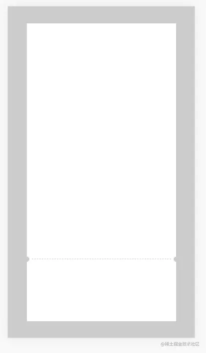
类型2
- 竖向优惠券模型
- 实现原理与类型1相同
<!DOCTYPE html>
<html lang="en">

<head>
    <meta charset="UTF-8">
    <meta http-equiv="X-UA-Compatible" content="IE=edge">
    <meta name="viewport" content="width=device-width, initial-scale=1.0">
    <title>Document</title>
    <style>
        * {
            margin: 0;
            padding: 0;
        }

        body {
            width: 100vw;
            height: 100vh;
            background: #ccc;
            display: flex;
            justify-content: center;
            align-items: center;
        }

        .box {
            width: 300px;
            height: 600px;
            background: #fff;
            position: relative;
            padding: 10px;
            box-sizing: border-box;
        }

        .box::before,
        .box::after {
            content: "";
            display: block;
            width: 10px;
            height: 10px;
            background: #ccc;
            border-radius: 50%;
            top: calc(80% - 5px);
            position: absolute;
            transform: translate(-50%, -50%);
        }

        .box::before {
            left: 0;
        }

        .box::after {
            right: 0;
            transform: translate(50%, -50%);
        }

        .box-1 {
            height: 80%;
            border-bottom:1px dashed #ccc;
        }
    </style>
</head>

<body>
    <div class="box">
        <div class="box-1"></div>
    </div>
</body>

</html>


