

CSS单位的介绍
CSS单位被定义为表示长度的不同方式。这种单位规定了网页设计与各种设备的交互方式,也被认为是一种基本的测量单位。CSS中的单位帮助像margin、width、font-size这样的CSS属性用单位来表达它们的长度,不需要空格,而且它也接受负值。对于一个值 "0",单位可以忽略不计。
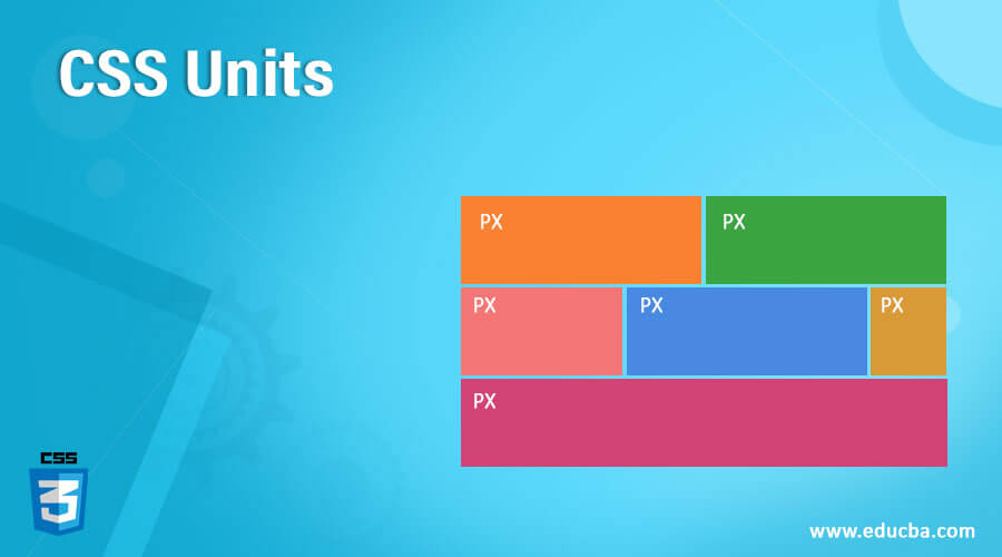
CSS单位列表(用例子解释每个单位)
在本节中,我们将重点介绍几种常用的CSS单位类型,以设置属性。有两种类型的CSS单位,分别是绝对单位和相对单位。
1.绝对单位
绝对单位的大小是固定的,它不用于屏幕尺寸,因为屏幕图像的大小是变化的。对于任何被设置为绝对值的属性,无论是在手机上还是在大窗口屏幕上,其尺寸都是一样的。例如,已知的输出尺寸,如页面布局被认为是一个绝对单位。当我们不期望网站有任何响应性时,这种单位被认为是很好的,而且在定义最大和最小宽度时,也有利于区域变得太宽。
物理绝对单位的列表如下。
- **px。**这是像素,是最流行的屏幕尺寸单位。这是CSS中最常见的单位,它在代码中固定了元素的宽度。也用于间距和位置属性。所以,像素是设备的视觉角度,固定了元素在屏幕上的尺寸。
例子。
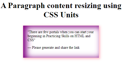
<!DOCTYPE html> <html> <head> <style> blockquote { width: 50%; margin: 25px auto; padding: 18px; font-size: 14px; box-shadow: inset 11px 3px 22px 3px purple, 3px 3px 9px 2px pink; } </style> </head> <body> <h1><center> A Paragraph content resizing using CSS Units</h1> <blockquote> <q>There are few portals when you can start your beginning in Practicing Skills on HTML and CSS</q> <p>— Please generate and share the link</p> </blockquote> </body> </html>
输出。
- pt。 它将单位定义为点。在CSS中,一个点被分配为1/72英寸。建议打印机等设备使用这一单位。
语法。
property : vpt;
其中'v'是数字值。例如:高度:10pt。
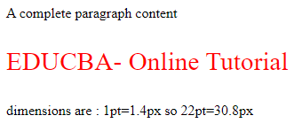
以点为单位的例子
<!DOCTYPE html> <html> <head> <style> .pointvalue { font-size: 22pt; color:red; } </style> </head> <body> <p>A complete paragraph content</p> <p class="pointvalue">EDUCBA- Online Tutorial</p> <p> dimensions are : 1pt=1.4px so 22pt=30.8px</p> </body> </html>
输出。
- **pc。**这个单位说明它是皮卡的长度单位,W3C不怎么推荐它。
语法。
property: a pt;
其中'a'是任何数字值。
- **in:**这个英寸是专门在创建印刷书页时使用的。
例子。
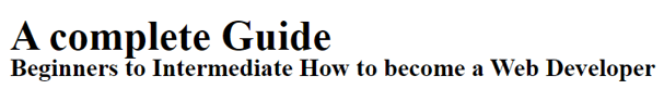
一起实现'pc'和'in'单位
<html> <head> <title>Absolute unit- Inches</title> <style> .examp { font-size: .7pc; font-weight:bold; } .skill { font-size: .3in; line-height: .2in; } </style> </head> <body> <div class = "examp"> A complete Guide</gfg> <div class = "skill"> Beginners to Intermediate How to become a Web Developer </body> </html>
输出。
- **厘米。**日常最常用的是厘米,在网络开发案例中使用较少。
例子。
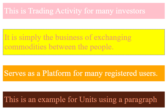
<!DOCTYPE html> <html> <head> <title> CSS Relative units- Example </title> <style> body { margin: 1cm; padding: 0.5cm; font-family: 'Times Roman'; font-size: 0.8cm; } p { padding: 12px 4px; margin: 1cm; color: darksalmon; } p:nth-of-type(1) { background: pink; color: white; } p:nth-of-type(2) { background: yellow; border: 1px dotted blue; font-family: 'Dosis'; } p:nth-of-type(3) { background: orange; color: white; } p:nth-of-type(4) { background: #56200e; } </style> </head> <body> <p>This is Trading Activity for many investors</p> <p> It is simply the business of exchanging commodities between the people.</p> <p>Serves as a Platform for many registered users.</p> <p>This is an example for Units using a paragraph</p> </body> </html>
输出。
- mm。 指定长度为毫米。
例子。
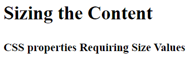
<html> <head> <title>Absolute unit- MM</title> <style> .abc { font-size: 10mm; font-weight:bold; } .demo { font-size: 6mm; line-height: 2mm; } </style> </head> <body> <div class = "abc"> Sizing the Content</abc> <br> </br> <div class = "demo"> CSS properties Requiring Size Values</div> </body> </html>
输出。
例子。
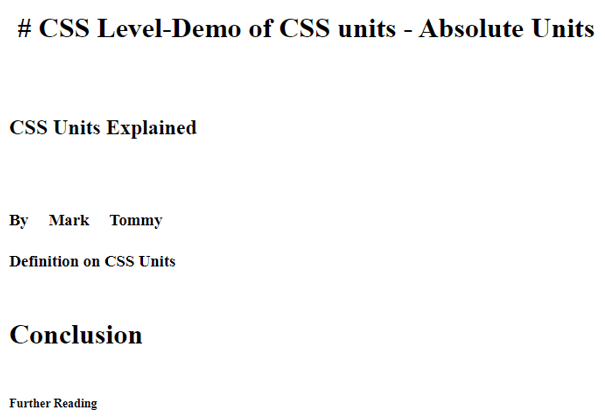
<!DOCTYPE html> <html lang="en"> <head> <meta charset="utf-8"> <title>Demo of CSS units - Absolute Units</title> <style> h1 { margin: 0.1in; } /* inches */ h2 { line-height: 4cm; } /* centimeters */ h3 { word-spacing: 5mm; } /* millimeters */ h4 { font-size: 14pt; } /* points */ h5 { font-size: 2pc; } /* picas */ h6 { font-size: 14px; } /* picas */ </style> </head> <body> <h1># CSS Level-Demo of CSS units - Absolute Units</h1> <h2>CSS Units Explained</h2> <h3>By Mark Tommy</h3> <h4>Definition on CSS Units</h4> <h5>Conclusion</h5> <h6>Further Reading</h6> </body> </html>
输出。
2.相对单位
这些单位在不同的设备上是不固定的,很好地用于低分辨率的屏幕尺寸,并有一个良好的、响应性的网站。他们指定的相对单位完全依赖于其他长度属性。这尤其适用于数字媒体屏幕。 相对单位包括
- 百分比。这有助于用百分比包围父元素。
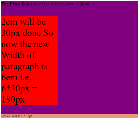
- **em。**这个相对单位属于元素的字体大小。当我们为HTML元素定义字体大小时,它们的值是相对的。例如,如果父元素的字体大小是10px,子元素的字体大小是0.2 em,那么呈现的大小就是2px。因此,子元素的字体大小可以增加或减少。
**例子。**在下面的例子中,em值被计算为像素。
<!DOCTYPE html> <html> <head> <style> div { font-size: 20px; background: purple; } .base { font-size: 2em; width: 6em; background: red; } .derived { font-size: 0.6em; background: darksalmon; } </style> </head> <body> <div> The Exact font size of the div property is 30px. <p class="base">2em will be 30px done So now the new Width of paragraph is 6em i.e. 6*30px = 180px <p> <p class="derived">2em will be 0.6*30 = 18px</p> </div> </body> </html>
输出。
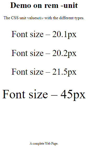
- **rem。**这个元素的值总是等于根元素的字体大小。下面是演示。
例子。
<html> <head> <style> body { text-align: center; } div { font-size: 2.1rem; } span { font-size: 3rem; } .hex { font-size: 12px; padding-top: 120px; } </style> </head> <h1>Demo on rem -unit</h1> <p>The CSS unit values<code>div</code> with the different types. </p> <div> <p>Font size – 20.1px</p> <div> <p>Font size – 20.2px</p> <div> <p>Font size – 21.5px <br><br><span> Font size – 45px</span></p> </div> </div> </div> <p class="hex">A complete Web Page.</p> </html>
输出。
- ch。它等于一个元素的宽度'0'。这意味着所有字符的宽度都是一样的。
例子。
width 20ch;
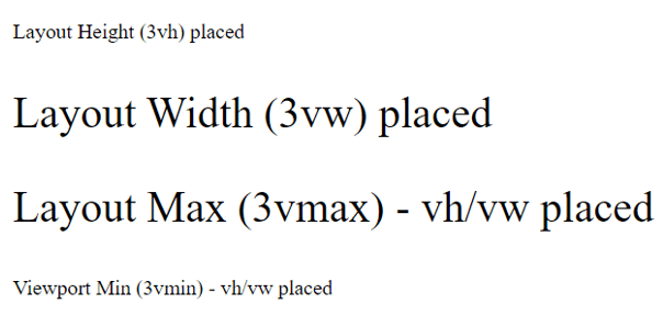
- vh。相对于视口的高度。
例子。
font-size: 12vh;
- **vw。**相对于视口的宽度。
例子。
font-size :8vw;
- vmin, vmax: 当我们需要一个图像适合更小或更大的视口尺寸时使用。
- **ex:**这个单位是字体大小的一个完全较低的数值分配。
例子。相对单位的例子。
<!DOCTYPE html> <html> <head> <title> CSS Relative units- Example </title> <style> .v1 { font-size:3vh; } .v2 { font-size:3vw; } .v3 { font-size:3vmax; } .v4 { font-size:3vmin; } </style> </head> <body> <p class="v1">Layout Height (3vh) placed</p> <p class="v2">Layout Width (3vw) placed</p> <p class="v3"> Layout Max (3vmax) - vh/vw placed </p> <p class="v4"> Viewport Min (3vmin) - vh/vw placed </p> </body> </html>
输出。
**注意:**这里,视口是你在浏览器屏幕上的可见区域。
总结
我们在这里简要介绍一下CSS单元,这是创建页面布局设计时最基本的方面。因此,在这篇文章中,我们已经看到了不同的CSS单元,以及它是如何工作的,这对创建一个更好的布局设计非常有帮助。
推荐文章
这是一本关于CSS单元的指南。在这里,我们讨论了CSS单元的清单以及它是如何工作的,并解释了每个例子和输出。你也可以看看下面的文章,以了解更多的信息。
