弹性布局
1.父级弹性布局,子级margin: auto;
<html>
  <div class="main">
    <div class="children"></div>
  </div>
  <style>
    .main{
      width: 100%;
      height: 100%;
      border: 1px solid #ABCDEF;
      display: flex;
    }
    .children{
      width: 100px;
      height: 100px;
      background: #CBA;
      margin: auto;
    }
  </style>
</html>
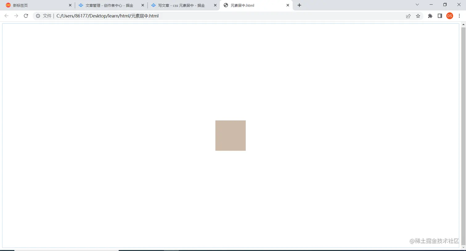
2.父级弹性布局,同时设置justify-content:center;align-items:center
  <style>
    .main{
      width: 100%;
      height: 100%;
      border: 1px solid #ABCDEF;
      display: flex;
      justify-content:center;
      align-items:center
    }
</style>
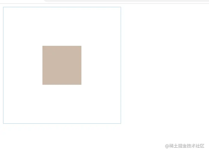
子绝父相
设置子元素top/left/right/bottom: 0,margin:auto
<html>
  <div class="main">
    <div class="children"></div>
  </div>
  <style>
    .main{
      width: 100%;
      height: 100%;
      border: 1px solid #ABCDEF;
      position: relative;
    }
    .children{
      width: 100px;
      height: 100px;
      background: #CBA;
      top:0;
      left: 0;
      bottom: 0;
      right: 0;
      margin: auto;
      position: absolute;
    }
  </style>
</html>
设置transform: translate: (-50%,-50%),left:50%,top:50%
    .children{
      width: 100px;
      height: 100px;
      background: #CBA;
      top:50%;
      left: 50%;
      transform: translate(-50%,-50%);
      position: absolute;
    }
margin负值法(需要知道子元素宽高)
    .children{
      width: 100px;
      height: 100px;
      background: #CBA;
      top:50%;
      left: 50%;
      margin: -50px -50px;
      position: absolute;
    }
父子元素宽高确定的情况
父元素设置display:table-cell vertical-align:middle,子元素设置:margin: 0 auto
  <style>
    .main{
      width: 300px;
      height: 300px;
      border: 1px solid #ABCDEF;
      display: table-cell;
      vertical-align: middle;
    }
    .children{
      width: 100px;
      height: 100px;
      background: #CBA;
      margin: 0 auto;
    }
  </style>


