一、空间转换
1.空间转换
   a.空间:是从坐标轴角度定义的。 x 、y 和z三条坐标轴构成了一个立体空间,z轴位置与视线方向相同。
   b.空间转换也叫3D转换。
   c.属性:transform
2.空间位移
- 语法
- transform: translate3d(x, y, z);
- transform: translateX(值);
- transform: translateY(值);
- transform: translateZ(值);
- 取值(正负均可)
3.透视效果
<style>
body {
perspective: 800px;
}
.box {
width: 200px;
height: 200px;
margin: 100px auto;
background-color: skyblue;
transition: all 0.5s;
}
.box:hover {
transform: translateZ(400px);
}
</style>
4.空间旋转
<!DOCTYPE html>
<html lang="en">
  <head>
    <meta charset="UTF-8" />
    <meta http-equiv="X-UA-Compatible" content="IE=edge" />
    <meta name="viewport" content="width=device-width, initial-scale=1.0" />
    <title>空间旋转-Z轴</title>
    <style>
      .box {
        width: 300px;
        margin: 100px auto;
      }

      img {
        width: 300px;
        transition: all 2s;
      }

      .box img:hover {
        transform: rotateZ(-360deg);
      }
    </style>
  </head>
  <body>
    <div class="box">
      <img src="./images/hero.jpeg" alt="" />
    </div>
  </body>
</html>
<!DOCTYPE html>
<html lang="en">
<head>
<meta charset="UTF-8" />
<meta http-equiv="X-UA-Compatible" content="IE=edge" />
<meta name="viewport" content="width=device-width, initial-scale=1.0" />
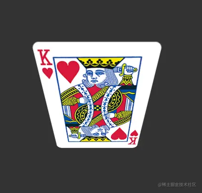
<title>空间旋转-X轴</title>
<style>
body {
background-color: #333;
}
.box {
width: 200px;
margin: 100px auto;
perspective: 400px;
}
img {
width: 200px;
transition: all 2s;
}
.box img:hover {
transform: rotateX(-45deg);
}
</style>
</head>
<body>
<div class="box">
<img src="./images/pk1.png" alt="" />
</div>
</body>
</html>
<!DOCTYPE html>
<html lang="en">
<head>
<meta charset="UTF-8" />
<meta http-equiv="X-UA-Compatible" content="IE=edge" />
<meta name="viewport" content="width=device-width, initial-scale=1.0" />
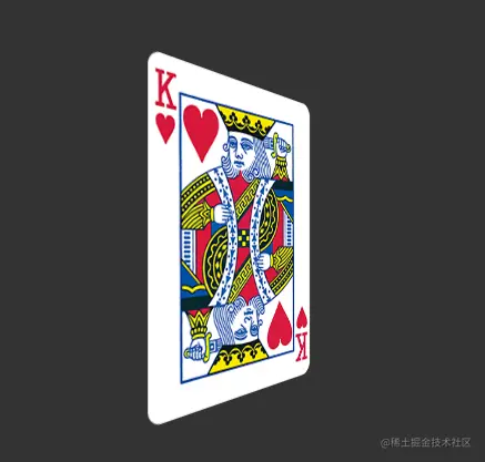
<title>空间旋转-Y轴</title>
<style>
body {
background-color: #333;
}
.box {
width: 200px;
margin: 100px auto;
perspective: 400px;
}
img {
width: 200px;
transition: all 2s;
}
.box img:hover {
transform: rotateY(45deg);
}
</style>
</head>
<body>
<div class="box">
<img src="./images/pk1.png" alt="" />
</div>
</body>
</html>
- 立体呈现
- 使用transform-style: preserve-3d呈现立体图形
<!DOCTYPE html>
<html lang="en">
<head>
<meta charset="UTF-8" />
<meta http-equiv="X-UA-Compatible" content="IE=edge" />
<meta name="viewport" content="width=device-width, initial-scale=1.0" />
<title>立体呈现</title>
<style>
body {
}
.box {
position: relative;
width: 200px;
height: 200px;
margin: 100px auto;
background-color: skyblue;
transition: all 2s;
perspective: 800px;
transform-style: preserve-3d;
}
.box div {
position: absolute;
left: 0;
top: 0;
width: 200px;
height: 200px;
}
.back {
background-color: green;
}
.front {
background-color: orange;
transition: 1s;
}
.box:hover .front {
transform: translateZ(300px);
}
.box:hover {
transform: rotateY(60deg);
}
</style>
</head>
<body>
<div class="box">
<div class="back">后面</div>
<div class="front">前面</div>
</div>
</body>
</html>
<!DOCTYPE html>
<html lang="en">
<head>
<meta charset="UTF-8" />
<meta http-equiv="X-UA-Compatible" content="IE=edge" />
<meta name="viewport" content="width=device-width, initial-scale=1.0" />
<title>Document</title>
<style>
* {
margin: 0;
padding: 0;
box-sizing: border-box;
}
.box {
position: relative;
width: 300px;
height: 300px;
margin: 200px auto;
transform-style: preserve-3d;
transform: rotateX(-30deg) rotateY(-30deg);
transition: 3s;
}
.box div {
position: absolute;
left: 0;
top: 0;
width: 300px;
height: 300px;
background-color: rgba(135, 207, 235, 0.5);
border: 1px solid tomato;
font-size: 60px;
color: #fff;
font-weight: 700;
text-align: center;
line-height: 298px;
}
.front {
transform: translateZ(150px);
}
.back {
transform: translateZ(-150px);
}
.left {
transform: translateX(-150px) rotateY(-90deg);
}
.right {
transform: translateX(150px) rotateY(90deg);
}
.top {
transform: translateY(-150px) rotateX(90deg);
}
.bottom {
transform: translateY(150px) rotateX(90deg);
}
.box:hover {
transform: rotateX(720deg) rotateY(-380deg) rotateZ(450deg);
}
</style>
</head>
<body>
<div class="box">
<div class="front">前</div>
<div class="back">后</div>
<div class="left">左</div>
<div class="right">右</div>
<div class="top">上</div>
<div class="bottom">下</div>
</div>
</body>
</html>
二、动画
1. 动画实现步骤
<!DOCTYPE html>
<html lang="en">
<head>
<meta charset="UTF-8" />
<meta http-equiv="X-UA-Compatible" content="IE=edge" />
<meta name="viewport" content="width=device-width, initial-scale=1.0" />
<title>动画实现步骤</title>
<style>
.box1 {
width: 200px;
height: 100px;
background-color: skyblue;
animation: bigger 2s;
}
@keyframes bigger {
to {
width: 600px;
}
}
.box2 {
width: 200px;
height: 100px;
background-color: tomato;
animation: move 4s;
}
@keyframes move {
50% {
width: 500px;
height: 300px;
}
100% {
width: 800px;
height: 500px;
}
}
</style>
</head>
<body>
<div class="box1"></div>
<br />
<br />
<div class="box2"></div>
</body>
</html>
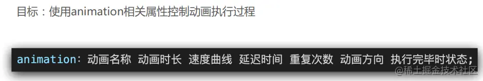
2.animation复合属性
<!DOCTYPE html>
<html lang="en">
<head>
<meta charset="UTF-8" />
<meta http-equiv="X-UA-Compatible" content="IE=edge" />
<meta name="viewport" content="width=device-width, initial-scale=1.0" />
<title>animation复合属性</title>
<style>
.box {
width: 200px;
height: 100px;
background-color: skyblue;
animation: change 2s steps(4) alternate infinite;
}
@keyframes change {
to {
width: 500px;
height: 500px;
background-color: orange;
border-radius: 50%;
}
}
.box:hover {
animation-play-state: paused;
}
</style>
</head>
<body>
<div class="box"></div>
</body>
</html>
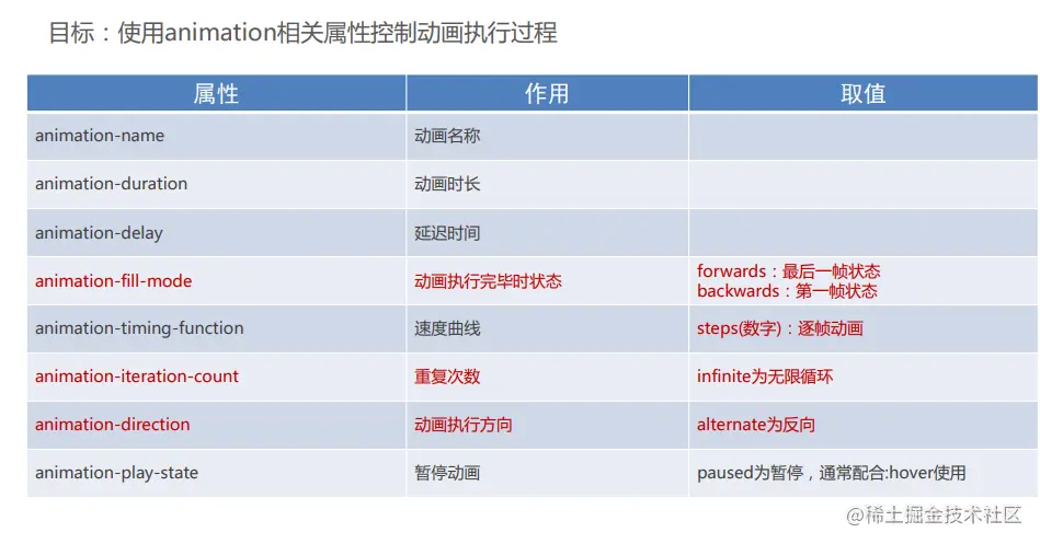
3.使用steps实现逐帧动画
- 逐帧动画:帧动画。开发中,一般配合精灵图实现动画效果。
- animation-timing-function: steps(N);
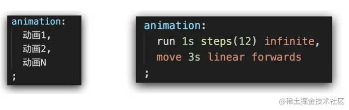
4.能够使用animation属性给一个元素添加多个动画效果
- 多组动画使用逗号隔开


