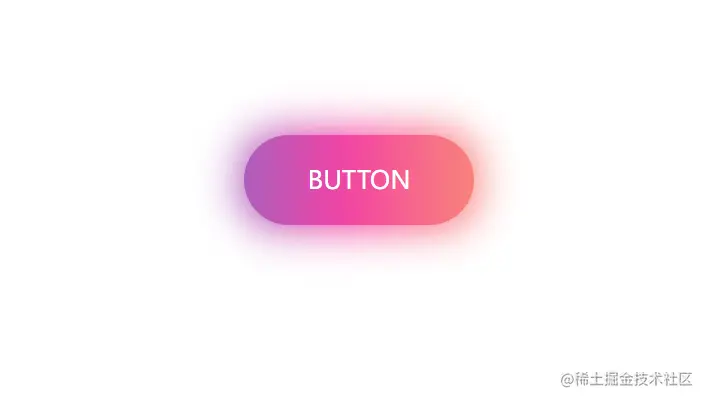
<style>
    .btn {
        position: absolute;
        top: 50%;
        left: 50%;
        transform: translate(-50%, -50%);
        width: 230px;
        height: 90px;
        line-height: 90px;
        text-align: center;
        color: #fff;
        font-size: 25px;
        text-transform: uppercase;
        cursor: pointer;
        background: linear-gradient(90deg, #03a9f4, #f441a5, #ffeb3b, #03a9f4);
        background-size: 400%;
        border-radius: 60px;
    }

    .btn:hover {
        animation: animate 8s linear infinite;
    }

    @keyframes animate {
        0% {
            background-position: 0%;
        }

        100% {
            background-position: 400%;
        }
    }

    .btn::before {
        content: '';
        position: absolute;
        top: -5px;
        left: -5px;
        right: -5px;
        bottom: -5px;
        z-index: -1;
        background: linear-gradient(90deg, #03a9f4, #f441a5, #ffeb3b, #03a9f4);
        background-size: 400%;
        border-radius: 40px;
        opacity: 0;
        transition: 0.5s;
    }

    .btn:hover::before {
        filter: blur(20px);
        opacity: 1;
        animation: animate 8s linear infinite;
    }
</style>

<body>
    <div href="#" class="btn">button</div>
</body>


