

margin 的负值问题
margin-top, 如果是负值, 元素向上移动
margin-left, 如果是负值, 元素向左移动
margin-right, 如果是负值, 右侧元素左移, 自身不受影响
margin-bottom, 如果是负值, 下侧元素上移, 自身不受影响
行高问题
line-height 属性可以继承
line-height: 30px; 直接继承 30px;
line-height: 2; 直接继承 2, 然后计算字体大小的 2 倍
line-height: 200%; 先计算行高, 再继承(小坑)
absolute 和 relative 分别依据什么定位?
relative 依据自身定位, 不会脱离文档流
absolute 依据最近一层的定位元素(absolute, relative, fixed)定位, 会脱离文档流
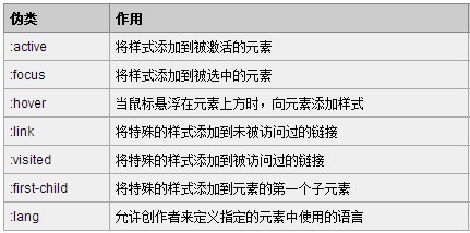
伪类和伪元素
其中伪类和伪元素的根本区别在于:它们是否创造了新的元素
伪类只能使用“:”
而伪元素既可以使用“:”,也可以使用“::”
 进行水平居中
有宽度的块级元素, 水平居中
margin 可以实现块级元素的水平居中
条件是必须有宽度, 左右margin设置成auto
此方法只能进行水平的居中,且对浮动元素或绝对定位元素无效
以上方法是让块级元素水平居中
行内元素或者行内块元素水平居中给其父元素添加 text-align:center 即可
单行文本, 垂直居中
把文字的 line-height 设为文字父容器的高度,适用于只有一行文字的情况。
通过表格特性, 进行垂直水平居中
对于那些不是表格的元素,我们可以通过display:table-cell 来把它模拟成一个表格单元格,这样就可以利用表格那很方便的居中特性了
块级元素修改为 inline-block 设置居中
把块级元素变成行内块元素
父级添加text-align:center
绝对定位的盒子居中
加了绝对定位的盒子不能通过 margin:0 auto 水平居中,但是可以通过以下计算方法实现水平和垂直居中
left: 50%;:让盒子的左侧移动到父级元素的水平中心位置。
margin-left: -100px;:让盒子向左移动自身宽度的一半
绝对定位盒子的垂直水平居中的第二种方案
absolute 元素(知道宽高): top, left, bottom, right = 0 + margin: auto;
不知道宽高, 如何实现垂直居中
absolute 元素(不知道宽高): left:50 % + top:50% + transform: translate(-50%, -50%)
通过display:table-cell 来把它模拟成一个表格单元格,这样就可以利用表格那很方便的居中特性了
通过 flex 属性, align-items: center; justify-content: center;
如何实现水平居中
inline, inline-block 元素: text-align: center
block 元素: margin: auto
absolute 元素(知道宽度): left:50% + margin-left 负值, 自身宽度的一半
如何实现垂直居中
inline 元素: 父元素 line-height = 父元素 height
inline/inline-block/block 元素: 父级设置 display: table-cell; vertical-align: middle;
absolute 元素(知道宽高): top:50% + margin-top 负值, 自身高度的一半
absolute 元素(知道宽高): top, left, bottom, right = 0 + margin: auto;
absolute 元素(不知道宽高): left:50 % + top:50% + transform: translate(-50%, -50%)
block 元素(不知道宽高): 父级设置 display: table-cell; vertical-align: middle;
block 元素(不知道宽高), 设置父级 flex 属性, align-items: center; justify-content: center;
父级外边距塌陷问题
原因是外边距折叠:
相嵌套的块级元素, 父子元素紧贴的 margin-top 会合并, 作用在父元素上
父级外边距塌陷解决方案
解决方案 1: 给父级边框
解决方案 2: 不用 margin-top, 改用父级的内边距, 删除儿子的 margin-top, 必要时需要配合 box-sizing: border-box;
解决方案 3: 儿子的 margin-top 保留, 给父级一个内边距, 1px
解决方案 4: 给父元素设置 overflow:hidden, (触发 bfc)
解决方案 5: 转换成行内块元素
有浮动, 固定, 绝对定位的盒子, 不存在塌陷问题, 所以也可以通过设置浮动, 定位来解决(触发 bfc)
margin 的纵向重叠问题
相邻的margin-top和margin-bottom会重叠, 选择最大的
CSS 哪些属性可以继承?
什么是继承?
什么是 css 继承
css 中哪些属性是可以继承的?
清除浮动有哪些方法, 各有什么优缺点?
为什么要清除浮动
防止父元素塌陷
<style>
    .box-container {
        width: 142px;
        padding: 10px;
        border: 1px solid red;
    }
    img {
        height: 45px;
        width: 45px;
        margin-right: 10px;
        float: left;
    }
    .right-box {
        float: right;
    }
    .right-box-title {
        font-size: 16px;
    }
    .right-box-content {
        font-size: 12px;
        color: gray;
    }
</style>
<div class="box-container">
    <img src="https://markdown-1253389072.cos.ap-nanjing.myqcloud.com/202111191638878.png" alt="" />
    <div class="right-box">
        <div class="right-box-title">java工程师</div>
        <div class="right-box-content">综合就业率第一</div>
    </div>
</div>
清除浮动有哪些方法
父元素固定宽高
.box-container {
    ...
    height: 45px;
}
添加新标签, 额外标签法
<style>
    ... .clear-element {
        clear: both;
    }
</style>
<div class="box-container">
    ...
    <div class="clear-element"></div>
</div>
所谓清除浮动, 实际上是清除浮动对元素的影响
我们知道, 如果两个元素, 一个浮动, 另一个就会顶替它的位置
如果我们不想让顶替的事件发生, 或者说要清除第一个元素浮动对第二个元素的影响
我们可以使用
clear:left,clear:right,clear:both来清除浮动
clear:left清除float:left对元素造成的影响
clear:right清除float:right对元素造成的影响
clear:both清除float:left和float:right对元素造成的影响
清除浮动的语法
css选择器 {
    clear: 属性值;
}
使用伪元素来清除浮动, 不需要修改 html 代码
元素::after, 相当于给元素增加了一个小儿子
元素::before, 相当于给元素增加了一个大儿子默认增加的都是
行级元素以为之前就是通过增加
小儿子的方式, 来把父级撑起来的现在我们可以使用
父元素::after的方式, 来实现同样的效果
... .box-container::after {
    content: "";
    display: block;
    clear: both;
}
也可以封装成一个类, 在需要清除浮动的元素上加上这个类即可
面试题: 手写这个类
clearfix, 越快越好
.clearfix::after {
    content: "";
    display: block;
    clear: both;
}
触发 bfc 可以清除浮动造成的父元素塌陷
给父级添加
overflow属性,将其属性值设置为hidden、auto或scroll
.box-container {
    ...
    overflow: hidden;
}
bfc 块级格式化上下文
块格式化上下文(Block Formatting Context,BFC) 是 Web 页面的可视 CSS 渲染的一部分,是块盒子的布局过程发生的区域,也是浮动元素与其他元素交互的区域。
简单的说 BFC 是一个完全独立的空间, 这个空间里子元素的渲染不会影响到外面的布局
解决外边距合并的问题
<!DOCTYPE html>
<html lang="en">
    <head>
        <meta charset="UTF-8" />
        <meta name="viewport" content="width=device-width, initial-scale=1.0" />
        <title>css-box</title>
        <style>
            section {
                background: red;
                color: black;
                width: 200px;
                line-height: 100px;
                text-align: center;
                margin: 50px;
            }
        </style>
    </head>
    <body>
        <section>box-one</section>
        <section>box-two</section>
    </body>
</html>
包一层 div, 给 div 加 overflow:hidden
<!DOCTYPE html>
<html lang="en">
    <head>
        <meta charset="UTF-8" />
        <meta name="viewport" content="width=device-width, initial-scale=1.0" />
        <title>css-box</title>
        <style>
            section {
                background: red;
                color: black;
                width: 200px;
                line-height: 100px;
                text-align: center;
                margin: 50px;
            }
            .container {
                overflow: hidden;
            }
        </style>
    </head>
    <body>
        <div class="container">
            <section>box-one</section>
        </div>
        <div class="container">
            <section>box-two</section>
        </div>
    </body>
</html>
触发 bfc
- float 不是 none
- position 是 absolute 或者 fixed
- overflow 不是 visible
- display 是 flex, inline-block, table-cell
overflow 溢出
内容超出盒子范围怎么办?
visible, 溢出不做处理
hidden, 超出部分隐藏, 没有滚动条
scroll, 超出部分隐藏, 有滚动条
auto, 按需出现滚动条
如何使用 css 画一个三角形?
使用场景
实现方法
<style>
    .triangle {
        width: 0px;
        height: 0px;
        border: 10px solid transparent;
        border-top-color: olivedrab;
    }
</style>
<div class="triangle"></div>
如何理解 html 语义化?
让人更容易读懂, 增加代码的可读性
让搜索引擎更容易读懂, 方便 SEO 优化
