import numpy as np
import pandas as pd
import matplotlib.pyplot as plt
import seaborn as sns
%matplotlib inline
uber = pd.read_csv('D:/KevinZhang/Study/data_analytics/uber-raw-data-apr14.csv')
uber.head()
.dataframe tbody tr th:only-of-type {
vertical-align: middle;
}
.dataframe tbody tr th {
vertical-align: top;
}
.dataframe thead th {
text-align: right;
}
|
Date/Time |
Lat |
Lon |
Base |
| 0 |
4/1/2014 0:11 |
40.7690 |
-73.9549 |
B02512 |
| 1 |
4/1/2014 0:17 |
40.7267 |
-74.0345 |
B02512 |
| 2 |
4/1/2014 0:21 |
40.7316 |
-73.9873 |
B02512 |
| 3 |
4/1/2014 0:28 |
40.7588 |
-73.9776 |
B02512 |
| 4 |
4/1/2014 0:33 |
40.7594 |
-73.9722 |
B02512 |
uber.info()
<class 'pandas.core.frame.DataFrame'>
RangeIndex: 564516 entries, 0 to 564515
Data columns (total 4 columns):
# Column Non-Null Count Dtype
0 Date/Time 564516 non-null object
1 Lat 564516 non-null float64
2 Lon 564516 non-null float64
3 Base 564516 non-null object
dtypes: float64(2), object(2)
memory usage: 17.2+ MB
def num_missing(x):
return sum(x.isnull())
print('Number of missing/null values per column')
print(uber.apply(num_missing, axis=0))
Number of missing/null values per column
Date/Time    0
Lat          0
Lon          0
Base         0
dtype: int64
uber.isna().sum()
Date/Time    0
Lat          0
Lon          0
Base         0
dtype: int64
uber['Date/Time'] = pd.to_datetime(uber['Date/Time'], format='%m/%d/%Y %H:%M:%S')
uber['DayofWeekNum'] = uber['Date/Time'].dt.dayofweek
uber['DayofWeek'] = uber['Date/Time'].dt.day_name()
uber['DayNum'] = uber['Date/Time'].dt.day
uber['HourOfDay'] = uber['Date/Time'].dt.hour
uber.head()
.dataframe tbody tr th:only-of-type {
vertical-align: middle;
}
.dataframe tbody tr th {
vertical-align: top;
}
.dataframe thead th {
text-align: right;
}
|
Date/Time |
Lat |
Lon |
Base |
DayofWeekNum |
DayofWeek |
DayNum |
HourOfDay |
| 0 |
2014-04-01 00:11:00 |
40.7690 |
-73.9549 |
B02512 |
1 |
Tuesday |
1 |
0 |
| 1 |
2014-04-01 00:17:00 |
40.7267 |
-74.0345 |
B02512 |
1 |
Tuesday |
1 |
0 |
| 2 |
2014-04-01 00:21:00 |
40.7316 |
-73.9873 |
B02512 |
1 |
Tuesday |
1 |
0 |
| 3 |
2014-04-01 00:28:00 |
40.7588 |
-73.9776 |
B02512 |
1 |
Tuesday |
1 |
0 |
| 4 |
2014-04-01 00:33:00 |
40.7594 |
-73.9722 |
B02512 |
1 |
Tuesday |
1 |
0 |
uber.shape
(564516, 8)
uber['Base'].unique()
array(['B02512', 'B02598', 'B02617', 'B02682', 'B02764'], dtype=object)
sns.catplot(x='Base', data=uber, kind='count')
<seaborn.axisgrid.FacetGrid at 0x1d1de4e2490>

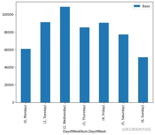
uber_week_data = uber.pivot_table(index=['DayofWeekNum','DayofWeek'], values='Base', aggfunc='count')
uber_week_data
.dataframe tbody tr th:only-of-type {
vertical-align: middle;
}
.dataframe tbody tr th {
vertical-align: top;
}
.dataframe thead th {
text-align: right;
}
|
|
Base |
| DayofWeekNum |
DayofWeek |
|
| 0 |
Monday |
60861 |
| 1 |
Tuesday |
91185 |
| 2 |
Wednesday |
108631 |
| 3 |
Thursday |
85067 |
| 4 |
Friday |
90303 |
| 5 |
Saturday |
77218 |
| 6 |
Sunday |
51251 |
uber_week_data.plot(kind='bar', figsize=(8,6))
<AxesSubplot:xlabel='DayofWeekNum,DayofWeek'>
uber_hourly_data = uber.pivot_table(index=['HourOfDay'], values='Base', aggfunc='count')
uber_hourly_data.plot(kind='line', figsize=(10,6), title='Hourly Journeys')
<AxesSubplot:title={'center':'Hourly Journeys'}, xlabel='HourOfDay'>

uber_day_data = uber.pivot_table(index=['DayNum'], values='Base', aggfunc='count')
uber_day_data.plot(kind='bar', figsize=(10,5), title='Journeys by DayNum')
<AxesSubplot:title={'center':'Journeys by DayNum'}, xlabel='DayNum'>

def count_rows(rows):
    return len(rows)

by_date = uber.groupby('DayNum').apply(count_rows)
by_date
DayNum
1     14546
2     17474
3     20701
4     26714
5     19521
6     13445
7     19550
8     16188
9     16843
10    20041
11    20420
12    18170
13    12112
14    12674
15    20641
16    17717
17    20973
18    18074
19    14602
20    11017
21    13162
22    16975
23    20346
24    23352
25    25095
26    24925
27    14677
28    15475
29    22835
30    36251
dtype: int64
by_date_sorted = by_date.sort_values()
by_date_sorted
DayNum
20    11017
13    12112
14    12674
21    13162
6     13445
1     14546
19    14602
27    14677
28    15475
8     16188
9     16843
22    16975
2     17474
16    17717
18    18074
12    18170
5     19521
7     19550
10    20041
23    20346
11    20420
15    20641
3     20701
17    20973
29    22835
24    23352
26    24925
25    25095
4     26714
30    36251
dtype: int64
plt.hist(uber.HourOfDay, bins=24, range=(.5, 24))
(array([ 7769.,  4935.,  5040.,  6095.,  9476., 18498., 24924., 22843.,
        17939., 17865., 18774., 19425., 22603., 27190., 35324., 42003.,
        45475., 43003., 38923., 36244., 36964., 30645., 20649.,     0.]),
 array([ 0.5       ,  1.47916667,  2.45833333,  3.4375    ,  4.41666667,
         5.39583333,  6.375     ,  7.35416667,  8.33333333,  9.3125    ,
        10.29166667, 11.27083333, 12.25      , 13.22916667, 14.20833333,
        15.1875    , 16.16666667, 17.14583333, 18.125     , 19.10416667,
        20.08333333, 21.0625    , 22.04166667, 23.02083333, 24.        ]),
 <BarContainer object of 24 artists>)

count_rows(uber)
by_hour_weekday = uber.groupby('HourOfDay DayofWeekNum'.split()).apply(count_rows).unstack()
by_hour_weekday
.dataframe tbody tr th:only-of-type {
vertical-align: middle;
}
.dataframe tbody tr th {
vertical-align: top;
}
.dataframe thead th {
text-align: right;
}
| DayofWeekNum |
0 |
1 |
2 |
3 |
4 |
5 |
6 |
| HourOfDay |
|
|
|
|
|
|
|
| 0 |
518 |
765 |
899 |
792 |
1367 |
3027 |
4542 |
| 1 |
261 |
367 |
507 |
459 |
760 |
2479 |
2936 |
| 2 |
238 |
304 |
371 |
342 |
513 |
1577 |
1590 |
| 3 |
571 |
516 |
585 |
567 |
736 |
1013 |
1052 |
| 4 |
1021 |
887 |
1003 |
861 |
932 |
706 |
685 |
| 5 |
1619 |
1734 |
1990 |
1454 |
1382 |
704 |
593 |
| 6 |
2974 |
3766 |
4230 |
3179 |
2836 |
844 |
669 |
| 7 |
3888 |
5304 |
5647 |
4159 |
3943 |
1110 |
873 |
| 8 |
3138 |
4594 |
5242 |
3616 |
3648 |
1372 |
1233 |
| 9 |
2211 |
2962 |
3846 |
2654 |
2732 |
1764 |
1770 |
| 10 |
1953 |
2900 |
3844 |
2370 |
2599 |
2086 |
2113 |
| 11 |
1929 |
2949 |
3889 |
2516 |
2816 |
2315 |
2360 |
| 12 |
1945 |
2819 |
3988 |
2657 |
2978 |
2560 |
2478 |
| 13 |
2294 |
3556 |
4469 |
3301 |
3535 |
2685 |
2763 |
| 14 |
3117 |
4489 |
5438 |
4083 |
4087 |
3042 |
2934 |
| 15 |
3818 |
6042 |
7071 |
5182 |
5354 |
4457 |
3400 |
| 16 |
4962 |
7521 |
8213 |
6149 |
6259 |
5410 |
3489 |
| 17 |
5574 |
8297 |
9151 |
6951 |
6790 |
5558 |
3154 |
| 18 |
4725 |
7089 |
8334 |
6637 |
7258 |
6165 |
2795 |
| 19 |
4386 |
6459 |
7794 |
5929 |
6247 |
5529 |
2579 |
| 20 |
3573 |
6310 |
7783 |
6345 |
5165 |
4792 |
2276 |
| 21 |
3079 |
5993 |
6921 |
6585 |
6265 |
5811 |
2310 |
| 22 |
1976 |
3614 |
4845 |
5370 |
6708 |
6493 |
1639 |
| 23 |
1091 |
1948 |
2571 |
2909 |
5393 |
5719 |
1018 |
plt.figure(figsize=(15, 10))
sns.heatmap(by_hour_weekday)
<AxesSubplot:xlabel='DayofWeekNum', ylabel='HourOfDay'>


