首字下沉
<style>
div {
height: 50px;
width: 50px;
float: left;
font-size: 30px;
}
</style>
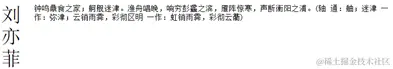
<div>刘亦菲</div>
<p> 钟鸣鼎食之家;舸舰迷津。渔舟唱晚,响穷彭蠡之滨,雁阵惊寒,声断衡阳之浦。(轴 通:舳;迷津 一作:弥津;云销雨霁,彩彻区明 一作:虹销雨霁,彩彻云衢)
</p>
首字下沉
<style>
.content {
width: 400px;
margin: 0 auto;
font-size: 20px;
}
p {
text-indent: 40px;
line-height: 1.5;
}
p:first-child {
text-indent: 0;
}
p:nth-child(1)::first-letter {
font-size: 30px;
float: left;
}
</style>
<div class="content">
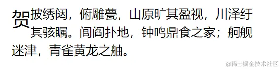
<p>贺披绣闼,俯雕甍,山原旷其盈视,川泽纡其骇瞩。闾阎扑地,钟鸣鼎食之家;舸舰迷津,青雀黄龙之舳。</p>
</div>
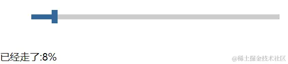
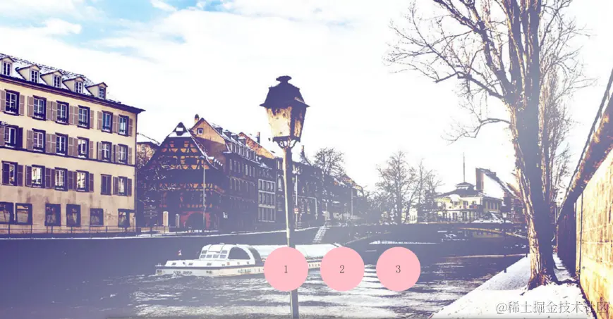
拖动水平条
<style>
.scroll {
width: 400px;
height: 8px;
background-color: #ccc;
margin: 50px;
position: relative;
}
.bar {
width: 10px;
height: 22px;
background-color: #369;
position: absolute;
top: -7px;
left: 0;
cursor: pointer;
}
.mask {
width: 0;
height: 100%;
background-color: #369;
position: absolute;
top: 0;
left: 0;
}
</style>
<div class="scroll" id="scrollBar">
<div class="bar"></div>
<div class="mask"></div>
</div>
<div id="demo">已经走了:0%</div>
<script>
let scrollBar = document.getElementById("scrollBar");
let bar = scrollBar.children[0];
let mask = scrollBar.children[1];
let demo = document.getElementById("demo");
bar.onmousedown = function (event) {
let ev = event || window.event;
let leftVal = ev.clientX - this.offsetLeft;
let that = this;
document.onmousemove = function (event) {
let ev = event || window.event;
that.style.left = ev.clientX - leftVal + "px";
let val = parseInt(that.style.left);
if (val < 0) {
that.style.left = 0;
} else if (val > 390) {
that.style.left = "390px";
}
mask.style.width = that.style.left;
demo.innerHTML ="已经走了:" + parseInt((parseInt(that.style.left) / 390) * 100) + "%";
window.getSelection
? window.getSelection().removeAllRanges()
: document.selection.empty();
};
document.onmouseup = function () {
document.onmousemove = null;
};
};
</script>
过渡-应用-汽泡
<style>
  .pop {
    margin: 100px auto;
    height: 100px;
    width: 300px;
    border-radius: 6px;
    background: url("images/paopao.png") left top no-repeat,
      url("images/paopao.png") right bottom no-repeat;
    background-color: #036;
    transition: all 1s linear;
  }
  .pop:hover {
    background-position: left bottom, right top;
  }
</style>
<div class="pop"></div>
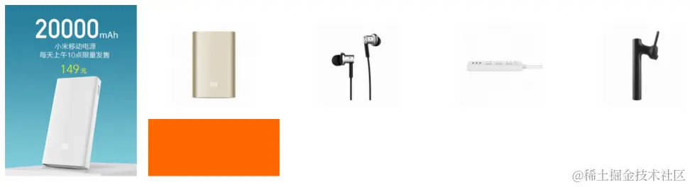
过渡-应用-仿小米官网商品列表
 <style>
    .items {
      width: 1250px;
      height: 320px;
      padding-left: 20px;
      margin: 80px auto;
    }
    .item {
      width: 230px;
      height: 300px;
      text-align: center;
      margin-right: 20px;
      background-color: #fff;
      float: left;
      position: relative;
      top: 0;
      overflow: hidden;
      transition: all 0.5s;
    }
    .pic {
      margin-top: 30px;
    }
    .desc {
      position: absolute;
      bottom: -100px;
      width: 100%;
      height: 100px;
      background-color: #ff6700;
      transition: all 0.5s;
    }
    .item:nth-child(1):hover {
      top: -5px;
      box-shadow: 1px 1px 15px #aaa;
    }
    .item:hover .desc {
      bottom: 0px;
    }
  </style>
  <div class="items">
    <div class="item">
      <img src="./images/1.jpg" alt="" />
    </div>

    <div class="item">
      <div class="pic">
        <img src="./images/2.jpg" alt="" />
      </div>
      <div class="desc"></div>
    </div>
    <div class="item">
      <div class="pic">
        <img src="./images/3.jpg" alt="" />
      </div>
      <div class="desc"></div>
    </div>
    <div class="item">
      <div class="pic">
        <img src="./images/4.jpg" alt="" />
      </div>
      <div class="desc"></div>
    </div>
    <div class="item">
      <div class="pic">
        <img src="./images/5.jpg" alt="" />
      </div>
      <div class="desc"></div>
    </div>
  </div>
2D转换--火箭
<style>
  html,
  body {
    height: 100%;
  }
  body {
    margin: 0;
    padding: 0;
    overflow: hidden;
  }
  section {
    height: 100%;
    background-color: #de8910;
    position: relative;
  }
  .rocket {
    width: 100px;
    height: 190px;
    position: absolute;
    bottom: 0;
    transition: all 2s;
    transform: translate(100px, 300px) rotate(30deg);
  }
  section:hover .rocket {
    transform: translate(800px, -340px) rotate(30deg);
  }
</style>
<section>
  <div class="rocket">
    <img src="./images/rocket.png" alt="" />
  </div>
</section>

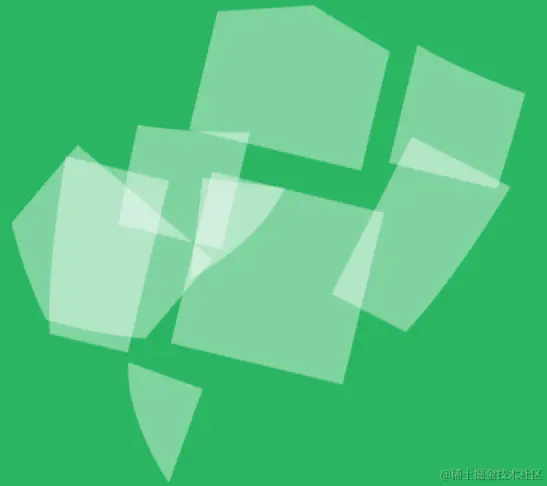
2D转换-盾牌
    <style>
      body {
        margin: 0;
        padding: 0;
        overflow: hidden;
      }
      section {
        height: 100%;
        background-color: #2ab561;
      }
      .shield {
        width: 440px;
        margin: 0 auto;
      }
      .shield img {
        transition: all 1s linear;
      }

      img:nth-child(1) {
        transform: translate(400px, 400px) rotate(45deg);
      }
      img:nth-child(2) {
        transform: translate(250px, 114px) rotate(45deg);
      }
      img:nth-child(3) {
        transform: translate(300px, 201px) rotate(45deg);
      }
      img:nth-child(4) {
        transform: translate(100px, 140px) rotate(45deg);
      }
      img:nth-child(5) {
        transform: translate(200px, 220px) rotate(45deg);
      }
      img:nth-child(6) {
        transform: translate(170px, 100px) rotate(90deg);
      }
      img:nth-child(7) {
        transform: translate(200px, 200px) rotate(66deg);
      }
      img:nth-child(8) {
        transform: translate(-400px, -400px) rotate(134deg);
      }
      img:nth-child(9) {
        transform: translate(-400px, -400px) rotate(24deg);
      }
      .shield:hover img {
        transform: translate(0px, 0px) rotate(0deg);
      }
    </style>
    <section>
      <div class="shield">
        <img src="./images/shield_1_01.png" alt="" />
        <img src="./images/shield_1_02.png" alt="" />
        <img src="./images/shield_1_03.png" alt="" />
        <img src="./images/shield_1_04.png" alt="" />
        <img src="./images/shield_1_05.png" alt="" />
        <img src="./images/shield_1_06.png" alt="" />
        <img src="./images/shield_1_07.png" alt="" />
        <img src="./images/shield_1_08.png" alt="" />
        <img src="./images/shield_1_09.png" alt="" />
      </div>
    </section>
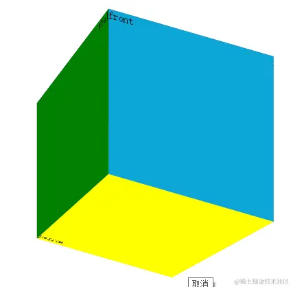
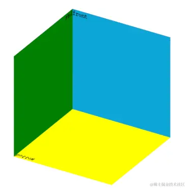
3D转换-立方体盒子
<style>
.box {
width: 200px;
height: 200px;
margin: 100px auto;
position: relative;
transform: rotateX(30deg) rotateY(30deg);
transform-style: preserve-3d;
}
.left,
.right,
.top,
.bottom,
.front,
.back {
width: 200px;
height: 200px;
position: absolute;
left: 0;
top: 0;
}
.left {
background: green;
transform: perspective(1000px) rotateY(90deg) translateZ(-100px);
}
.right {
background: pink;
transform: perspective(1000px) rotateY(90deg) translateZ(100px);
}
.top {
background: #036;
transform: perspective(1000px) rotateX(90deg) translateZ(100px);
}
.bottom {
background: yellow;
transform: perspective(1000px) rotateX(90deg) translateZ(-100px);
}
.front {
background: #0da5d6;
transform: perspective(1000px) translateZ(100px);
}
.back {
background: #ffcaca;
transform: perspective(1000px) translateZ(-100px);
}
</style>
<div class="box">
<div class="left">left</div>
<div class="right">right</div>
<div class="front">front</div>
<div class="back">back</div>
<div class="top">top</div>
<div class="bottom">bottom</div>
</div>
3D转换-音乐盒
<style>
body {
margin: 0;
padding: 0;
background-color: #fff;
}
.music-box {
width: 300px;
height: 300px;
margin: 50px auto;
position: relative;
perspective: 1000px;
}
.music-box::before,
.music-box::after {
content: "";
display: block;
position: absolute;
left: 0;
top: 0;
width: 100%;
height: 100%;
border-radius: 150px;
}
.music-box::before {
background-image: url(./images/musict.jpg);
}
.music-box::after {
background-image: url(./images/musicb.jpg);
transition: all 1s;
transform-origin: center bottom;
}
.music-box:hover::after {
transform: rotateX(-180deg);
}
</style>
<div class="music-box"></div>
3D转换-百度钱包
<style>
body {
margin: 0;
padding: 0;
background-color: #b3c04c;
}
.wallet {
width: 300px;
height: 300px;
margin: 50px auto;
position: relative;
transform-style: preserve-3d;
transition: all 3s;
}
.wallet::before,
.wallet::after {
content: "";
position: absolute;
left: 0;
top: 0;
display: block;
width: 100%;
height: 100%;
background-image: url(./images/bg.png);
background-repeat: no-repeat;
background-size: 100% 100%;
}
.wallet::before {
background-position: right top;
transform: rotateY(180deg);
}
.wallet::after {
background-position: left top;
transform: translateZ(2px);
}
.wallet:hover {
transform: rotateY(180deg);
}
</style>
<div class="wallet"></div>

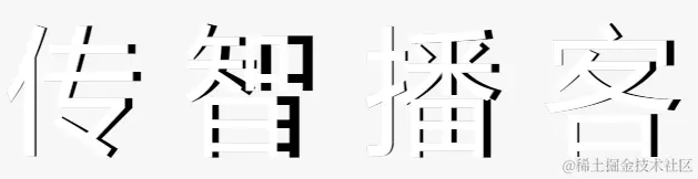
3D转换-翻转的文字
<style>
body {
margin: 0;
padding: 0;
font-family: "微软雅黑";
background-color: #f7f7f7;
}
.text-box {
margin-top: 100px;
text-align: center;
line-height: 1;
font-size: 100px;
}
.text-box span {
display: inline-block;
position: relative;
}
span::before,
span::after {
content: attr(data-text);
position: absolute;
top: 0;
left: 0;
transform-origin: left center;
transition: all 4s;
}
span::before {
transform: rotateY(-20deg);
color: #fff;
z-index: 3;
}
span::after {
z-index: 2;
color: rgba(0, 0, 0, 0.4);
}
span:hover::before {
transform: rotateY(-40deg);
}
span:hover::after {
}
</style>
<div class="text-box">
<span data-text="传">传</span>
<span data-text="智">智</span>
<span data-text="播">播</span>
<span data-text="客">客</span>
</div>
3D转换-3D导航
<style>
body {
margin: 0;
padding: 0;
font-family: "微软雅黑";
background-color: #f7f7f7;
}
.nav {
height: 40px;
margin-top: 50px;
text-align: center;
list-style: none;
}
li {
width: 140px;
height: 40px;
text-align: center;
line-height: 40px;
float: left;
position: relative;
transform-style: preserve-3d;
transition: all 1s;
}
li span {
display: block;
width: 100%;
height: 100%;
position: absolute;
left: 0;
top: 0;
}
li span:nth-child(1) {
background-color: yellow;
transform: rotateX(90deg) translateZ(20px);
}
li span:nth-child(2) {
background-color: green;
transform: translateZ(20px);
}
li:nth-child(1) {
transition-delay: 0s;
}
li:nth-child(2) {
transition-delay: 0.25s;
}
li:nth-child(3) {
transition-delay: 0.5s;
}
li:nth-child(4) {
transition-delay: 0.75s;
}
li:nth-child(5) {
transition-delay: 1s;
}
ul:hover li {
transform: rotateX(-90deg);
}
</style>
<ul class="nav">
<li>
<span>刘亦菲</span>
<span>Web前端</span>
</li>
<li>
<span>刘亦菲</span>
<span>Web前端</span>
</li>
<li>
<span>刘亦菲</span>
<span>Web前端</span>
</li>
<li>
<span>刘亦菲</span>
<span>Web前端</span>
</li>
<li>
<span>刘亦菲</span>
<span>Web前端</span>
</li>
</ul>

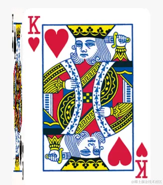
3D转换-立体盒子
<style>
  body {
    margin: 0;
    padding: 0;
    font-family: "微软雅黑";
    background-color: #f7f7f7;
  }

  .box {
    width: 310px;
    height: 438px;
    margin: 80px auto;
    position: relative;
    transition: all 1s;
    transform-style: preserve-3d;
    transform-origin: left center;
  }

  .top,
  .bottom {
    position: absolute;
    top: 0;
    left: 0;
    width: 100%;
    height: 100%;
  }

  .top {
    transform: rotateY(90deg) translateZ(155px) translateX(155px);
  }

  .box:hover {
    transform: rotateY(-90deg);
  }
</style>
<div class="box">
  <div class="top">
    <img src="./images/pk1.png" alt="" />
  </div>
  <div class="bottom">
    <img src="./images/pk2.png" alt="" />
  </div>
</div>
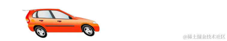
CSS3动画-小车
<style>
  html,
  body {
    height: 100%;
  }
  body {
    margin: 0;
    padding: 0;
    position: relative;
  }
  .car {
    width: 240px;
    position: absolute;
    top: 50%;
    transform: translate(100px, -50%);
    animation: run 2s forwards 1s infinite;
  }
  img {
    display: block;
    width: 100%;
  }
  @keyframes run {
    0% {
    }
    15% {
      transform: translate(0, -50%) skew(30deg);
    }
    90% {
      transform: translate(800px, -50%) skew(-20deg);
      animation-timing-function: ease-in;
    }
    100% {
      transform: translate(800px, -50%) skew(0deg);
      transform-origin: right bottom;
    }
  }
</style>
<div class="car">
  <img src="./images/car.jpg" alt="" />
</div>
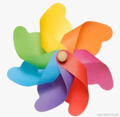
CSS3动画-风车
<style>
  body {
    margin: 0;
    padding: 0;
    background-color: #f7f7f7;
  }
  .box {
    width: 400px;
    margin: 100px auto;
  }

  .box img {
    width: 100%;
    animation: change 3s linear infinite forwards;
  }
  @keyframes change {
    0% {
      transform: rotate(0deg) scale(1);
      opacity: 1;
    }
    50% {
      transform: rotate(-60deg) scale(1);
      opacity: 0.5;
    }
    100% {
      transform: rotate(-360deg) scale(1);
      opacity: 0.8;
    }
  }
</style>
<div class="box">
  <img src="./images/fengche.png" />
</div>
CSS3动画keyframes
<style>
#timer {
text-align: center;
line-height: 1;
padding: 20px 0;
font-size: 80px;
font-family: Arial;
color: red;
}
.box {
width: 200px;
height: 200px;
margin: 0 auto;
background-color: green;
animation: change 10s linear forwards;
}
@keyframes change {
0% {
}
20% {
width: 400px;
height: 200px;
}
40% {
height: 400px;
}
80% {
width: 400px;
height: 400px;
background-color: yellow;
}
100% {
width: 200px;
height: 200px;
background-color: green;
}
}
</style>
<div id="timer">0</div>
<div class="box"></div>
<script>
let timer = document.getElementById("timer"),
end = 0;
setInterval(function () {
if (end >= 10) return;
timer.innerHTML = ++end;
}, 1000);
</script>
3d 盒子旋转鼠标悬停停止
<style>
.box {
width: 200px;
height: 200px;
margin: 100px auto;
position: relative;
transform: rotateX(30deg) rotateY(30deg);
transform-style: preserve-3d;
animation: beat 3s linear 0s infinite;
}
.left,
.right,
.top,
.bottom,
.front,
.back {
width: 200px;
height: 200px;
position: absolute;
left: 0;
top: 0;
}
.box:hover {
animation-play-state: paused;
}
.left {
background: green;
transform: rotateY(90deg) translateZ(-100px);
}
.right {
background: pink;
transform: rotateY(90deg) translateZ(100px);
}
.top {
background: #036;
transform: rotateX(90deg) translateZ(100px);
}
.bottom {
background: yellow;
transform: rotateX(90deg) translateZ(-100px);
}
.front {
background: #0da5d6;
transform: translateZ(100px);
}
.back {
background: #ffcaca;
transform: translateZ(-100px);
}
@keyframes beat {
from {
transform: rotateX(0deg) rotateY(0deg);
}
to {
transform: rotateX(290deg) rotateY(310deg);
}
}
</style>
<div class="box">
<div class="left">left</div>
<div class="right">right</div>
<div class="front">front</div>
<div class="back">back</div>
<div class="top">top</div>
<div class="bottom">bottom</div>
</div>
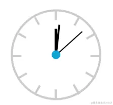
动态时钟
<style>
.clock {
margin: 100px auto;
height: 200px;
width: 200px;
border: 5px solid #ccc;
border-radius: 50%;
position: relative;
}
.line {
border: 3px solid #ccc;
height: 200px;
position: absolute;
left: 50%;
}
.line1 {
margin-left: -3px;
}
.line2 {
transform: rotate(30deg);
}
.line3 {
transform: rotate(60deg);
}
.line4 {
transform: rotate(90deg);
}
.line5 {
transform: rotate(120deg);
}
.line6 {
transform: rotate(150deg);
}
.cover {
width: 160px;
height: 160px;
position: absolute;
left: 50%;
background-color: #fff;
top: 50%;
border-radius: 50%;
transform: translate(-50%, -50%);
}
.hour {
height: 60px;
width: 6px;
background: black;
position: absolute;
left: 50%;
top: 50%;
margin-top: -60px;
transform-origin: bottom center;
animation: change 43200s steps(60) infinite;
margin-left: -3px;
}
.minute {
height: 70px;
width: 4px;
background: black;
position: absolute;
left: 50%;
top: 50%;
margin-left: -2px;
margin-top: -70px;
transform-origin: bottom center;
animation: change 3600s steps(60) infinite;
}
.second {
height: 80px;
width: 2px;
background: black;
position: absolute;
left: 50%;
top: 50%;
margin-top: -80px;
transform-origin: bottom center;
animation: change 60s steps(60) infinite;
}
.dotted {
width: 20px;
height: 20px;
position: absolute;
left: 50%;
top: 50%;
transform: translate(-50%, -50%);
background-color: #0da5d6;
border-radius: 50%;
}
@keyframes change {
from {
transform: rotate(0deg);
}
to {
transform: rotate(360deg);
}
}
</style>
<div class="clock">
<div class="line line1"></div>
<div class="line line2"></div>
<div class="line line3"></div>
<div class="line line4"></div>
<div class="line line5"></div>
<div class="line line6"></div>
<div class="cover"></div>
<div class="hour"></div>
<div class="minute"></div>
<div class="second"></div>
<div class="dotted"></div>
</div>
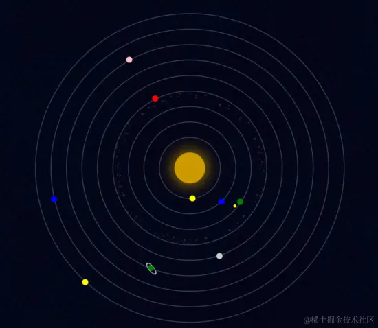
宇宙
<style>
  body {
    margin: 0;
    padding: 0;
    background: #080e24 url(./bg.jpg) repeat;
  }

  ul {
    width: 600px;
    height: 600px;
    margin: 40px auto;
    position: relative;
    list-style: none;
  }

  ul li {
    border: 2px solid #394057;
    position: absolute;
    left: 50%;
    top: 50%;
    border-radius: 50%;
    transform: translate(-50%, -50%);
    box-sizing: border-box;

    animation-iteration-count: infinite;
    animation-timing-function: linear;
    animation-name: orbit;
  }

  ul li span {
    display: block;
    position: absolute;
    left: 0;
    width: 12px;
    height: 12px;
    border-radius: 50%;
  }

  ul li:nth-child(1) {
    width: 60px;
    height: 60px;
    border: none;
    box-shadow: 0 0 50px #c90;
    background-color: #c90;
    animation-duration: 5s;
  }

  ul li:nth-child(2) {
    width: 120px;
    height: 120px;
    animation-duration: 6s;
  }

  ul li:nth-child(2) span {
    background-color: yellow;
    left: 80px;
    top: 0;
  }

  ul li:nth-child(3) {
    width: 180px;
    height: 180px;
    animation-duration: 10s;
  }

  ul li:nth-child(3) span {
    background-color: blue;
    left: 47px;
    top: 0;
  }

  ul li:nth-child(4) {
    width: 240px;
    height: 240px;
    animation-duration: 12s;
  }

  ul li:nth-child(4) > span {
    background-color: green;
    left: 209px;
    top: 43px;
    animation: orbit 2s infinite linear;
  }

  ul li:nth-child(4) > span span {
    width: 6px;
    height: 6px;
    left: 16px;
    background-color: yellow;
  }

  ul li:nth-child(5) {
    width: 300px;
    height: 300px;
    background-image: url(./asteroids_meteorids.png);
    background-size: cover;
    animation-duration: 25s;
  }

  ul li:nth-child(5) span {
    background-color: red;
    left: 95px;
    top: 0;
  }

  ul li:nth-child(6) {
    width: 360px;
    height: 360px;
    animation-duration: 20s;
  }

  ul li:nth-child(6) span {
    background-color: #ccc;
    left: -5px;
    top: 200px;
  }

  ul li:nth-child(7) {
    width: 420px;
    height: 420px;
    animation-duration: 30s;
  }

  ul li:nth-child(7) > span {
    background-color: green;
    left: 300px;
    top: 18px;
  }

  ul li:nth-child(7) > span span {
    width: 15px;
    height: 15px;
    border: 2px solid #ccc;
    left: -4px;
    top: -4px;
    transform: skew(0, 45deg);
  }

  ul li:nth-child(8) {
    width: 480px;
    height: 480px;
    animation-duration: 35s;
  }

  ul li:nth-child(8) span {
    background-color: pink;
    left: 0;
    top: 170px;
  }

  ul li:nth-child(9) {
    width: 540px;
    height: 540px;
    animation-duration: 40s;
  }

  ul li:nth-child(9) span {
    background-color: blue;
    left: 47px;
    top: 100px;
  }

  ul li:nth-child(10) {
    width: 600px;
    height: 600px;
    animation-duration: 45s;
  }

  ul li:nth-child(10) span {
    background-color: yellow;
    left: 224px;
    top: 0;
  }

  @keyframes orbit {
    0% {
      transform: translate(-50%, -50%) rotate(0deg);
    }

    100% {
      transform: translate(-50%, -50%) rotate(360deg);
    }
  }
</style>
<ul>
  <li></li>
  <li><span></span></li>
  <li><span></span></li>
  <li>
    <span><span></span></span>
  </li>
  <li><span></span></li>
  <li><span></span></li>
  <li>
    <span><span></span></span>
  </li>
  <li><span></span></li>
  <li><span></span></li>
  <li><span></span></li>
</ul>
大海波涛
<style>
html, body { height: 100%;}
body {
margin: 0;
padding: 0;
background-color: #0EA9B1;
}
section {
height: 100%;
position: relative;
overflow: hidden;
}
.bg1, .bg2 {
position: absolute;
left: 0;
width: 100%;
}
.bg1 {
bottom: 20px;
height: 211px;
background-image: url(./1.png);
animation: move 1s linear infinite;
}
.bg2 {
bottom: 0;
height: 235px;
background-image: url(./2.png);
animation: move 1s linear infinite;
}
.sun {
width: 50px;
height: 50px;
background-color: #FFF;
border-radius: 25px;
position: absolute;
left: 200px;
top: 100px;
}
.sun::before, .sun::after {
content: '';
display: block;
position: absolute;
left: 0;
top: 0;
width: 100%;
height: 100%;
background-color: #FFF;
border-radius: 25px;
}
.sun::before {
animation: scale 1s infinite linear;
}
.sun::after {
animation: scale 1s 0.5s infinite linear;
}
@keyframes scale {
0% {
}
100% {
transform: scale(2);
opacity: 0;
}
}
@keyframes move {
0% {
}
50% {
bottom: -20px;
}
100% {
}
}
</style>
<section>
<div class="sun"></div>
<div class="bg1"></div>
<div class="bg2"></div>
</section>

全屏切换
<style>
html,
body {
height: 100%;
}
body {
margin: 0;
padding: 0;
position: relative;
}
ul {
padding: 0;
margin: 0;
}
.img-box {
padding: 0;
margin: 0;
height: 100%;
position: relative;
}
.img-box li {
width: 100%;
height: 100%;
background-size: cover;
position: absolute;
left: 0;
top: 0;
}
.img-box li:nth-child(1) {
background-image: url(./images/bg1.jpg);
z-index: 3;
}
.img-box li:nth-child(2) {
background-image: url(./images/bg2.jpg);
z-index: 2;
}
.img-box li:nth-child(3) {
background-image: url(./images/bg3.jpg);
z-index: 1;
}
.handle {
position: absolute;
bottom: 80px;
z-index: 10;
width: 100%;
height: 100px;
text-align: center;
}
.handle li {
display: inline-block;
width: 100px;
height: 100px;
line-height: 100px;
margin: 0 10px;
background-color: pink;
border-radius: 50px;
}
.handle a {
display: inline-block;
width: 100%;
height: 100%;
text-decoration: none;
font-size: 24px;
color: #444;
}
#img1:target {
z-index: 3;
animation: slideleft 1s linear;
}
#img2:target {
z-index: 3;
}
#img3:target {
z-index: 3;
}
@keyframes slideleft {
from {
transform: translate(-100%);
}
to {
transform: translate(0);
}
}
</style>
<ul class="handle">
<li><a href="#img1">1</a></li>
<li><a href="#img2">2</a></li>
<li><a href="#img3">3</a></li>
</ul>
<ul class="img-box">
<li id="img1"></li>
<li id="img2"></li>
<li id="img3"></li>
</ul>
动态进度条
<style>
  .progress {
    width: 500px;
    height: 40px;
    margin: 100px auto;
    background-color: yellow;
    border-radius: 5px;
    background-image: linear-gradient(
      135deg,
      green 25%,
      transparent 25%,
      transparent 50%,
      green 50%,
      green 75%,
      transparent 75%,
      transparent 100%
    );
    background-size: 40px 40px;
    background-position: 0 0;
    animation: move 1s linear infinite;
  }

  @keyframes move {
    0% {
      background-position: 0 0;
    }
    100% {
      background-position: 40px 0;
    }
  }
</style>
<div class="progress"></div>
无缝滚动
<style>
body {
margin: 0;
padding: 0;
background-color: #f7f7f7;
}
.view {
width: 882px;
height: 86px;
margin: 200px auto;
position: relative;
overflow: hidden;
border: 1px solid #ccc;
}
ul {
width: 1764px;
height: 86px;
padding: 0;
margin: 0;
list-style: none;
position: absolute;
left: 0;
animation: move 8s linear infinite;
}
ul:hover {
animation-play-state: paused;
}
li {
float: left;
font-size: 0;
}
@keyframes move {
0% {
left: 0;
}
100% {
left: -882px;
}
}
</style>
<div class="view">
<ul>
<li><img src="./images/1.jpg" alt="" /></li>
<li><img src="./images/2.jpg" alt="" /></li>
<li><img src="./images/3.jpg" alt="" /></li>
<li><img src="./images/4.jpg" alt="" /></li>
<li><img src="./images/5.jpg" alt="" /></li>
<li><img src="./images/6.jpg" alt="" /></li>
<li><img src="./images/7.jpg" alt="" /></li>
</ul>
</div>

跳动的心
<style>
html,
body {
height: 100%;
}
body {
margin: 0;
padding: 0;
background: #ffa5a5;
background: linear-gradient(to bottom, #ffa5a5 0%, #ffd3d3 100%);
}
.chest {
width: 500px;
height: 500px;
margin: 0 auto;
position: relative;
}
.heart {
position: absolute;
z-index: 2;
background: linear-gradient(-90deg, #f50a45 0%, #d5093c 40%);
animation: beat 0.7s ease 0s infinite normal;
}
.heart.center {
background: linear-gradient(-45deg, #b80734 0%, #d5093c 40%);
}
.heart.top {
z-index: 3;
}
.side {
top: 100px;
width: 220px;
height: 220px;
border-radius: 220px;
}
.center {
width: 210px;
height: 210px;
bottom: 100px;
left: 145px;
}
.left {
left: 62px;
}
.right {
right: 62px;
}
@keyframes beat {
0% {
transform: scale(1) rotate(225deg);
box-shadow: 0 0 40px #d5093c;
}
50% {
transform: scale(1.1) rotate(225deg);
box-shadow: 0 0 70px #d5093c;
}
100% {
transform: scale(1) rotate(225deg);
box-shadow: 0 0 40px #d5093c;
}
}
</style>
<div class="chest">
<div class="heart left side top"></div>
<div class="heart center"></div>
<div class="heart right side"></div>
</div>

baidu动画
<style>
  .logo {
    width: 270px;
    height: 129px;
    margin: 100px auto;
    background-image: url(./baidu.png);
    background-position: 0 0;
  }
</style>
<div class="logo"></div>

<script>
  let logo = document.querySelector(".logo");
  let offset = -270;
  let n = 0;
  setInterval(function () {
    n++;
    logo.style.backgroundPosition = offset * n + "px 0px";
    if (n >= 64) n = 0;
  }, 100);
</script>


