盒子水平居中,垂直居中办法
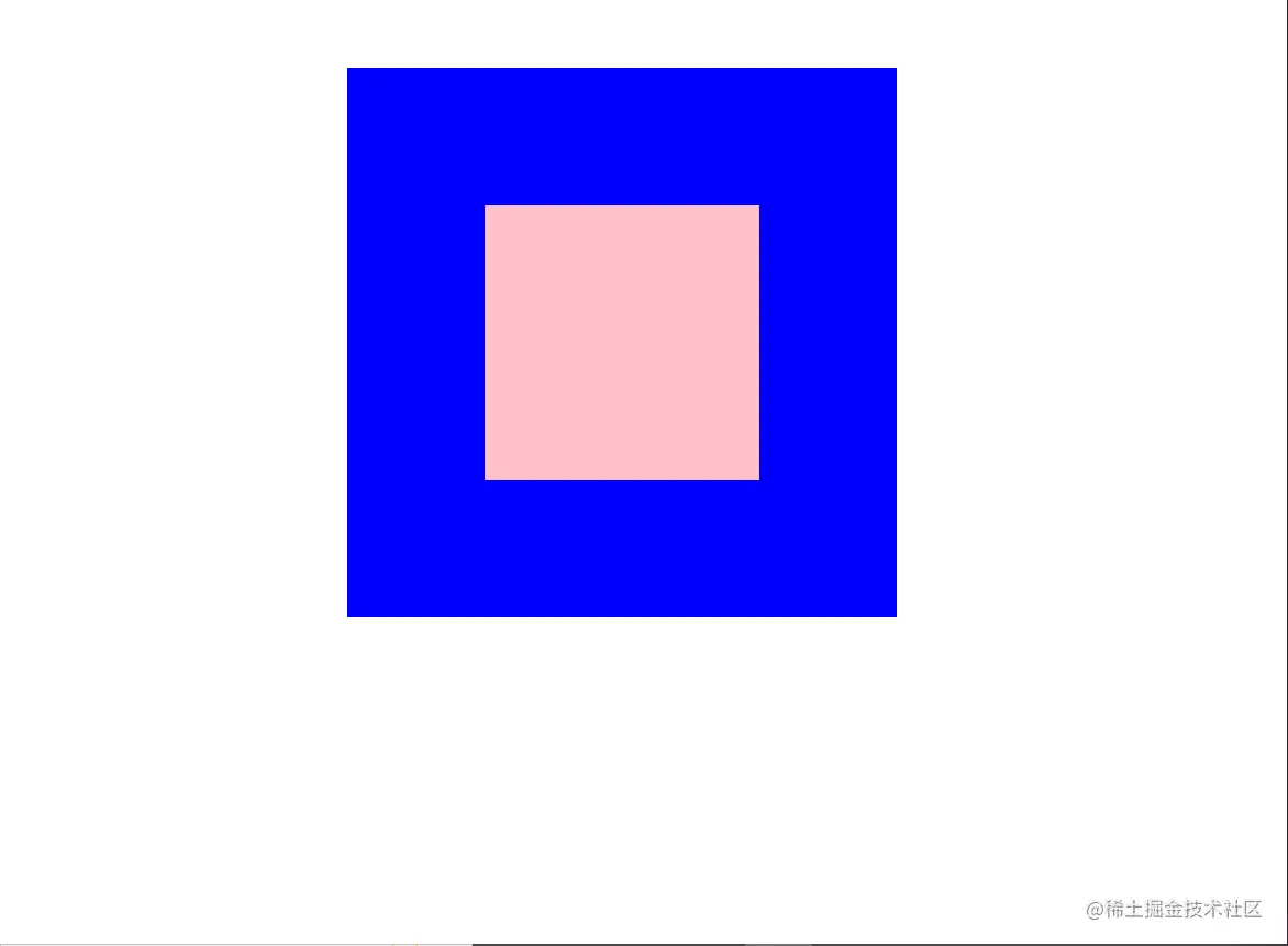
1.定位(父相子决)
<html lang="en">

<head>
  <meta charset="UTF-8">
  <meta http-equiv="X-UA-Compatible" content="IE=edge">
  <meta name="viewport" content="width=device-width, initial-scale=1.0">
  <title>Document</title>
  <style>
    * {
      margin: 0;
      padding: 0;
      box-sizing: border-box;
    }

    .father {
      position: relative;
      width: 400px;
      height: 400px;
      background-color: blue;
      margin: 50px auto 0;
    }

    .son {
      /* 绝对定位 */
      position: absolute;
      left: 50%;
      top: 50%;
      /* margin-left: -100px;
      margin-top: -100px; */
      /* pc端 布局 有兼容性问题  */
      /* 移动可以放心使用 */
      transform: translate(-50%, -50%);
      width: 200px;
      height: 200px;
      background-color: pink;
    }

    /*
    请使用多种方式让盒子水平垂直居中
      1 let:50%;top: 50%; 使用margin负值移动盒子自身的一半
      2 使用transform移动(百分比)
      3 flex布局()
    */
  </style>
</head>

<body>
  <div class="father">
    <div class="son"></div>
  </div>
</body>

</html>
结果图:
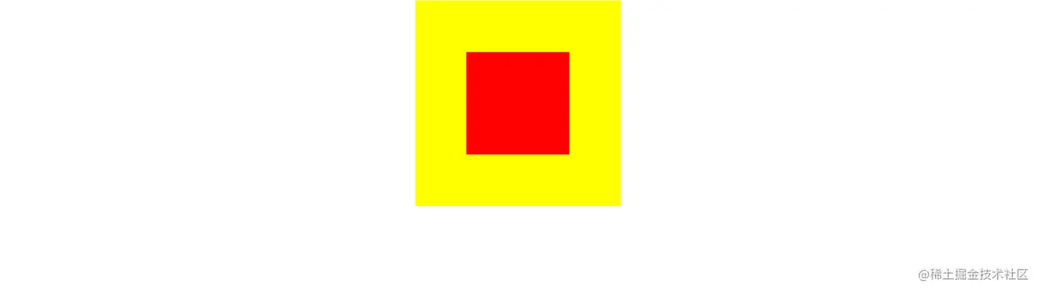
2.flex布局:一定要给父盒子设置flex布局,在父盒子里设置水平居中和垂直居中.
<html lang="en">
<head>
  <meta charset="UTF-8">
  <meta http-equiv="X-UA-Compatible" content="IE=edge">
  <meta name="viewport" content="width=device-width, initial-scale=1.0">
  <title>Document</title>

  <style>
    .father{
      display: flex;
      justify-content: center;
      align-items: center;
      width: 300px;
      height: 300px;
      margin: 0 auto;
      background-color: yellow;
    }

    .son{
      width: 150px;
      height: 150px;
      background-color: red;

    }

  </style>
</head>
<body>

  <div class="father">
    <div class="son">

    </div>
  </div>
</body>
</html>


