<!DOCTYPE html>
<html>
<head>
<meta charset="utf-8">
<title>responsivelayout</title>
<style>
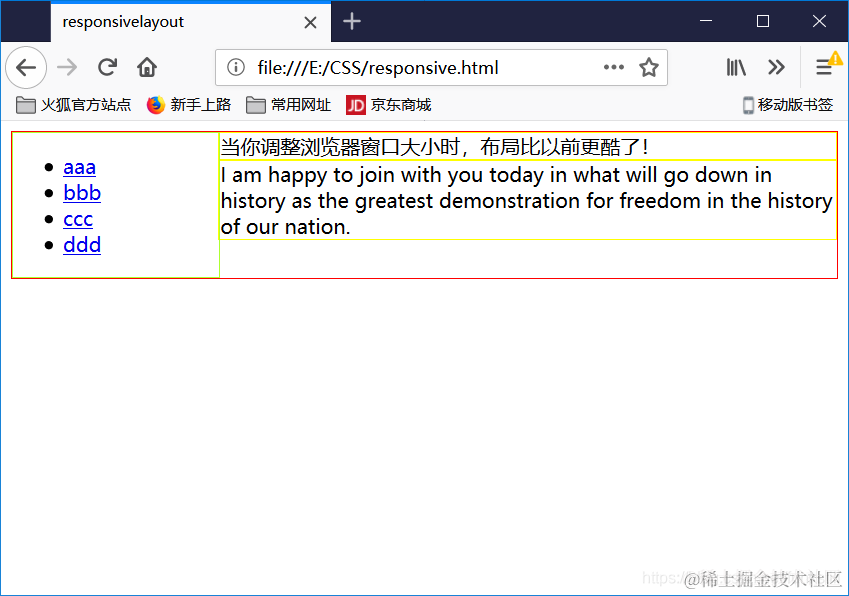
@media screen and (min-width:600px){
nav {
float: left;
width: 25%;
border: solid greenyellow 1px;
}
section{
margin-left: 25%;
border: solid yellow 1px;
}
}
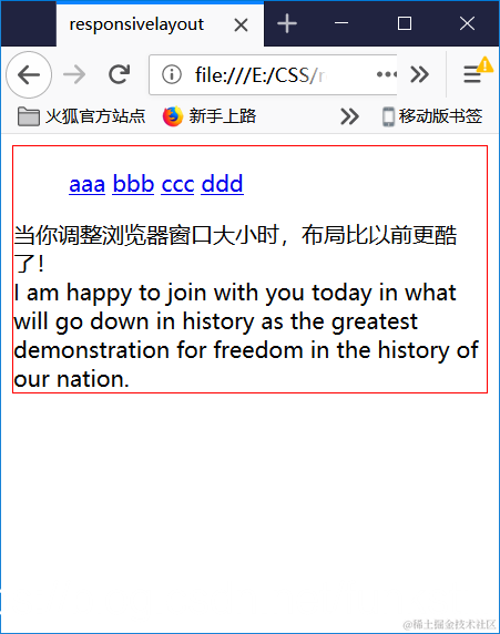
@media screen and (max-width:599px){
nav li {
display: inline;
}
}
div {
border: solid red 1px;
}
.clearfix {
overflow: auto;
}
</style>
</head>
<body>
<div class="container clearfix">
<nav>
<ul>
<li><a href="#">aaa</a></li>
<li><a href="#">bbb</a></li>
<li><a href="#">ccc</a></li>
<li><a href="#">ddd</a></li>
</ul>
</nav>
<section>
当你调整浏览器窗口大小时,布局比以前更酷了!
</section>
<section>
I am happy to join with you today in what will go down in history as the greatest demonstration for freedom in the history of our nation.
</section>
</div>
</body>
</html>


