1.Flex的优势与特点
  01.浏览器提倡的布局模型,页面渲染性能高.
  02.布局简单.方便
  03.避免了浮动脱标的问题
  04.兼容性较高(除个别低版本的浏览器)
2.组成部分
   01.弹性容器(父级盒子,添加display:flex的盒子)
   02.弹性盒子(子级)
   03.主轴(默认水平)
   04.侧轴(默认垂直)
3.主轴的对齐方式
01.主轴:
   justify-content: center: (居中)
   justify-content: between: (间距出现在弹性盒子之间)
   justify-content: evenly: (父子级间距都相同)
   justify-content: around: (间距出现在弹性盒子两侧--视觉效果: 子级之间的间距是父级左右两侧间距的2倍)
02.侧轴:
     02-1:align-items(控制所有弹性盒子)
       align-items-center(侧轴居中)
       align-items-center(侧轴居中)
       align-items-stretch(默认值,拉伸)
     02-2:align-self(控制某个弹性盒子)
 4.弹性伸缩比:flex:整数数字(flex:1(占满剩余空间))注:此属性给子盒子设置
1.主轴/侧轴方向居中
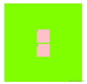
<!DOCTYPE html>
<html lang="en">

<head>
    <meta charset="UTF-8">
    <meta http-equiv="X-UA-Compatible" content="IE=edge">
    <meta name="viewport" content="width=device-width, initial-scale=1.0">
    <title>Document</title>
    <style>
        .box {
            display: flex;
            width: 600px;
            height: 600px;
            margin: 100px auto;
            flex-direction: column;
            justify-content: center;
            align-items: center;
            background-color: chartreuse;
        }

        div {
            height: 100px;
            width: 100px;
            background-color: pink;
        }

        .box div:first-child {
            margin: 10px 0;
        }
    </style>
</head>

<body>
    <div class="box">
        <div>1</div>
        <div>2</div>
    </div>
</body>

</html>
2.弹性盒子换行
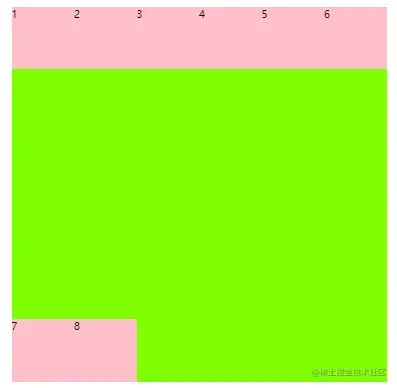
<!DOCTYPE html>
<html lang="en">

<head>
    <meta charset="UTF-8">
    <meta http-equiv="X-UA-Compatible" content="IE=edge">
    <meta name="viewport" content="width=device-width, initial-scale=1.0">
    <title>Document</title>
    <style>
        .box {
            display: flex;
            margin: 100px auto;
            width: 600px;
            height: 600px;
            flex-wrap: wrap;
            align-content: space-between;
            background-color: chartreuse;
        }

        div {
            height: 100px;
            width: 100px;
            background-color: pink;
        }
    </style>
</head>

<body>
    <div class="box">
        <div>1</div>
        <div>2</div>
        <div>3</div>
        <div>4</div>
        <div>5</div>
        <div>6</div>
        <div>7</div>
        <div>8</div>
    </div>
</body>
</html>


