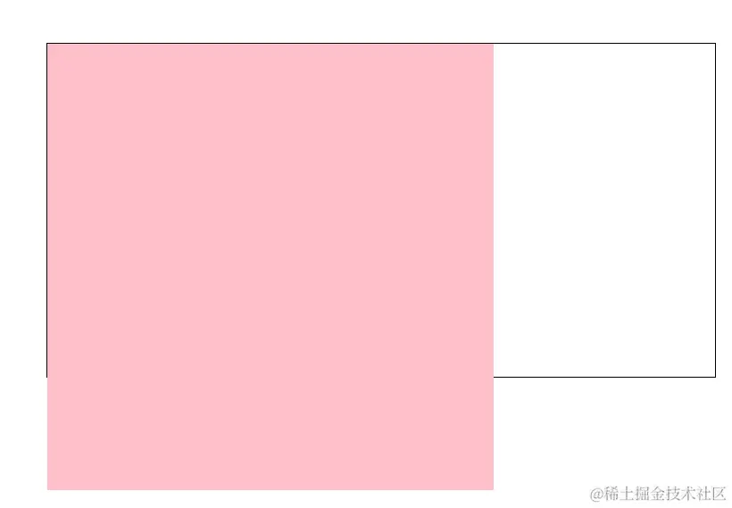
1.rem适配
<style>
html {
font-size: 20px;
}
.box {
width: 10rem;
height: 10rem;
background-color: skyblue;
}
.box1 {
width: 5rem;
height: 5rem;
background-color: pink;
}
</style>
</head>
<body>
<div class="box">1</div>//200
<div class="box1"></div>//100
</body>
2.px转为rem
<style>
@media(width:375px) {
html {
font-size: 37.5px;
}
}
.box {
width: 1.813rem;
height: 0.773rem;
background-color: pink;
}
</style>
</head>
<body>
<div class="box"></div>
</body>
注:适配时需要在电脑显示设置里面设为100%
3.rem适配案例
.box {
width: 10rem;
height: 10rem;
background-color: pink;
}
.box1 {
width: 0.8rem;
height: 0.8rem;
background-color: skyblue;
}
</style>
</head>
<body>
<div class="box"></div>
<div class="box1"></div>
<script src="./js/flexible.js"></script>
</body>
4.弹性盒子换行显示
<style>
.box {
display: flex;
flex-wrap: nowrap;
flex-wrap: wrap;
width: 600px;
height: 300px;
border: 1px solid #000;
margin: 100px auto;
}
.box div {
width: 200px;
height: 200px;
background-color: pink;
}
</style>
</head>
<body>
<div class="box">
<div></div>
<div></div>
<div></div>
<div></div>
</div>
</body>
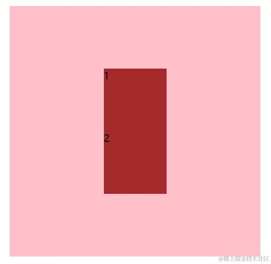
5.两个盒子上下左右垂直居中
<style>
.box {
display: flex;
flex-direction: column;
justify-content: center;
align-items: center;
width: 400px;
height: 400px;
background-color: pink;
margin: 100px auto;
}
.box div {
width: 100px;
height: 100px;
background-color: brown;
}
</style>
</head>
<body>
<div class="box">
<div>1</div>
<div>2</div>
</div>
</body>
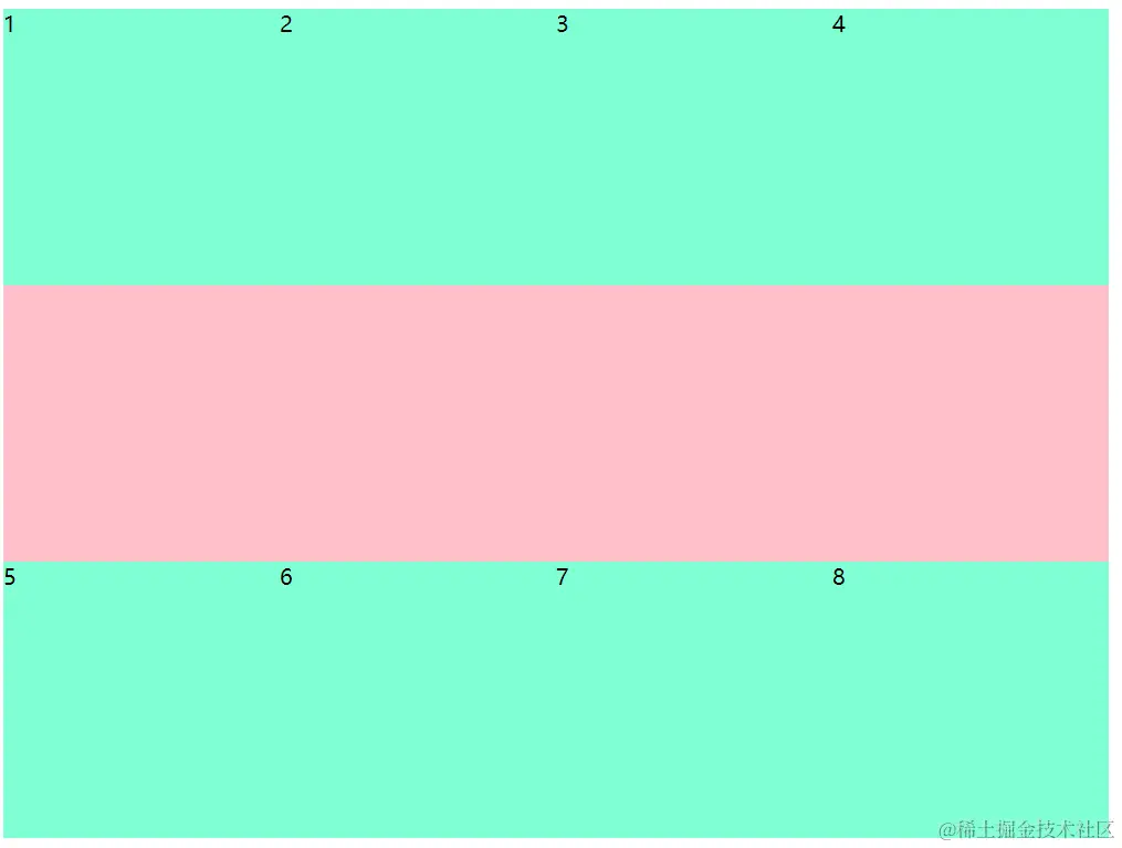
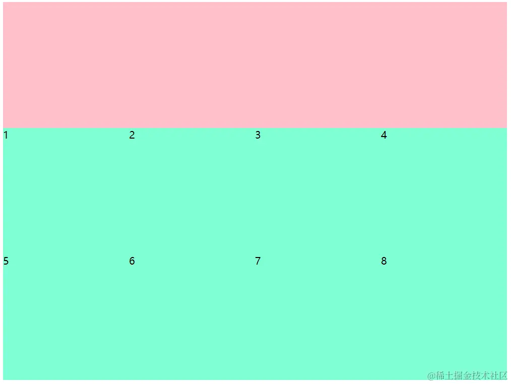
6.多行侧轴对齐方式-----主轴两边贴边
      <style>
.box {
  display: flex;
  flex-wrap: wrap;
  align-content: space-between;
  width: 800px;
  height: 600px;
  background-color: pink;
}

.box div {
  width: 200px;
  height: 200px;
  background-color: aquamarine;
}
  </style>
 </head>

  <body>
      <div class="box">
           <div>1</div>
           <div>2</div>
           <div>3</div>
           <div>4</div>
           <div>5</div>
           <div>6</div>
           <div>7</div>
           <div>8</div>
      </div>
  </body>
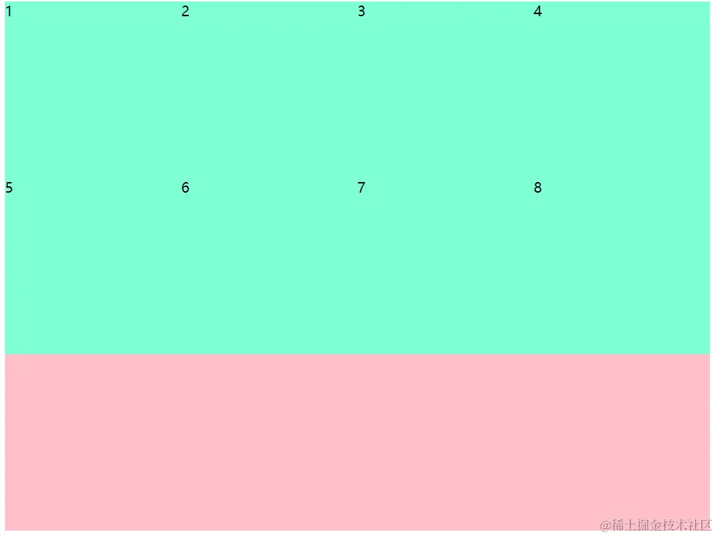
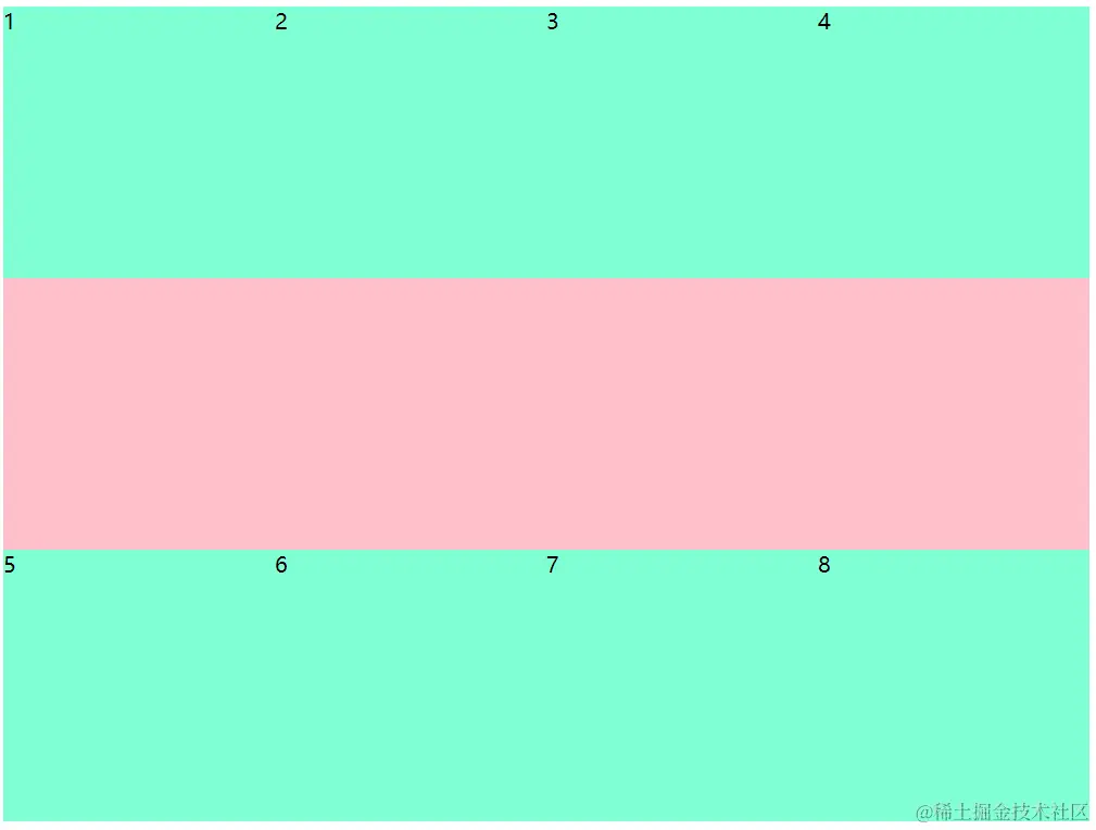
7.多行侧轴对齐方式-----顶部对齐
   <style>
      .box {
           display: flex;
           flex-wrap: wrap;
           align-content: flex-start;
           width: 800px;
           height: 600px;
           background-color: pink;
          }

    .box div {
              width: 200px;
              height: 200px;
              background-color: aquamarine;
            }
    </style>
    </head>

     <body>
           <div class="box">
               <div>1</div>
               <div>2</div>
               <div>3</div>
               <div>4</div>
               <div>5</div>
               <div>6</div>
               <div>7</div>
               <div>8</div>
           </div>
    </body>
8.多行侧轴对齐方式-----底部对齐
   <style>
      .box {
           display: flex;
           flex-wrap: wrap;
           align-content: flex-end;
           width: 800px;
           height: 600px;
           background-color: pink;
          }

    .box div {
              width: 200px;
              height: 200px;
              background-color: aquamarine;
            }
    </style>
    </head>

     <body>
           <div class="box">
               <div>1</div>
               <div>2</div>
               <div>3</div>
               <div>4</div>
               <div>5</div>
               <div>6</div>
               <div>7</div>
               <div>8</div>
           </div>
    </body>
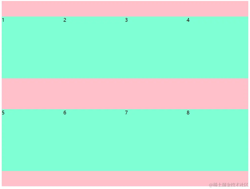
9.多行侧轴对齐方式-----居中对齐
   <style>
      .box {
           display: flex;
           flex-wrap: wrap;
           align-content: center;
           width: 800px;
           height: 600px;
           background-color: pink;
          }

    .box div {
              width: 200px;
              height: 200px;
              background-color: aquamarine;
            }
    </style>
    </head>

     <body>
           <div class="box">
               <div>1</div>
               <div>2</div>
               <div>3</div>
               <div>4</div>
               <div>5</div>
               <div>6</div>
               <div>7</div>
               <div>8</div>
           </div>
    </body>
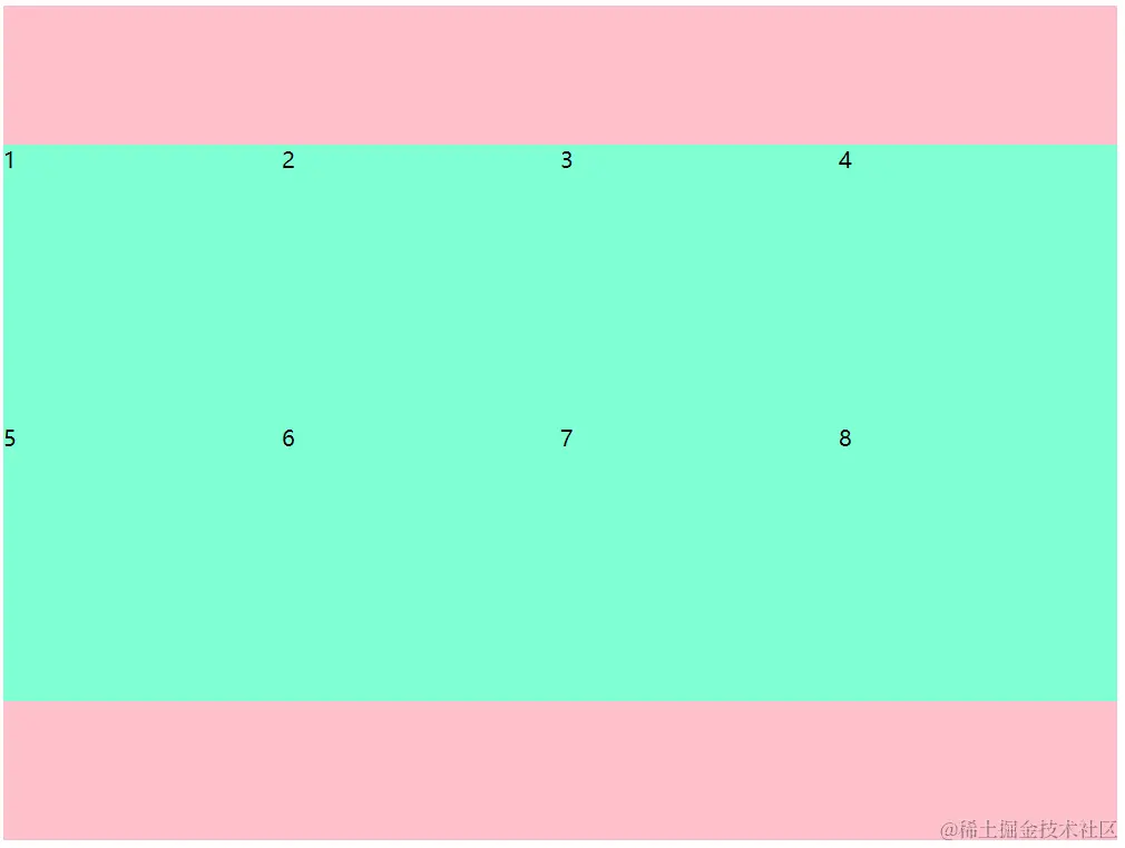
10.多行侧轴对齐方式-----中间的间隙等于两边加起来的间隙
 <style>
      .box {
           display: flex;
           flex-wrap: wrap;
           align-content: space-around;
           width: 800px;
           height: 600px;
           background-color: pink;
          }

    .box div {
              width: 200px;
              height: 200px;
              background-color: aquamarine;
            }
    </style>
    </head>

     <body>
           <div class="box">
               <div>1</div>
               <div>2</div>
               <div>3</div>
               <div>4</div>
               <div>5</div>
               <div>6</div>
               <div>7</div>
               <div>8</div>
           </div>
    </body>
11.多行侧轴对齐方式-----上下贴边
  <style>
      .box {
           display: flex;
           flex-wrap: wrap;
           align-content: space-between;
           width: 800px;
           height: 600px;
           background-color: pink;
          }

    .box div {
              width: 200px;
              height: 200px;
              background-color: aquamarine;
            }
    </style>
    </head>

     <body>
           <div class="box">
               <div>1</div>
               <div>2</div>
               <div>3</div>
               <div>4</div>
               <div>5</div>
               <div>6</div>
               <div>7</div>
               <div>8</div>
           </div>
    </body>
12.多行侧轴对齐方式-----间隙一样大
     <style>
      .box {
           display: flex;
           flex-wrap: wrap;
           align-content: space-evenly;
           width: 800px;
           height: 600px;
           background-color: pink;
          }

    .box div {
              width: 200px;
              height: 200px;
              background-color: aquamarine;
            }
    </style>
    </head>

     <body>
           <div class="box">
               <div>1</div>
               <div>2</div>
               <div>3</div>
               <div>4</div>
               <div>5</div>
               <div>6</div>
               <div>7</div>
               <div>8</div>
           </div>
    </body>

13.文字强制一行显示

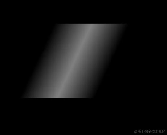
14.让图片显示光效果
<style>
body {
background-color: black;
}
.box {
margin: 100px auto;
width: 200px;
height: 200px;
transform: skewX(-25deg);
background-image: -webkit-linear-gradient(0deg, hsla(0, 0%, 100%, 0), hsla(0, 0%, 100%, .5), hsla(0, 0%, 100%, 0));
}
</style>
</head>
<body>
<div class="box"></div>
</body>
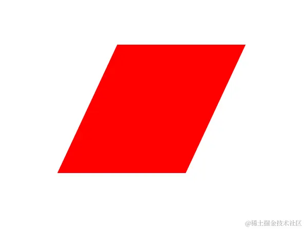
15.如何让一个正方形变成等边四边形
  <style>
     .box {
           margin: 100px auto;
           width: 200px;
           height: 200px;
           background-color: red;
           transform: skewX(-25deg);
         }
 </style>
  </head>

  <body>
        <div class="box"></div>
  </body>
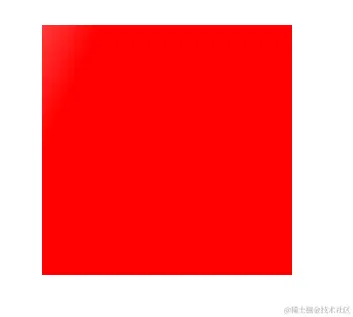
16.如何给盒子添加像光一样的过渡效果
<style>
 .box {
      position: relative;
      margin: 100px auto;
      width: 200px;
      height: 200px;
      background-color: red;
    }

 .box::before {
     content: '';
     position: absolute;
     left: -100%;
     top: 0;
     width: 100%;
     height: 100%;
     transform: skewX(-25deg);
     background-image: -webkit-linear-gradient(0deg, hsla(0, 0%, 100%, 0), hsla(0, 0%, 100%, .5), hsla(0, 0%, 100%, 0));
}

  .box:hover::before {
        transition: all 0.5s;
        left: 100%;
     }
  </style>
 </head>

<body>
  <div class="box"></div>
</body>


