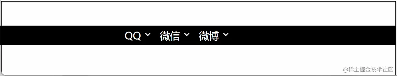
使用两个盒子互相压盖形成三角形
<!DOCTYPE html>
<html lang="en">
<head>
<meta charset="UTF-8">
<meta http-equiv="X-UA-Compatible" content="IE=edge">
<meta name="viewport" content="width=device-width, initial-scale=1.0">
<title>Document</title>
<style>
* {
margin: 0;
padding: 0;
}
header {
height: 30px;
background-color: #000;
color: #fff;
line-height: 30px;
}
nav {
width: 400px;
margin: 0 auto;
}
a {
text-decoration: none;
color: #fff;
}
ul {
list-style: none;
}
li {
float: left;
margin-right: 30px;
position: relative;
}
li:last-child {
margin-right: 0;
}
.arrow {
position: absolute;
width: 12px;
height: 12px;
right: -17px;
top: 50%;
margin-top: -6px;
transition: transform .2s ease 0s;
}
.arrow b {
position: absolute;
width: 6px;
height: 6px;
background-color: #fff;
transform: rotate(45deg);
top: 0;
left: 3px;
}
.arrow i {
position: absolute;
width: 6px;
height: 6px;
background-color: #000;
transform: rotate(45deg);
top: -2px;
left: 3px;
}
li:hover .arrow {
transform: rotate(180deg);
}
</style>
</head>
<body>
<header>
<nav>
<ul>
<li>
<a href="">QQ</a>
<em class="arrow">
<b></b>
<i></i>
</em>
</li>
<li>
<a href="">微信</a>
<em class="arrow">
<b></b>
<i></i>
</em>
</li>
<li>
<a href="">微博</a>
<em class="arrow">
<b></b>
<i></i>
</em>
</li>
</ul>
</nav>
</header>
</body>
</html>
使用边框制作
<!DOCTYPE html>
<html lang="en">
<head>
<meta charset="UTF-8">
<meta http-equiv="X-UA-Compatible" content="IE=edge">
<meta name="viewport" content="width=device-width, initial-scale=1.0">
<title>Document</title>
<style>
* {
margin: 0;
padding: 0;
}
header {
height: 30px;
background-color: #000;
color: #fff;
line-height: 30px;
}
nav {
width: 400px;
margin: 0 auto;
}
a {
text-decoration: none;
color: #fff;
}
ul {
list-style: none;
}
li {
float: left;
margin-right: 30px;
position: relative;
}
li:last-child {
margin-right: 0;
}
li::before {
content: "";
position: absolute;
top: 14px;
right: -14px;
width: 0;
height: 0;
border: 5px solid transparent;
border-bottom: none;
border-top-color: #fff;
transition: transform .2s ease 0s;
}
li:hover::before {
transform: rotate(180deg);
}
</style>
</head>
<body>
<header>
<nav>
<ul>
<li>
<a href="">QQ</a>
</li>
<li>
<a href="">微信</a>
</li>
<li>
<a href="">微博</a>
</li>
</ul>
</nav>
</header>
</body>
</html>


