1.PC端/移动端不同?
  PC端

-   屏幕大,网页固定版心
-   端浏览器繁多,更多考虑兼容性问题。(布局: 浮动+定位+标准流)

 移动端

-   手机屏幕小,网页宽度多数为100%,是适配手机屏幕宽度
-   移动端则基本不需要考虑兼容性问题,放心大胆使用CSS新特性
2.物理分辨率和逻辑分辨率
 1.  物理分辨率:硬件所支持的,屏幕出厂就设定无法修改
 2.  逻辑分辨率:软件可以达到的, 我们开发中写的是逻辑分辨率
3.视口
视口(viewport)就是浏览器显示页面内容的**屏幕区域**。
视口的分类:
   1.  布局视口 。 iOS, Android基本都将这个视口分辨率设置为980px。
   2.视觉视口。用户正在看到的网站的区域。
   3.理想视口。 设备有多宽,我的网页就显示有多宽
视口标签
有了视口标签,可以达到我们想要的理想视口。

        width=device-width:视口宽度=设备宽度
        initial-scale=1.0:初始页面缩放倍数
        maximum-scale=1.0 最大缩放倍数
        user-scalable=0 不允许用户缩放页面(移动端) 或者为 no 如果为 yes 则允许用户缩放
4.百分比布局案例
<style>
* {
margin: 0;
padding: 0;
box-sizing: border-box;
}
li {
list-style: none;
}
.box {
position: fixed;
left: 0px;
bottom: 0px;
width: 100%;
height: 50px;
background-color: pink;
}
.box li {
float: left;
width: 20%;
height: 50px;
}
.box li img {
width: 100%;
height: 100%;
}
</style>
</head>
<body>
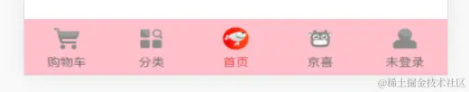
<div class="box">
<ul>
<li><a href="#"><img src="./02-京东/images/car.png" alt=""></a></li>
<li><a href="#"><img src="./02-京东/images/classify.png" alt=""></a></li>
<li><a href="#"><img src="./02-京东/images/index.png" alt=""></a></li>
<li><a href="#"><img src="./02-京东/images/jd.png" alt=""></a></li>
<li><a href="#"><img src="./02-京东/images/login.png" alt=""></a></li>
</ul>
</div>
</body>
5.flex布局主轴对齐方式
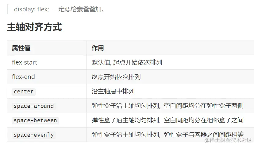
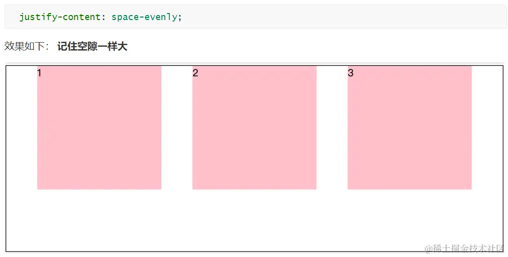

右侧对齐
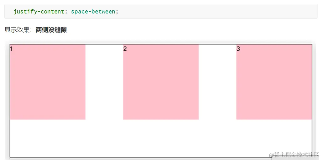
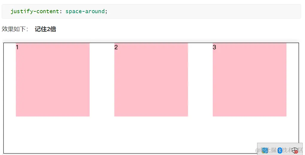
justify-content: flex-end;
  注意点:
        两侧没缝隙是 between
        缝隙一样大是 evenly
        倍缝隙是 around
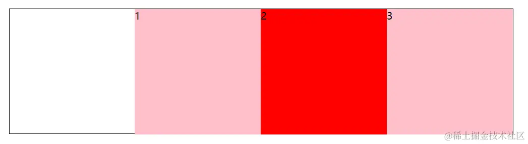
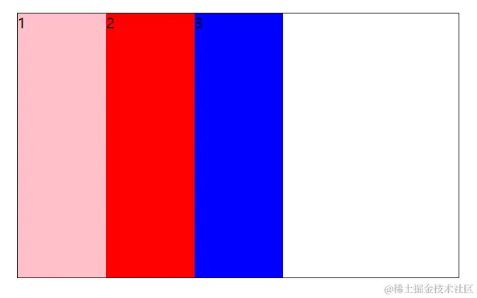
6.flex布局侧轴对齐方式
   黙认值顶部对齐
   align-items: flex-start;
   底部对齐
    align-items: flex-end;
        垂直居中
       align-items: center;
拉伸 测试拉伸时需要把子盒子高度注释
align-items: stretch;
.box{
align-items: stretch;
display: flex;
width: 500px;
height: 300px;
border: 1px solid #000;
margin: 100px auto;
}
.box>span {
width: 100px;
background-color: pink;
}
.box span:nth-child(2) {
background-color: red;
}
.box span:nth-child(3) {
background-color: blue;
}
</style>
</head>
<body>
<div class="box">
<span>1</span>
<span>2</span>
<span>3</span>
</div>
</body>
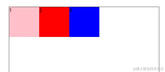
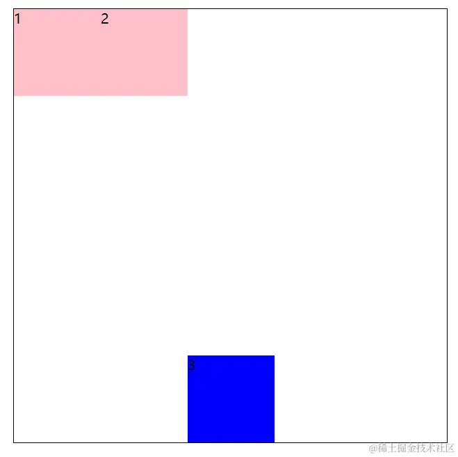
7.align-self:控制弹性盒子侧轴对齐方式
 注意: align-self是添加到子级身上的
 设置自已在侧轴对齐方式  居中
 .box span:nth-child(2) {
                          align-self: center;
                          background-color: red;
                        }
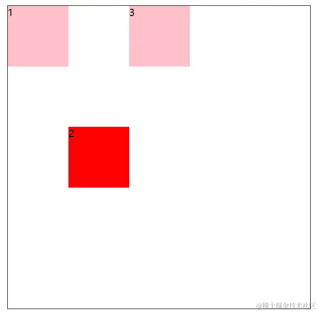
 设置自已在侧轴对齐方式  底部对齐
   .box span:nth-child(3) {
                             align-self: flex-end;
                             background-color: blue;
                          }
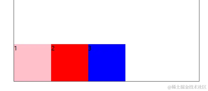
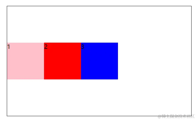
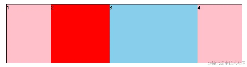
8.伸缩比
.box {
display: flex;
width: 800px;
height: 200px;
border: 1px solid #000;
margin: 100px auto;
}
.box div {
width: 150px;
background-color: pink;
}
.box div:nth-child(2) {
flex: 2;
background-color: red;
}
.box div:nth-child(3) {
flex: 3;
width: 500px;
background-color: skyblue;
}
</style>
</head>
<body>
<div class="box">
<div>1</div>
<div>2</div>
<div>3</div>
<div>4</div>
</div>
</body>
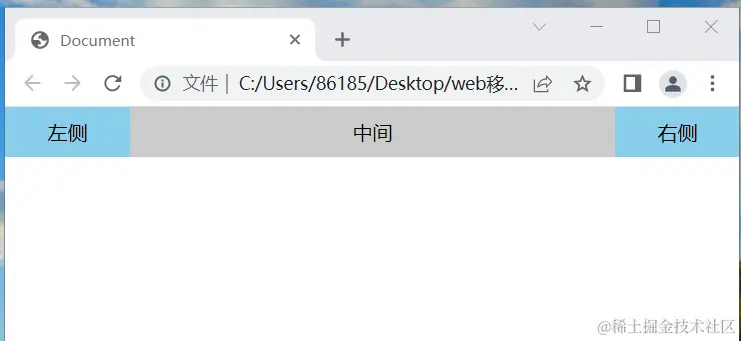
9.圣杯布局
所谓的圣杯布局就是左右两边大小固定不变,中间宽度自适应。
核心思路:
两侧盒子写固定大小
中间盒子 flex: 1; 占满剩余空间
<style>
* {
margin: 0;
padding: 0;
box-sizing: border-box;
}
.box {
display: flex;
width: 100%;
height: 40px;
background-color: #ccc;
text-align: center;
line-height: 40px;
}
.box div:nth-child(1),
.box div:nth-child(3) {
width: 100px;
background-color: skyblue;
}
.box div:nth-child(2) {
flex: 1;
}
</style>
</head>
<body>
<div class="box">
<div>左侧</div>
<div>中间</div>
<div>右侧</div>
</div>
</body>


