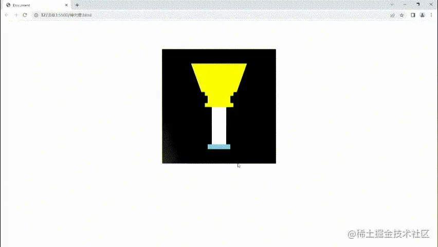
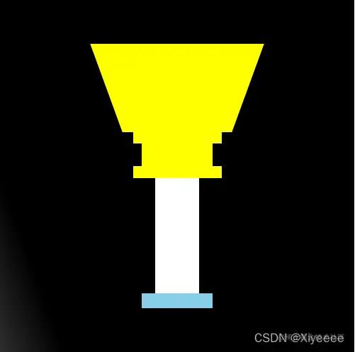
那一刻,我变成了光啊,兄弟们!
代码奉上!让大家都是光,啊哈哈哈哈
<html lang="en">
<head>
<meta charset="UTF-8">
<meta http-equiv="X-UA-Compatible" content="IE=edge">
<meta name="viewport" content="width=device-width, initial-scale=1.0">
<title>Document</title>
<style>
.main{
position: relative;
overflow: hidden;
display: flex;
flex-direction: column;
justify-content: center;
align-items: center;
margin: 100px auto;
width: 400px;
height: 400px;
background-color: black;
}
.flash {
position: absolute;
left: -100%;
top: 0;
width: 400px;
height: 400px;
background-image: -webkit-linear-gradient(0deg,hsla(0,0%,100%,0),hsla(0,0%,100%,.5),hsla(0,0%,100%,0));
transform: skew(20deg);
}
.head {
display: flex;
justify-content: center;
}
.left {
width: 100px;
height: 100px;
background-color: yellow;
transform: skew(20deg) translateX(60px);
}
.center {
width: 80px;
height: 80px;
border-radius: 50%;
background-color: #473f4a;
}
.right{
width: 100px;
height: 100px;
background-color: yellow;
transform: skew(-20deg) translateX(-60px);
}
.footer {
display: flex;
flex-direction: column;
align-items: center;
width: 200px;
height: 200px;
}
.footer .box1{
width: 100px;
height: 15px;
background-color: yellow;
}
.footer .box2{
width: 80px;
height: 30px;
background-color: yellow;
}
.footer .box3{
width: 100px;
height: 15px;
background-color: yellow;
}
.footer .box4{
width: 50px;
height: 150px;
background-color: #fff;
}
.footer .box5{
width: 80px;
height: 20px;
background-color: skyblue;
}
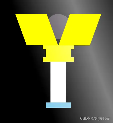
.main:hover .left{
transform: skew(20deg) translateX(0);
transition: all 2s;
}
.main:hover .right{
transform: skew(-20deg) translateX(0);
transition: all 2s;
}
.main:hover .flash {
transition: all 2s;
left: 100%;
}
</style>
</head>
<body>
<!-- 我在css中意外捡到了神光棒啊,兄弟们,我是奥特曼的身份藏不住了 -->
<div class="main">
<div class="flash"></div>
<div class="head">
<div class="left"></div>
<div class="center"></div>
<div class="right"></div>
</div>
<div class="footer">
<div class="box1"></div>
<div class="box2"></div>
<div class="box3"></div>
<div class="box4"></div>
<div class="box5"></div>
</div>
</div>
</body>
</html>


