1.空间转换
3d位移写法
  transform: translate3d(x, y, z);
  transform: translate3d(100px, 100px, 100px);
  x轴往右越大,是正值,否则反之
  y轴往下越大,是正值,否则反之
  Z轴指向我们越大是正值,否则反之
2.透视
目标:使用perspective属性实现透视效果
属性(添加给父级)
perspective: 值;
取值:像素单位数值, 数值一般在800 – 1200。
作用:空间转换时,为元素添加近大远小、近实远虚的视觉效果
body {
perspective: 900px;
}
.box {
width: 200px;
height: 200px;
background-color: pink;
margin: 100px auto;
transition: all 0.5s;
}
.box:hover {
transform: translateZ(300px);
}
3.空间旋转
  语法
      transform: rotateZ(值);
      transform: rotateX(值);
      transform: rotateY(值);
案例
body {
       perspective: 800px;
    }

img {
  transition: all 0.5s;
  margin: 100px 700px;
}

img:hover {
  整个图片的位置不动 旋转一圈
  transform: rotateZ(360deg)
  1turn表示1圈 相当于旋转360度
  transform: rotateZ(1turn)
  0.5turn表示半圈 相当于旋转180度
   transform: rotateZ(0.5turn)
   图片表面向上摆动60度
   transform: rotateX(60deg);
    图片表面向右摆动60度
     transform: rotateY(60deg);
   }
案例
      body {
             perspective: 800px;
           }

img {
  display: block;
  transition: all 2s;
  margin: 100px auto;
}
img:hover {
     x轴旋转 左手法则 4个手指指向的正值旋转方向
     transform: rotateX(180deg); */
     y轴旋转 左手法则 大拇指朝下指 4个手指弯曲方向
     transform: rotateY(90deg);
     旋转复合语法 */
     transform: rotate3d(x,y,z,deg);
      x,y,z的取值为0-1之间的数字 */
     transform: rotate3d(0, 1, 0, 90deg);
     transform: rotate3d(1, 1, 1, 90deg);
    }
4.立体呈现
  目标: 使用transform-style: preserve-3d呈现立体图形
     呈现立体图形步骤:
   1. 盒子父元素添加transform-style: preserve-3d;
   2. 按需求设置子盒子的位置(位移或旋转)
案例
<style>
* {
margin: 0;
padding: 0;
box-sizing: border-box;
}
.box {
position: relative;
width: 200px;
height: 200px;
background-color: pink;
margin: 100px auto;
transition: all 10s;
transform-style: preserve-3d;
}
.box div {
position: absolute;
left: 0;
top: 0;
width: 200px;
height: 200px;
}
.box:hover {
transform: rotateY(180deg);
}
.front {
background-color: orange;
transform: translateZ(100px);
}
.back {
background-color: green;
transform: translateZ(-100px);
}
</style>
<div class="box">
<div class="front">前面</div>
<div class="back">后面</div>
</div>
5.3D导航
导航栏案例
<style>
* {
margin: 0;
padding: 0;
}
.box {
position: relative;
width: 140px;
height: 50px;
margin: 100px auto;
transition: all .5s;
transform-style: preserve-3d;
}
.box div {
position: absolute;
top: 0;
left: 0;
width: 100%;
height: 100%;
font-size: 20px;
line-height: 50px;
color: #fff;
text-align: center;
}
.box div:first-child {
background-color: pink;
transform: translateY(-25px) rotateX(90deg);
}
.box div:last-child {
background-color: skyblue;
transform: translateZ(25px);
}
.box:hover {
transform: rotateX(-90deg);
}
</style>
<div class="box">
<div>黑马前端</div>
<div>Web78期</div>
</div>
6.动画
 目标:使用animation添加动画效果
  动画属性
   目标:使用animation相关属性控制动画执行过程
案例
<style>
.box {
width: 200px;
height: 200px;
background-color: pink;
border-radius: 50%;
text-align: center;
line-height: 200px;
font-size: 30px;
color: #fff;
animation: move 3s;
}
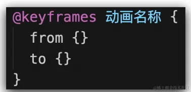
@keyframes move {
from {
transform: translateX(50%);
}
to {
transform: translateX(100%);
}
}
</style>
<div class="box">圆球</div>
案例
<style>
.box {
width: 200px;
height: 200px;
background-color: pink;
animation: move 3s;
}
@keyframes move {
to {
transform: translateX(1000px);
background-color: skyblue;
border-radius: 50%;
}
}
</style>
<div class="box"></div>
动画属性
<style>
.box {
width: 200px;
height: 200px;
background-color: pink;
animation: identifier 3s steps(2);
}
@keyframes identifier {
from {
transform: translateX(0);
}
to {
transform: translateX(1000px);
}
}
.box:hover {
animation-play-state: paused;
}
</style>
<body>
<div class="box"></div>
</body>
案例
<style>
.box {
width: 100px;
height: 100px;
background-color: pink;
使用动画
animation: move 10s;
}
定义动画
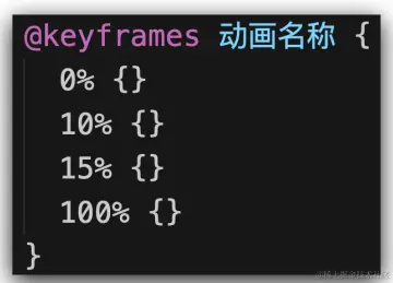
@keyframes move {
25% {
transform: translate(1300px, 0);
background-color: aqua;
}
50% {
transform: translate(1300px, 600px);
background-color: coral;
}
75% {
transform: translate(0, 600px);
background-color: red;
}
100% {
transform: translate(0, 0);
background-color: gold;
}
}
</style>
<body>
<div class="box"></div>
</body>
案例:实现盒子里面的字体不断向上循环,且鼠标经过盒子时能暂停
<style>
* {
margin: 0;
padding: 0;
box-sizing: border-box;
}
li {
list-style: none;
}
a {
text-decoration: none;
color: #333;
}
a:hover {
color: #ff8400;
}
.box {
overflow: hidden;
width: 400px;
height: 400px;
border: 1px solid #000;
margin: 100px auto;
}
.box li {
height: 40px;
line-height: 40px;
}
.box ul {
animation: move 10s linear infinite;
}
@keyframes move {
100% {
transform: translateY(-400px);
}
}
.box:hover ul {
animation-play-state: paused;
}
</style>
<body>
<div class="box">
<ul>
<li><a href="#">红色血脉 文化传承 代表推荐 “守护山” 反腐败 抓手</a></li>
<li><a href="#">新华社连发六文 深揭乌克兰乱局背后的美国“黑手”</a></li>
<li><a href="#">一箱油150欧元,美西方对俄制裁砸了欧洲民生的脚</a></li>
<li><a href="#">准备回家!听听神舟十三号航天员回家前唠点啥</a></li>
<li><a href="#">五角大楼又缺钱:中俄研发武器打击美国卫星</a></li>
<li><a href="#">美国炮制“国别人权报告”对多国指手画脚,中方回应</a></li>
<li><a href="#">乌总统全球演讲中有多少策略和“心机”</a></li>
<li><a href="#">吉林省各市州均实现疫情防控社会面清零目标</a></li>
<li><a href="#">《方舱日记》:住在方舱是种什么体验</a></li>
<li><a href="#">周口一名医护高温下采核酸晕倒 醒来第一句让人泪目</a></li>
</ul>
</div>
</body>
案例:两个盒子叠加在一起,并实现3D效果
<style>
* {
margin: 0;
padding: 0;
}
body {
perspective: 800px;
}
.box {
position: relative;
width: 200px;
height: 200px;
margin: 100px auto;
transition: all 1s;
transform-style: preserve-3d;
}
.box div {
position: absolute;
top: 0;
left: 0;
width: 100%;
height: 100%;
}
.box div:first-child {
background-color: pink;
}
.box div:last-child {
background-color: aqua;
transform: rotateX(80deg);
}
.box:hover {
transform: rotateY(45deg);
}
</style>
<body>
     <div class="box">
          <div></div>
          <div></div>
     </div>
</body>
案例:字体逐桢效果
<style>
.box {
overflow: hidden;
width: 0;
height: 30px;
line-height: 30px;
background-color: pink;
text-align: center;
font-size: 20px;
white-space: normal;
animation: move 5s steps(10) forwards;
}
@keyframes move {
100% {
width: 200px;
}
}
</style>
</head>
<body>
<div class="box">世纪佳缘我在这里等你</div>
</body>


