

- pyecharts文档 画折线图的代码:
import matplotlib.pyplot as plt
import numpy as np
from pyecharts.charts import Bar
from pyecharts.render import make_snapshot
from pyecharts import options as opts
from pyecharts.globals import ThemeType
from pyecharts.commons.utils import JsCode

# import pyecharts.options as opts
from pyecharts.charts import Line
from pyecharts.faker import Faker

# 使用 snapshot-selenium 渲染图片
from snapshot_selenium import snapshot

p = []
y = []
with open("8.12.o.log", "r") as f:
    i = 0
    for line in f:
        i += 1
        p.append(i)
        y.append(round(float(line), 1))
        if i == 38:
            break
c = (
    Line(init_opts=opts.InitOpts(theme=ThemeType.LIGHT))
    # theme=ThemeType.LIGHT INFOGRAPHIC ROMA WESTEROS
    .add_xaxis(p)
    .add_yaxis("运行时间", y,label_opts=opts.LabelOpts(
            font_size=8, is_show=True, position="top", color="lightblue"
        ), is_smooth=True, areastyle_opts=opts.AreaStyleOpts(opacity=0.9),symbol_size=3, is_connect_nones = True, is_selected = True,is_clip=True,is_hover_animation=True)
    .set_global_opts(title_opts=opts.TitleOpts(title="进程个数实验"))
    .render("8.12.html")
)
其中“8.12.o.log”里的数据为:
1.522044 1.477458 1.608361 1.549604 1.634640 2.003351 2.159271 2.183891 2.093249 2.289871 2.773230 2.566977 2.713554 2.646365 2.350819 3.039307 2.396356 2.607148 3.139854 2.496325 3.118845 3.133251 2.480581 3.234695 3.461977 2.923945 3.276957 3.245272 3.512806 3.262974 3.080004 3.480790 5.676186 4.112512 4.451274 5.774258 7.309446 9.226856 17.648028 245.876896 625.635196
一共41行
运行后生成的html截图:
可以看到1的时候没有数据,2开始的每个数据都是前一种情况的运行时间。
解决
- 方法1
第16、17行初始化时加个0:
p = [0]
y = [0]
效果:没有错位了。
- 方法2
import matplotlib.pyplot as plt
import numpy as np
from pyecharts.charts import Bar
from pyecharts.render import make_snapshot
from pyecharts import options as opts
from pyecharts.globals import ThemeType
from pyecharts.commons.utils import JsCode
# import pyecharts.options as opts
from pyecharts.charts import Line
from pyecharts.faker import Faker
# 使用 snapshot-selenium 渲染图片
from snapshot_selenium import snapshot
p = []
y = []
num=38
with open("8.12.o.log", "r") as f:
i = 0
for line in f:
i += 1
p.append(i)
y.append(round(float(line), 1))
if i == num:
break
c = (
Line(init_opts=opts.InitOpts(theme=ThemeType.LIGHT))
# theme=ThemeType.LIGHT INFOGRAPHIC ROMA WESTEROS
.add_xaxis(p)
.add_yaxis("运行时间", y,label_opts=opts.LabelOpts(
font_size=7, is_show=True, position="top", color="lightblue"
), is_smooth=True, areastyle_opts=opts.AreaStyleOpts(opacity=0.7),symbol_size=3, is_connect_nones = True, is_selected = True,is_clip=True,is_hover_animation=True)
.set_global_opts(
title_opts=opts.TitleOpts(title="进程个数实验"),
xaxis_opts=opts.AxisOpts(
type_="value",
name="进 程 个 数",
is_show=True,
is_scale=True,
name_location='middle',
name_gap=25,
min_=1,
max_=num+2,
min_interval=1,
max_interval=2,
axislabel_opts=opts.LabelOpts(margin=5, color="black"),
axisline_opts=opts.AxisLineOpts(is_show=True,is_on_zero=True,symbol=['none','arrow']),
axistick_opts=opts.AxisTickOpts(
is_show=True,
length=200,
is_inside=True,
linestyle_opts=opts.LineStyleOpts(color="#ffffff1f"),
),
# splitline_opts=opts.SplitLineOpts(
# is_show=True, linestyle_opts=opts.LineStyleOpts(color="#red")
# )
),
yaxis_opts=opts.AxisOpts(
type_="value",
name="运行时间(s)",
is_show=True,
is_scale=False,
name_location='middle',
name_gap=25,
min_=0,
# max_=10,
min_interval=1,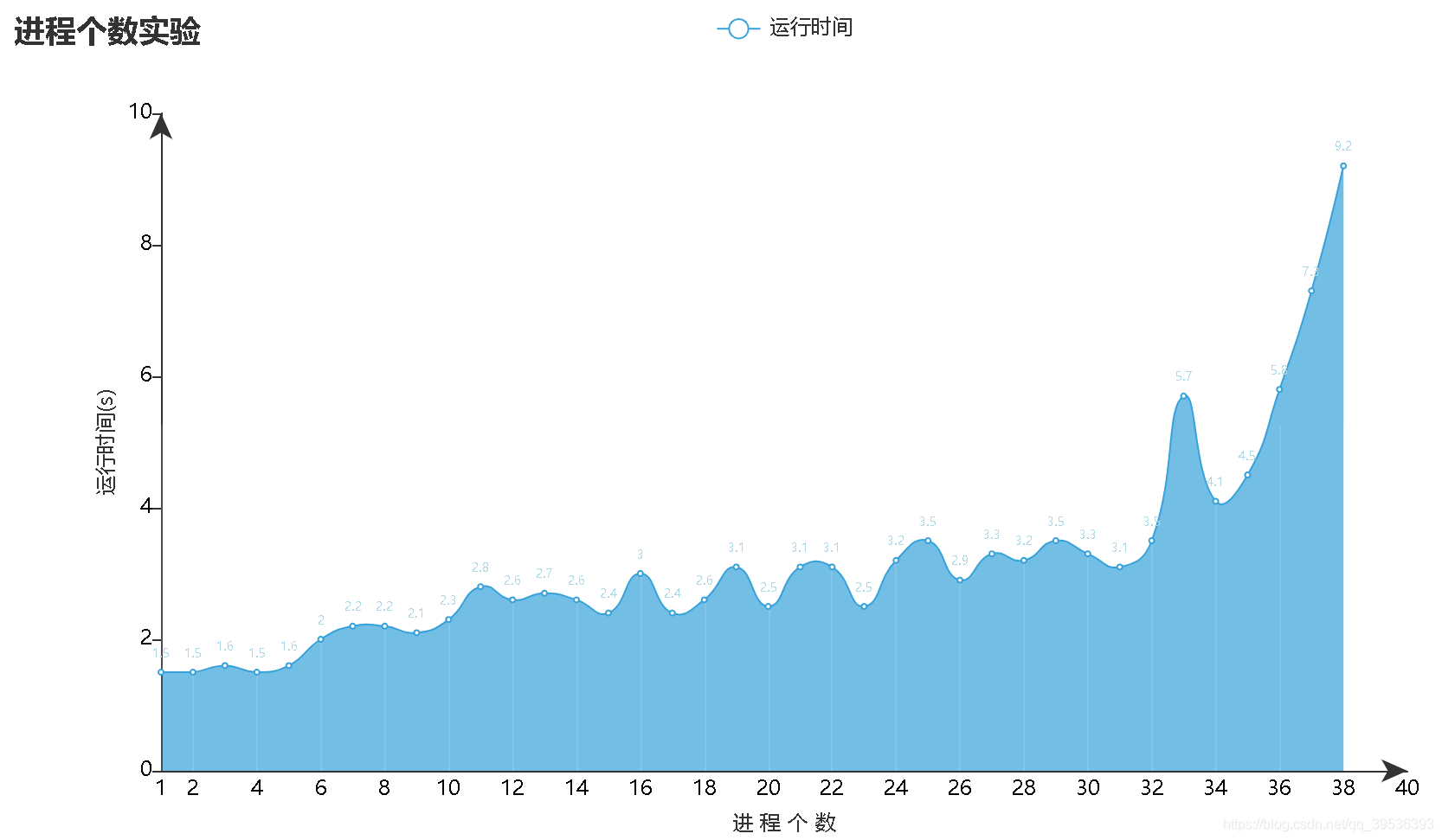
max_interval=2,
axislabel_opts=opts.LabelOpts(margin=5, color="black"),
axisline_opts=opts.AxisLineOpts(is_show=True,is_on_zero=True,symbol=['none','arrow'])
)
).render("8.12.html")
)
第43行把min_设成1,就可以让坐标轴从1开始显示了,效果如下:
