由于长期的学习vue 导致个人对h5c3 的知识已经快要忘却
在此简单用flex布局制作九种麻将布局

flex布局的知识点:
1.flex布局又称为"弹性布局",用来为盒状模型提供最大的灵活性。
.box {
    display: flex;
}
.box {
    display: inline-flex;
}
Webkit内核的浏览器,必须加上-webkit前缀
.box {
    display: -webkit-flex;
    display: flex;
}
注意点: 设为flex布局以后 子元素的float clear 和 vertical-align属性都将消失 没有塌陷和需要清除浮动的情况
2.flex布局的语法:
- 主轴侧轴方向转换: (决定主轴的方向)
flex-direction: row | row-reverse | column | column-reverse
- row(默认): 主轴水平方向 起点在左端
- row-reverse: 主轴为水平方向,起点在右端
- column: 主轴为垂直方向 起点在上沿
- column-reverse: 主轴为垂直方向,起点在下沿
2.flex-wrap属性 flex布局默认项目都在一条线上 使用flex-wrap属性可以强制换行操作
flex-wrap: nowrap | wrap | wrap-reverse;
- nowrap(默认): 不换行
- wrap: 换行 第一行在上方
- wrap-reverse: 换行 第一行在下方
- justify-content属性
justify-content: flex-start | flex-end | center | space-between | space-around | space-evenly
- flex-start(默认): 左对齐
- flex-end: 右对齐
- center: 居中
- space-between: 两端对齐,项目之间的间隔都相等
- space-around: 每个项目左右两边都有相等的间距 (一个项目右边和另一个项目左边的距离为两倍的单边间距)
- space-evenly: 每个项目左右两边的距离都均等
- align-items属性 定义项目在侧轴上如何对齐
justify-content: flex-start | flex-end | center | baseline | stretch
- flex-start(默认): 侧轴的起点对齐
- flex-end: 侧轴的终点对齐
- center: 侧轴居中
- baseline: 项目的第一行文字的基线对齐
- stretch(默认值): 如果项目未设置高度或设为auto 将占满整个容器的高度
- align-self属性 允许单个项目与其他项目不一样的对齐方式 可覆盖align-items属性
justify-content: auto | flex-start | flex-end | center | baseline | stretch
- 除了auto其他属性值与align-items用法相同
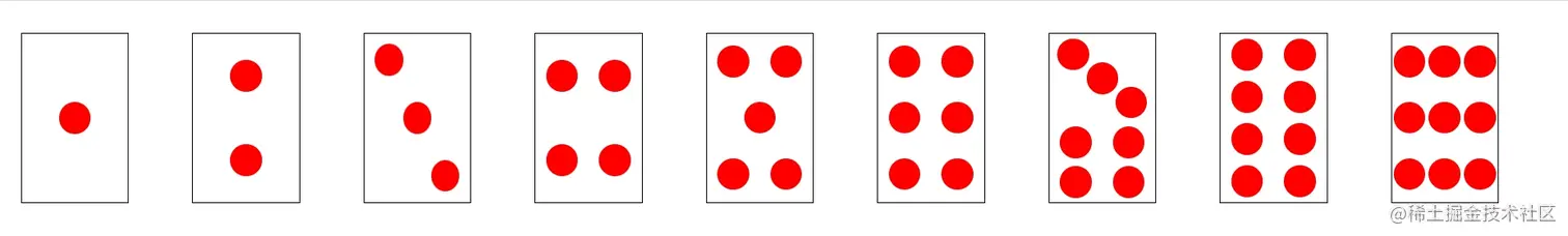
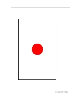
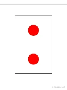
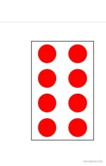
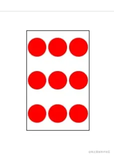
3.个人基于flex布局完成的麻将布局的样式: (结构 样式如下)
<body>
<ul>
<li></li>
</ul>
<ul>
<li></li>
<li></li>
</ul>
<ul>
<li></li>
<li></li>
<li></li>
</ul>
<ul>
<li></li>
<li></li>
<li></li>
...
</ul>
</body>
* {
margin: 0;
padding: 0;
}
body {
display: flex;
}
ul {
display: flex;
width: 100px;
height: 160px;
border: 1px solid #000;
margin: 30px;
}
ul li {
list-style: none;
height: 30px;
width: 30px;
background-color: red;
border-radius: 50%;
}
ul:nth-child(1) {
align-items: center;
justify-content: center;
}
ul:nth-child(2) {
flex-direction: column;
justify-content: space-around;
align-items: center;
}
ul:nth-child(3) {
justify-content: space-between;
}
ul:nth-child(3) li:nth-child(1) {
margin: 10px 0 0 10px;
}
ul:nth-child(3) li:nth-child(2) {
align-self: center;
}
ul:nth-child(3) li:nth-child(3) {
align-self: flex-end;
margin: 0 10px 10px 0;
}
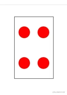
ul:nth-child(4) {
flex-wrap: wrap;
align-items: center;
}
ul:nth-child(4) li {
margin: 0 10px;
}
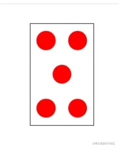
ul:nth-child(5) {
flex-wrap: wrap;
align-items: center;
justify-content: space-around;
}
ul:nth-child(5) li:nth-child(3) {
margin: 0 35px;
}
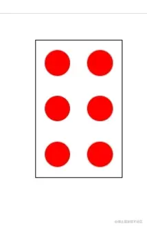
ul:nth-child(6) {
flex-wrap: wrap;
align-items: center;
justify-content: space-around;
}
ul:nth-child(6) li {
margin: 0 10px;
}
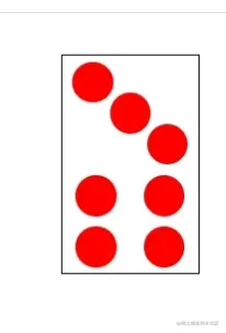
ul:nth-child(7) {
flex-wrap: wrap;
align-items: center;
justify-content: space-around;
align-items: center;
}
ul:nth-child(7) li:nth-child(1) {
margin: 1px 60px -10px 5px;
}
ul:nth-child(7) li:nth-child(2) {
margin: -5px 35px 0;
}
ul:nth-child(7) li:nth-child(3) {
margin-left: 60px;
margin: -15px 5px 0 60px;
}
ul:nth-child(7) li:nth-child(n+4) {
margin: 0 10px;
}
ul:nth-child(8) {
flex-wrap: wrap;
align-items: center;
justify-content: space-around;
align-items: center;
}
ul:nth-child(8) li {
margin: 0 10px;
}
ul:nth-child(9) {
flex-wrap: wrap;
align-items: center;
justify-content: space-around;
align-items: center;
}


