1.弹性布局基础属性
1.flex-direction:决定主轴的方法
参数:row:主轴为水平方向,
     column:主轴为竖直方向
     row-reverse:主轴水平,与row反向
     column-reverse:主轴竖直,与column反向
2.flex-wrap:决定是否换行排列
参数:nowrap:自动缩小项目,不换行
     wrap:换行,且第一行在上方
     wrap-reverse:换行,第一行在下面
3.flex-flow:flex-direction和flex-wrap的简写形式,
参数: row wrap|column wrap-reverse
4.justify-content:决定item在主轴上的对齐方式
参数:flex-start:左对齐
     flex-end:右对齐
     center:居中对齐
     space-between:两端对齐
     space-around:沿轴线均匀分布
5.align-items:决定了item在交叉轴上的对齐方式
参数:flex-start:顶端对齐
     flex-end:底部对齐
     center:竖直方向上居中对齐
     baseline:item第一行文字的底部对齐
     stretch:当item未设置高度时,item将和容器等高对齐
2.基础布局
    .mahiong-box{display: flex;}
    .mahiong-item{
        width: 110px;
        height: 150px;
        border-radius: 5px;
        background-color: #bcbcbc;
        margin-right: 20px;
        padding: 10px;
        p{
        width: 20px;
        height: 20px;
        border-radius: 50%;
        background-color: red;
    }
    }
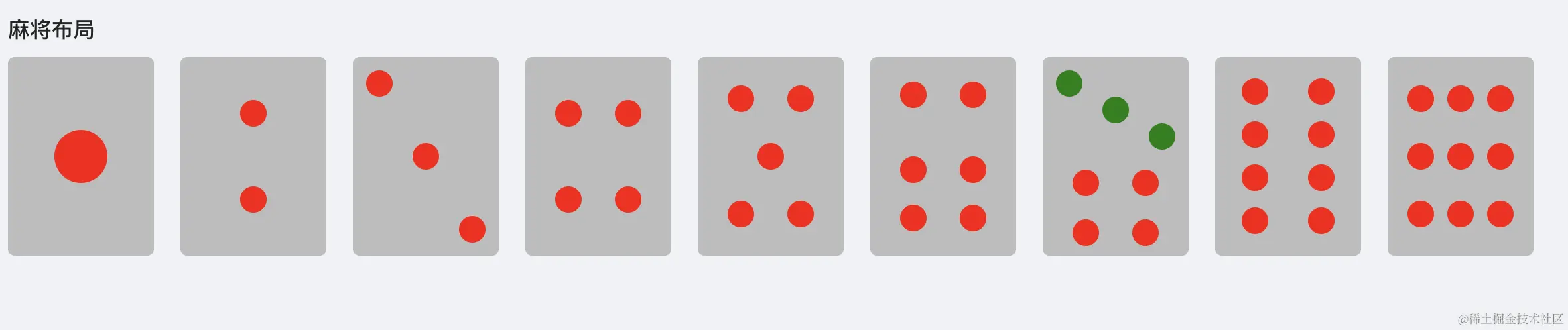
2.1.一筒布局
     .mahiong-one{
        display: flex;
        justify-content: center;
        align-items: center;
        p{
            width: 40px;
            height: 40px;
        }
     }
2.2.二筒布局
   .mahiong-two{
        display: flex;
        flex-direction: column;
        align-items: center;
        justify-content: space-around;
    }
2.3.三筒布局
   .mahiong-three{
        display: flex;
        flex-direction: column;
        justify-content: space-between;
        .two{
           align-self: center;
        }
        .three{
            align-self: flex-end;
        }
    }
2.4.四筒布局
 .mahiong-four{
        display: flex;
        flex-wrap: wrap;
        justify-content: space-around;
        align-items: center;
        p{
           margin:0 10px ;
        }
    }
2.5.五筒布局
 .mahiong-five{
        display: flex;
        justify-content: space-around;
        align-items: center;
        flex-wrap: wrap;
        .three{
             margin: 0 35px;
        }
    }
2.6.六筒布局
 .mahiong-sive{
        display: flex;
        justify-content: space-around;
        align-items: center;
        flex-wrap: wrap;
        P{
         margin:0 10px ;
        }
        .three,.four{
            margin-top: 20px;
        }
    }
2.7.七筒布局
     <div className="mahiong-seveen mahiong-item">
      <div className="top">
        <p />
        <p className="two" />
        <p className="three" />
      </div>
      <div className="bottom">
        <p />
        <p />
        <p />
        <p />
      </div>
    </div>
 .mahiong-seveen{
        .top{
            height:75px;
            display: flex;
            flex-direction: column;
            p{
                background-color: green;
            }
            .two{
                align-self: center;
            }
            .three{
                align-self: flex-end;
            }
        }
        .bottom{
            height:75px;
            display: flex;
            justify-content: space-around;
            flex-wrap:wrap;
            p{
                 margin: 0 10px;
            }
        }
    }
2.8.八筒布局
 .mahiong-eight{
        display: flex;
        flex-wrap: wrap;
        justify-content: space-between;
        align-items: center;
        p{
            margin: 0 10px;
        }
    }
2.9.九筒布局
 .mahiong-nine{
        display: flex;
        flex-wrap: wrap;
        justify-content: space-between;
        align-items: center;
        p{
            margin: 0 5px;
        }
    }


