<html lang="en">
<head>
<meta charset="UTF-8">
<meta http-equiv="X-UA-Compatible" content="IE=edge">
<meta name="viewport" content="width=device-width, initial-scale=1.0">
<title>Document</title>
<style>
* {
margin: 0;
padding: 0;
}
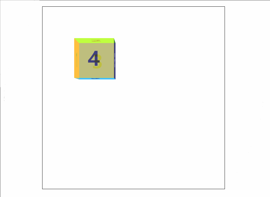
.box {
width: 300px;
height: 300px;
margin: 100px auto;
border: 1px solid #000;
position: relative;
/* 景深效果 */
perspective: 12000px;
/* 设置屏幕观察点 */
perspective-origin: 50% 50%;
/* 3d效果 */
transform-style: preserve-3d;
/* 过渡 */
transition: all 5s;
}
.box>div {
width: 100px;
height: 100px;
position: absolute;
/* 背景透明度 */
opacity: 0.5;
font-weight: 900;
font-size: 50px;
line-height: 100px;
text-align: center;
}
.box1 {
left: 0;
top: 100px;
background-color: #f00;
transform-origin: right;
transform: rotateY(90deg);
}
.box2 {
left: 100px;
top: 0;
background-color: yellow;
transform-origin: bottom;
transform: rotateX(-90deg);
}
.box3 {
left: 100px;
top: 100px;
background-color: blue;
}
.box4 {
left: 100px;
top: 100px;
background-color: green;
transform: translateZ(100px);
}
.box5 {
left: 100px;
top: 200px;
background-color: aqua;
transform-origin: top;
transform: rotateX(90deg);
}
.box6 {
left: 200px;
top: 100px;
background-color: purple;
transform-origin: left;
transform: rotateY(-90deg);
}
.box:hover {
transform: rotateX(180deg) rotateY(360deg);
/* transform: rotateY(180deg); */
}
</style>
</head>
<body>
<div class="box">
<div class="box1"></div>
<div class="box2"></div>
<div class="box3"></div>
<div class="box4"></div>
<div class="box5"></div>
<div class="box6"></div>
</div>
</body>
</html>


